The Magic of Accent Colors in Open Floor Plans
Open floor plans have become a hallmark of modern American living, offering a seamless flow between the kitchen, dining, and living areas. While this layout promotes togetherness and makes even modest homes feel spacious, it also presents a unique design challenge: how do you create distinct spaces without erecting walls or disrupting that coveted open vibe? The answer lies in the strategic use of accent colors. By thoughtfully incorporating bold or contrasting hues into your décor, you can define zones and infuse each area with personality—without breaking up the airy atmosphere. Accent colors allow you to celebrate your personal style while keeping the space visually cohesive, making them an essential tool for anyone looking to add character to an open concept home.
2. Choosing the Right Accent Hues for Distinction
Picking the perfect accent colors is like choosing the right vinyl record for a Saturday night—its all about setting the mood and making your space sing. In an open floor plan, the right hues help create invisible boundaries between your living zones without needing walls or heavy-handed dividers. But how do you select shades that truly vibe with your style, play nice with your existing palette, and still give each area its own personality?
Tips for Selecting Your Signature Colors
1. Reflect Your Vibe: Are you more mid-century modern cool or cozy boho retreat? Bold jewel tones (think emerald, navy, or mustard) add drama and energy, while subtle pastels or earth tones keep things chill and grounded. Let your lifestyle be your guide.
2. Complement Your Existing Palette: Take a cue from what’s already working—your sofa, rug, or artwork might offer a hint at what accent color will feel natural. Use a color wheel to find complementary shades, or stick to analogous colors for a softer transition between spaces.
3. Match Color to Zone Function: Each zone has its own rhythm. Maybe the dining area gets a pop of cherry red for lively dinners, while the reading nook stays serene with sage green or powder blue. Here’s a quick reference:
| Zone | Bold Accent Suggestions | Subtle Accent Suggestions |
|---|---|---|
| Living Area | Cobalt Blue, Burnt Orange | Dove Gray, Soft Taupe |
| Dining Area | Cherry Red, Mustard Yellow | Moss Green, Blush Pink |
| Work Space | Sapphire, Charcoal Black | Pale Mint, Cool White |
| Relaxation Nook | Aubergine, Teal | Sage Green, Powder Blue |
Pro Tip: Sample Before You Commit!
Tape up paint swatches or bring in colored pillows to test-drive your picks under different lighting throughout the day. Sometimes that avocado green looks groovy by daylight but falls flat come evening—so trust your eyes and instincts.
![]()
3. Practical Ways to Apply Accent Colors
When it comes to defining spaces in an open floor plan, accent colors are your secret weapon. Instead of relying on walls, use bold hues to visually separate areas and give each zone its own personality. Let’s dive into some tried-and-true methods that American homeowners love for adding pops of color without overwhelming their space.
Paint a Feature Wall
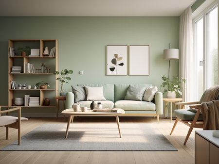
One of the most popular ways to incorporate accent colors is by painting a single feature wall. Whether you go for a classic navy in the dining nook or a vibrant terra cotta behind your living room sofa, this technique creates an instant focal point. In larger open spaces, try using different shades for each area to subtly signal a shift in function—think sage green for the kitchen and deep blue for the lounge.
Colorful Furniture
If you’re not ready to commit to paint, furniture is a flexible option. A mustard yellow couch or emerald green armchair can anchor a conversation area and make it stand out from adjacent spaces. Mix and match pieces in different finishes or fabrics to create visual interest without sacrificing cohesion. Americans especially love mixing mid-century modern lines with bold upholstery for that retro-cool vibe.
Vibrant Rugs
Rugs are a game-changer in open concept homes. Use a patterned or brightly colored rug to define zones like the dining area or reading corner. Layering rugs is also a fun way to play with color and texture; go for a playful vintage kilim under your coffee table or a graphic black-and-white runner along the entryway. It’s all about creating “rooms” without walls.
Quirky Accessories
Don’t underestimate the power of accessories! Toss pillows in funky prints, bold vases, and even colorful lamps can all act as accents that reinforce your chosen palette. Americans often express their personalities through these finishing touches—think retro neon clocks in the kitchen or pop art prints above the bar cart. Swapping out accessories seasonally keeps things fresh and lets you experiment with trends without making permanent changes.
Mixing Old & New
The real magic happens when you blend vintage finds with contemporary pieces. Scour local flea markets for unique treasures—maybe a mid-century credenza in teal or an antique mirror with a painted frame—to inject history and character into your space. This nostalgic twist makes each accent color feel intentional and rooted in personal style, perfectly capturing that American love for eclectic, lived-in interiors.
4. Color Psychology in Shared Spaces
When it comes to open floor plans, accent colors aren’t just decorative—they’re emotional cues that shape how we feel and interact in each distinct zone. Understanding color psychology can help you select shades that energize a family room, calm a workspace, or warm up a dining nook, making your open concept home both beautiful and functional.
How Colors Influence Moods
In American homes, the vibe of each space matters. The right accent color can make a spot feel inviting or focused. For example, bold hues like sunny yellow or vibrant teal add energy and sociability to a family room where everyone gathers. On the other hand, muted blues and soft greens are perfect for workspaces—they dial down distractions and boost concentration. In the dining nook, rich earth tones such as terracotta or warm golds foster comfort and appetite, encouraging longer, cozier meals together.
Matching Shades with Purpose
| Space | Mood Desired | Accent Color Ideas | Why It Works |
|---|---|---|---|
| Family Room | Energetic & Social | Cobalt Blue, Citrus Yellow, Coral | Lifts spirits and sparks conversation; great for group activities |
| Workspace/Office Nook | Calm & Focused | Sage Green, Slate Blue, Soft Gray | Reduces stress and supports productivity; helps block out distractions |
| Dining Nook | Warm & Inviting | Burgundy, Terracotta, Mustard Gold | Enhances appetite and makes meals feel special; encourages connection |
The Bottom Line: Moods Matter!
Choosing accent colors based on their psychological effects isn’t just about aesthetics—it’s about setting the tone for daily life. Whether you want your open floor plan to feel lively during game night or serene during work hours, let your accent shades do some of the heavy lifting. That’s how you make every corner of your home work for you—and look good while doing it.
5. Accent Color Do’s and Don’ts
American Style Secrets: Unifying Your Open Floor Plan
When using accent colors to define spaces in an open floor plan, its all about striking the right balance—a true American style secret. Bold choices can breathe life into a room, but overdoing it can make your space feel chaotic rather than cohesive. Instead, pick one or two accent hues that complement your main palette, ensuring they flow naturally from one area to the next. Layering with neutrals is key: use whites, grays, or earthy tones as your base to let those vibrant pops of color shine without overwhelming the senses.
Dos: Balance and Layer Thoughtfully
Do anchor each zone with a signature accent color—think navy throw pillows in the living area or sunny yellow barstools at the kitchen island. Do repeat your chosen accent shades in subtle ways across different zones; this creates visual harmony while still giving each space its own vibe. And do mix textures and materials: a velvet emerald green ottoman pairs beautifully with a sleek metal lamp in the same hue for that layered, lived-in look Americans love.
Don’ts: Avoid Common Pitfalls
Don’t overwhelm your open floor plan by using too many competing colors—this tends to create visual clutter instead of definition. Don’t ignore undertones; cool and warm tones can clash if not handled carefully, so stick within a harmonious temperature range. And don’t forget about lighting: bold colors may look stunning in natural daylight but turn harsh under artificial light. Always test paint swatches and fabric samples before committing to an accent scheme.
Keep It Unified, Keep It Personal
Ultimately, the goal is to define spaces while maintaining unity throughout your home. By following these American-inspired do’s and don’ts—balancing boldness, layering with neutrals, and steering clear of common mistakes—you’ll give every corner its own personality without losing that seamless, inviting flow that makes open floor plans so appealing.
6. Inspiration From U.S. Design Trends
Across the United States, accent color choices are as diverse as the regions themselves—each area bringing its own twist to open floor plan living. California cool is all about effortless vibes; think breezy layouts defined by ocean-inspired blues and sun-washed corals that echo the Pacific coastline. These pops of color often outline living areas or highlight kitchen islands, lending a relaxed yet intentional separation of space.
Head to the Southwest, and you’ll find earthy terracotta, burnt orange, and cactus green infusing warmth into vast open concepts. Locals love using these hues for feature walls or statement furniture pieces that distinguish dining nooks from lounging zones—all while reflecting the desert landscape outside.
In the Midwest, practicality meets personality. Accent colors tend toward deep forest greens, barn reds, and buttery yellows—shades reminiscent of classic Americana. It’s common to see painted built-ins or bold rugs anchoring distinct areas in a family-oriented great room.
The Northeast leans traditional with rich navy blues, hunter greens, and cranberry reds. Homeowners here use accent colors to frame fireplaces or create cozy reading corners within open layouts, nodding to historic colonial charm while keeping spaces fresh.
Finally, in the South, genteel pastels like mint, peach, and sky blue reign supreme. These hues draw subtle boundaries between spaces—softly highlighting sitting rooms or breakfast areas without breaking up sightlines.
No matter where you live in the U.S., local flavor inspires how accent colors define and personalize open floor plans—making every home feel just right for its region.