Introduction to Modern Patio Color Schemes
When it comes to creating a chic and contemporary patio, the color scheme you choose sets the entire mood for your outdoor space. In American homes, patios are not just for relaxing—they’re an extension of your style, a place for gatherings, and a spot to unwind after a busy day. That’s why picking the right colors is so important; they help define whether your patio feels inviting, modern, and on-trend.
Modern patio color schemes focus on balance, simplicity, and sophistication. The right palette can make even a small backyard feel expansive or turn an ordinary deck into an eye-catching retreat. Whether you prefer cool neutrals or bold contrasts, your choices should reflect your personality while enhancing comfort and style.
Why Do Color Schemes Matter in Patio Design?
A well-thought-out color scheme does more than look good—it influences how you feel when you step outside. Certain colors can make a space feel calm and serene, while others bring energy and excitement. For American homeowners who love to entertain or relax outdoors, the right colors create the perfect vibe for any occasion.
How Colors Set a Chic, Contemporary Mood
Contemporary design favors clean lines and uncluttered spaces, often highlighted by a smart mix of color tones. By combining classic shades with trendy pops of color, you can achieve a stylish outdoor area that feels both timeless and fresh. Here’s a quick look at how different color types impact your patio’s overall feel:
| Color Type | Mood/Effect | Best For |
|---|---|---|
| Neutrals (gray, beige, white) | Calm, versatile foundation | Couches, flooring, walls |
| Earth Tones (olive green, terracotta) | Warmth & natural vibes | Pillows, rugs, planters |
| Bolds (navy blue, charcoal black) | Dramatic focal points | Accent furniture, decor pieces |
| Pops of Color (yellow, teal) | Fun & inviting energy | Cushions, throws, accessories |
Setting the Scene for Stylish Outdoor Living
Your patio should reflect how you want to live outside—whether that means hosting summer BBQs or sipping coffee in peace. With the right color scheme as your starting point, you’ll have a strong foundation for building a space that looks great and works perfectly for American lifestyles.
2. Classic Neutrals: Timeless and Versatile
When it comes to creating a chic and contemporary patio, classic neutrals like whites, grays, and beiges are at the top of the list for many American homeowners. These shades aren’t just trendy—they’re also incredibly practical and flexible for all kinds of outdoor settings.
Why Neutrals Are So Popular for Patios
Neutrals bring a sense of calm and sophistication to any outdoor space. They act as a perfect backdrop, letting your plants, furniture, and decorative accents take center stage. Plus, these colors are easy to match with different materials—from wood to stone—and can adapt as your style changes over time.
How Neutrals Blend with Outdoor Features
One of the best things about neutral color schemes is how effortlessly they blend with various outdoor features. Whether you have bold landscaping, colorful cushions, or unique lighting fixtures, whites, grays, and beiges help everything work together without feeling overwhelming.
| Color | Best Used With | Patio Vibe |
|---|---|---|
| White | Modern furniture, green plants, black accents | Crisp & Clean |
| Gray | Stonework, metal details, glass elements | Sleek & Contemporary |
| Beige | Wooden furniture, natural textiles, terracotta pots | Warm & Inviting |
Tips for Using Neutrals Outdoors
If you want your patio to feel fresh year after year, start with a base of neutral tones for large surfaces like flooring and walls. Then add pops of color through throw pillows, outdoor rugs, or seasonal flowers. This way, you can easily refresh your look anytime without a major overhaul.
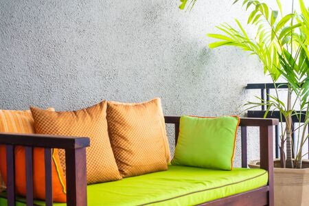
3. Bold and Vibrant Statements
If you want your patio to stand out and truly reflect your personality, consider embracing bold and vibrant color schemes. By mixing deep, energetic shades like navy blue, emerald green, and terracotta, you can create an outdoor space that feels lively, inviting, and unmistakably modern.
Why Go Bold?
Bold colors instantly add energy and make a strong impression. They bring excitement to your patio, making it the perfect spot for entertaining or relaxing after a long day. These hues can also help highlight architectural features or unique furniture pieces.
Popular Bold Color Choices
| Color | Vibe | How to Use |
|---|---|---|
| Navy Blue | Sophisticated & Modern | Cushions, planters, accent walls |
| Emerald Green | Fresh & Inviting | Potted plants, rugs, outdoor curtains |
| Terracotta | Warm & Earthy | Tiles, pots, side tables |
Tips for Mixing Bold Colors
- Pair with neutral tones like beige or gray to balance the look.
- Add metallic accents (such as brass or gold) for extra chicness.
- Use bold patterns on throw pillows or area rugs to tie everything together.
Don’t be afraid to experiment—mixing these vibrant shades will help your patio feel personal and full of life, making it a true extension of your home’s style.
4. Earth Tones for a Natural Vibe
Earth tones are a top choice when it comes to designing a chic and contemporary patio that feels warm and inviting. Browns, olives, and muted greens not only reflect the beauty of nature but also create a cozy, grounding atmosphere that fits right in with typical American backyard settings. These shades blend seamlessly with both lush green lawns and wooden decks, making them ideal for patios across the U.S.
Why Choose Earth Tones?
Earthy colors help your outdoor space feel relaxed and timeless. Browns bring warmth, olives add depth, and muted greens mimic the calm of surrounding plants and trees. Together, they offer a soothing backdrop for all kinds of outdoor activities—from family barbecues to quiet evenings around the firepit.
Popular Earth Tone Combinations
| Color | Common Use | How It Feels |
|---|---|---|
| Warm Brown | Wooden furniture, decking, planters | Cozy & welcoming |
| Olive Green | Cushions, umbrellas, accent walls | Natural & calming |
| Muted Sage | Pots, rugs, throws | Fresh & grounding |
| Soft Beige | Pillows, lanterns, curtains | Light & airy |
Tips for Using Earth Tones on Your Patio:
- Mix Textures: Combine wood, stone, and fabric in these colors for extra interest.
- Add Greenery: Potted plants or vertical gardens enhance the natural vibe.
- Layer Accents: Use different shades in pillows or outdoor rugs to avoid a flat look.
- Keep It Balanced: Let earth tones dominate but add pops of black or white for a crisp finish.
This approach helps your patio blend effortlessly with its surroundings while remaining stylish and comfortable—just like so many beloved American backyard hangouts.
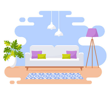
5. Cool Blues and Refreshing Tones
When it comes to creating a chic and contemporary patio, cool color palettes like blues and aquas are a go-to choice for many American homeowners. These colors instantly evoke feelings of relaxation, much like a luxury resort or a breezy beachside lounge. With the right shades, your outdoor space can become a serene escape perfect for entertaining friends or enjoying quiet evenings under the stars.
Why Choose Cool Blues?
Blue tones—from soft sky blue to deep navy—bring calmness and balance to any patio design. They pair beautifully with natural materials like wood, stone, or wicker, making them versatile for modern outdoor furniture and decor. Aqua and turquoise add a splash of energy without overwhelming the senses, keeping the vibe fresh yet tranquil.
Popular Combinations for Patios
| Primary Color | Accent Color | Recommended Materials |
|---|---|---|
| Navy Blue | Crisp White | Teak, Canvas Cushions |
| Aqua | Sand Beige | Rattan, Outdoor Rugs |
| Pale Sky Blue | Slate Gray | Ceramic Planters, Stone Tiles |
How to Use Cool Palettes Outdoors
- Add throw pillows in varying shades of blue to your lounge chairs.
- Choose aqua glassware or dinnerware for outdoor dining tables.
- Use blue-striped umbrellas or outdoor rugs as statement pieces.
Pro Tip:
If you want your patio to feel even more like a vacation spot, incorporate water features such as a small fountain or reflective pool. The blue tones will amplify the tranquil atmosphere and make your space the ultimate retreat.
6. Mixing and Matching: Expert Tips
Creating a chic and contemporary patio isn’t just about picking one color scheme—it’s about knowing how to blend colors, patterns, and textures for a cohesive and inviting look. Here are some expert tips to help you mix and match color schemes effortlessly:
Start with a Base Palette
Choose two or three main colors as your foundation. For example, you could use cool grays and whites for a modern vibe, or soft blues and sandy beiges for a coastal feel.
Table: Sample Base Palettes
| Style | Main Colors |
|---|---|
| Modern Minimalist | Charcoal Gray, White, Black |
| Coastal Contemporary | Pale Blue, Sand, White |
| Urban Chic | Navy, Taupe, Light Gray |
Add Accents for Personality
Once your base is set, layer in accent colors through throw pillows, outdoor rugs, planters, or side tables. Bold hues like sunny yellow or teal can energize the space, while metallics such as brass or matte black add sophistication.
Tip:
Stick to one or two accent shades to avoid overwhelming your patio. Repeat them in small doses for balance.
Mix Textures and Patterns
Combine different fabrics—think linen cushions with woven throws or patterned outdoor rugs—to create depth without clashing. Geometric prints work well with solids, while stripes can add visual interest when paired with subtle florals.
Tie Everything Together with Accessories
Use items like lanterns, vases, or artwork to reinforce your color story. For example, if your scheme features navy accents, choose navy candle holders or ceramic pots to unify the look.
Table: Accessory Ideas by Color Scheme
| Main Scheme | Accent Options | Accessory Suggestions |
|---|---|---|
| Gray + White | Cobalt Blue, Lemon Yellow | Cushions, Outdoor Dinnerware |
| Navy + Beige | Copper, Emerald Green | Lamps, Planters |
| Sage Green + Cream | Terracotta Orange, Gold | Candles, Side Tables |
Keep Functionality in Mind
Your patio should be stylish but also practical. Choose weather-resistant materials for cushions and easy-to-clean surfaces for tables so your design lasts all season long.
With these mixing and matching tips, you’ll be able to combine various color schemes effectively and pull together a patio that feels both fresh and thoughtfully designed.
7. Conclusion: Personalize Your Patio Palette
Designing a chic and contemporary patio is all about making your outdoor space an extension of your home and lifestyle. The color schemes we explored—ranging from calming neutrals to bold, modern contrasts—are just starting points. There’s no one-size-fits-all formula, especially with the diverse climates and styles across the United States. Whether you live in sunny California, humid Florida, or the cooler Pacific Northwest, your patio can reflect both your personal taste and your local environment.
Find Your Perfect Color Scheme
| Region | Suggested Color Schemes | Why It Works |
|---|---|---|
| Southwest | Terracotta & Turquoise | Complements desert landscapes and vibrant sunsets |
| Southeast | Crisp White & Navy Blue | Keeps things cool and classic in humid climates |
| Pacific Northwest | Moss Green & Charcoal Gray | Blends naturally with lush surroundings and cloudy skies |
| Northeast | Slate Blue & Warm Taupe | Adds warmth for cooler seasons and coordinates with traditional architecture |
Tips to Make It Yours
- Mix and match colors from different schemes for a custom look.
- Test samples outdoors before committing—colors can look different in natural light.
- Add pops of color with cushions, planters, or outdoor rugs to refresh your space seasonally.
Your Patio, Your Rules
The most important thing is to experiment and have fun with your patio’s palette. Use these color schemes as inspiration, but don’t be afraid to break the rules or add your own twist. Let your patio tell the story of who you are and create a space that feels right for you and your climate. With a little creativity, your outdoor area can become your favorite spot at home.