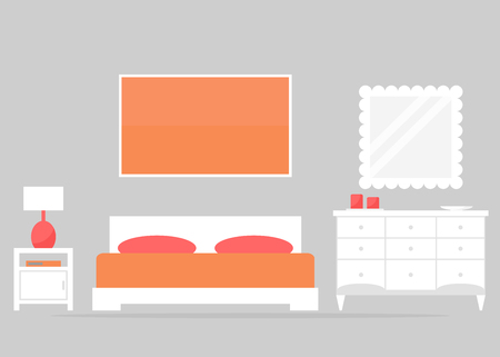
1. The Psychology of Color in the Bedroom
Color plays a crucial role in setting the mood of a bedroom. The right color palette can promote relaxation, improve sleep quality, and create a peaceful atmosphere. Understanding how different colors affect emotions can help you design a space that feels calming and restorative.
How Colors Influence Mood and Sleep
Each color has psychological effects that can impact how we feel in a space. Some hues promote tranquility, while others may be too stimulating for a restful environment. Here’s how common bedroom colors influence mood and sleep:
| Color | Psychological Effect | Best For |
|---|---|---|
| Blue | Calming, lowers heart rate, reduces stress | Ideal for bedrooms, promotes deep sleep |
| Green | Refreshing, balances emotions, reduces anxiety | A great choice for relaxation and harmony |
| Pale Yellow | Warm, cozy, evokes happiness | Adds comfort without overstimulation |
| Purple (Soft Shades) | Sophisticated, encourages creativity and relaxation | Lavender tones are excellent for soothing spaces |
| Neutral Tones (Beige, Gray) | Sophisticated, versatile, promotes calmness | A timeless backdrop for a serene bedroom |
| Red or Bright Orange | Energizing, increases heart rate, stimulating | Avoid in bedrooms as they may disrupt sleep |
| Pink (Soft Shades) | Nurturing, calming, evokes warmth and comfort | A good choice for a cozy and inviting atmosphere |
The Best Colors for a Restful Bedroom Environment
The best bedroom colors are those that encourage relaxation and reduce stress. Soft blues, muted greens, gentle grays, and warm neutrals work well to create a soothing environment. Avoid overly bright or intense shades like neon yellow or bold red, as they can be overstimulating and make it harder to unwind.
Tips for Choosing the Right Shade
- Select Muted Tones: Softer versions of colors tend to be more relaxing than vibrant shades.
- Avoid High-Contrast Schemes: Sharp contrasts can create visual tension that disrupts relaxation.
- Add Natural Elements: Earthy tones paired with natural materials like wood can enhance the calming effect.
- Tie It Together with Lighting: Warm lighting can complement soft hues and create a cozy ambiance.
The Role of Personal Preference in Color Choice
Your personal connection to certain colors matters too. While general color psychology provides guidance, always consider which hues make you feel most comfortable and at ease. A harmonious bedroom should reflect your personality while maintaining a tranquil atmosphere.
2. Understanding Color Theory: Hue, Saturation, and Contrast
Creating a harmonious bedroom starts with understanding the basics of color theory. By learning how hue, saturation, and contrast work together, you can design a space that feels balanced and visually appealing. Lets break down these key elements.
Hue: The Foundation of Color
Hue refers to the pure color itself—red, blue, yellow, and everything in between. Each hue has its own psychological impact and can influence the mood of a room:
| Hue | Mood & Effect |
|---|---|
| Warm Colors (Reds, Oranges, Yellows) | Create a cozy, inviting atmosphere; great for energizing spaces |
| Cool Colors (Blues, Greens, Purples) | Evoke calmness and relaxation; ideal for a peaceful bedroom |
Saturation: Controlling Intensity
Saturation describes how vivid or muted a color appears. Highly saturated colors are bold and vibrant, while desaturated hues feel softer and more neutral. In a bedroom setting:
- High saturation: Best used as an accent to add energy without overwhelming the space.
- Low saturation: Works well for walls and larger areas to maintain a soothing ambiance.
Contrast: Creating Visual Interest
Contrast is the difference between light and dark colors or complementary hues. A well-balanced contrast adds depth to your bedroom without making it feel too stark.
Tips for Using Contrast Effectively:
- Soft contrast: Pair pastels or neutral tones for a subtle and elegant look.
- Bolder contrast: Combine deep tones with lighter shades to create visual interest.
- Avoid too much contrast: Extremely high contrast can be jarring in a restful space like a bedroom.
A good approach is to choose one dominant hue, adjust its saturation for balance, and introduce contrast strategically to enhance depth. With these principles in mind, you can create a bedroom that feels both visually appealing and emotionally comforting.
3. Popular Color Combinations for a Serene Atmosphere
Choosing the right color combination is essential to creating a peaceful and harmonious bedroom. Certain color pairings have been proven to evoke calmness, making your space feel like a retreat from daily stress. Below are some tried-and-true combinations that can help you achieve a serene atmosphere.
Soft Neutrals for Timeless Elegance
Neutral tones offer a soothing and versatile foundation for any bedroom. They create a sense of balance and tranquility, making them ideal for relaxation.
| Primary Color | Accent Color | Effect |
|---|---|---|
| Warm Beige | Soft White | Creates a cozy and inviting ambiance |
| Cool Gray | Pale Blue | Adds a touch of sophistication while remaining calming |
| Cream | Light Taupe | Provides a warm and understated elegance |
Nature-Inspired Palettes
Bringing nature indoors through color can have a grounding and restorative effect. These palettes mimic natural elements, promoting relaxation and well-being.
| Primary Color | Accent Color | Effect |
|---|---|---|
| Sage Green | Earthy Brown | Elicits feelings of serenity and connection to nature |
| Deep Ocean Blue | Soft Sand Beige | Creates a coastal-inspired, tranquil environment |
| Moss Green | Pale Yellow | Adds freshness while maintaining warmth and comfort |
Pale Pastels for a Light and Airy Feel
Pale pastels bring softness to the bedroom, offering gentle hues that promote restfulness without overwhelming the senses.
| Primary Color | Accent Color | Effect |
|---|---|---|
| Pale Blue | Muted Lavender | Encourages relaxation with a hint of dreamy elegance |
| Dusty Rose | Misty Gray | Adds warmth while keeping the space light and airy |
| Soft Peach | Pearl White | Cultivates a comforting yet refreshing aesthetic |
Monochromatic Tones for Minimalist Harmony
A monochromatic color scheme uses varying shades of the same hue to create depth while maintaining simplicity and calmness.
- Shades of Blue: A mix of light sky blue, medium teal, and deep navy fosters relaxation.
- Tonal Grays: Soft dove gray paired with charcoal creates a modern yet soothing environment.
- Misty Greens: Combining pale mint with deeper olive green brings an organic, peaceful feel.
Tips for Choosing the Right Combination
- If your bedroom has limited natural light, opt for lighter shades to keep the space feeling open and airy.
- Add texture through bedding, rugs, or curtains in complementary hues to enhance depth.
- If using bold colors, incorporate them as accents rather than dominant tones to maintain tranquility.
- Avoid overly vibrant contrasts, as they may disrupt the room’s calming effect.
- Test paint samples on walls before committing to ensure they align with your desired mood.
The right color combination can significantly impact how restful and inviting your bedroom feels. Whether you prefer soft neutrals, nature-inspired hues, or delicate pastels, selecting colors that resonate with you will help cultivate a serene sanctuary where you can unwind.
4. Accent Colors and Textures for Depth and Interest
Creating a harmonious bedroom doesn’t mean sticking to just one or two colors. Accent colors and textures play a crucial role in adding depth, personality, and warmth to your space without overwhelming the overall aesthetic. By carefully selecting textiles, decorative elements, and small pops of color, you can enhance the design while maintaining balance.
How to Use Accent Colors Effectively
Accent colors are secondary hues that complement your primary color palette. They help break monotony and introduce visual interest. When choosing accent colors, consider the 60-30-10 rule:
| Percentage | Element | Description |
|---|---|---|
| 60% | Main Color | The dominant shade used on walls, large furniture pieces, or bedding. |
| 30% | Secondary Color | A complementary tone used for curtains, rugs, or statement furniture. |
| 10% | Accent Color | A bold or contrasting hue used in pillows, artwork, or accessories. |
Incorporating Textures for a Cozy Feel
Textures add dimension by creating contrast between soft, rough, smooth, and plush surfaces. Mixing different materials makes your bedroom feel more inviting and visually engaging.
Ways to Introduce Texture:
- Bedding: Layering cotton sheets with a knit throw or velvet pillow adds depth.
- Rugs: A shaggy rug can soften hardwood floors while adding warmth.
- Curtains: Linen drapes bring an airy feel, whereas velvet curtains add luxury.
- Furniture: A combination of wood, metal, or woven elements enhances contrast.
Decorative Elements That Tie Everything Together
Small décor pieces can reinforce your color scheme while adding character to your bedroom. Here are some easy ways to incorporate them:
- Pillows & Throws: Choose patterns or solid hues that complement your accent color.
- Lamps & Lighting Fixtures: Warm-toned lighting enhances coziness and highlights textures.
- Wall Art & Mirrors: Artwork featuring your accent color helps unify the space.
- Plants & Greenery: Natural elements introduce fresh texture and color contrast.
By thoughtfully incorporating accent colors and textures, you can create a bedroom that feels layered, stylish, and harmonious. Experiment with different combinations until you find a balance that reflects your personal style while maintaining a cohesive look.
5. Practical Tips for Applying Color in Your Bedroom
Creating a harmonious bedroom color scheme doesn’t have to be overwhelming. By following these practical tips, you can choose paint, bedding, and decor that work together to promote relaxation and comfort.
Choose the Right Paint Color
The wall color sets the foundation for your bedroom’s overall look and feel. Consider these factors when selecting a shade:
- Soft Neutrals: Colors like beige, soft gray, or warm white create a calming atmosphere.
- Cool Tones: Blues and greens are known for their soothing effects and can make the space feel more restful.
- Accent Walls: If you love bold colors, consider using them on just one wall to add depth without overwhelming the room.
Select Coordinating Bedding
Your bedding should complement your wall color while adding texture and visual interest. Here’s how to make it work:
| Bedding Element | Recommended Color Choices |
|---|---|
| Sheets & Pillowcases | Stick with neutral tones like white, ivory, or light gray for versatility. |
| Duvet Cover or Comforter | Select a shade that matches or contrasts tastefully with your walls. |
| Throw Blankets & Accent Pillows | Add pops of color with complementary or analogous hues. |
Add Thoughtful Decor Elements
The right decor pieces can tie everything together. Consider these ideas:
- Curtains & Rugs: Choose colors that blend well with your bedding and walls for a unified look.
- Lamps & Accessories: Metallics like gold or silver can add elegance without disrupting your color scheme.
- Nature-Inspired Accents: Incorporate wood tones or greenery for a fresh, organic feel.
Create Balance with Lighting
The way colors appear can change depending on lighting. Keep these points in mind:
- Naturally Lit Rooms: Colors will look brighter during the day, so test swatches in different lighting conditions.
- Lamp Selection: Warm bulbs enhance cozy hues, while cool bulbs emphasize blues and greens.
- Dimmers: Adjustable lighting helps control ambiance throughout the day.
A Simple Formula for Success
If you’re unsure where to start, use the “60-30-10 Rule”:
- 60% – Primary Color: This is your dominant shade (walls, large furniture).
- 30% – Secondary Color: A complementary tone found in bedding or curtains.
- 10% – Accent Color: Small pops of color through pillows or artwork.
A well-balanced color palette enhances relaxation and ensures your bedroom feels inviting. By carefully selecting paint, bedding, and decor items that complement each other, you’ll create a cohesive and serene retreat perfect for unwinding at the end of the day.