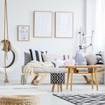
1. Introduction to Color in Minimalist Interiors
Minimalist interior design is often associated with simplicity, clean lines, and a neutral color palette. However, color plays a crucial role in shaping the aesthetics and atmosphere of a minimalist space. While minimalism focuses on reducing clutter and emphasizing functionality, the strategic use of color can enhance the overall design and create a welcoming environment.
The Importance of Color in Minimalist Design
In minimalist interiors, color is used intentionally to influence mood, highlight architectural features, and define spaces without overwhelming the design. The right colors can make a room feel warm and inviting or cool and calming. Even subtle variations in shades can have a significant impact on how a space is perceived.
How Color Affects Atmosphere
Different colors evoke different emotions and atmospheres. Here’s how some common colors are used in minimalist interiors:
| Color | Effect | Common Use in Minimalist Interiors |
|---|---|---|
| White | Creates a sense of openness, cleanliness, and simplicity | Main background color for walls and furniture |
| Gray | Adds sophistication and neutrality while maintaining warmth | Used for accent walls, flooring, or furniture |
| Beige | Brings warmth and coziness without overpowering the space | Applied to textiles, upholstery, or wall colors |
| Black | Adds depth, contrast, and elegance when used sparingly | Commonly found in fixtures, trims, or statement pieces |
| Earth Tones | Create a natural and organic feel while maintaining minimalism | Used in wooden elements, textiles, or decorative pieces |
Balancing Colors in Minimalist Spaces
The key to using color effectively in minimalist interiors is balance. A well-thought-out color palette ensures that the space remains harmonious while still allowing for visual interest. Too many bold colors can disrupt the minimalist aesthetic, while too little variation may make the space feel monotonous.
By carefully selecting colors that complement each other and incorporating them through textures, materials, and accents, designers can create inviting yet refined minimalist interiors that feel both functional and aesthetically pleasing.
2. The Psychological Impact of Color
Color plays a powerful role in shaping the mood and perception of a space. In minimalist interior design, where simplicity and intentionality are key, choosing the right colors can make all the difference. Understanding how different colors affect emotions helps create an environment that feels balanced and inviting.
How Colors Influence Mood
Each color carries psychological effects that can enhance or alter the feel of a minimalist space. Below is a breakdown of common colors and their impacts:
| Color | Psychological Effect | Best Use in Minimalist Design |
|---|---|---|
| White | Creates a sense of cleanliness, openness, and simplicity. | Main background color for walls and furniture to enhance spaciousness. |
| Gray | Adds sophistication, neutrality, and calmness. | Ideal for accent walls, furniture, or textiles to create depth without overwhelming. |
| Beige | Elicits warmth and comfort while maintaining neutrality. | A great base color for creating a cozy yet modern atmosphere. |
| Pale Blue | Promotes relaxation, tranquility, and clarity. | Suits bedrooms and living spaces to encourage a peaceful ambiance. |
| Pale Green | Energizes the mind while offering a connection to nature. | An excellent choice for small decor elements or feature walls. |
| Black | Adds contrast, elegance, and grounding effects. | A strategic accent color for defining spaces without overpowering them. |
The Balance Between Warm and Cool Tones
A well-balanced minimalist space often incorporates both warm and cool tones to create harmony. Warm colors like beige or soft earth tones can add coziness, while cool shades such as gray or blue promote serenity. Mixing these thoughtfully ensures that the space does not feel too stark or too enclosed.
The Role of Accent Colors
A minimalist design does not have to be entirely neutral. Introducing subtle pops of color—such as muted pastels or natural greens—can enhance personality while maintaining simplicity. Using accents through pillows, artwork, or decorative pieces keeps the space visually interesting without disrupting its clean aesthetic.
Avoiding Overuse of Strong Colors
Bolder hues like bright red or deep orange can be stimulating but should be used sparingly in minimalist interiors. A single statement piece or limited accents can bring energy without overwhelming the tranquil atmosphere that minimalism aims to achieve.
Selecting colors with intention ensures that a minimalist space remains visually appealing while also supporting emotional well-being. Thoughtfully chosen hues contribute to a comfortable and harmonious environment that aligns with modern design principles.
![]()
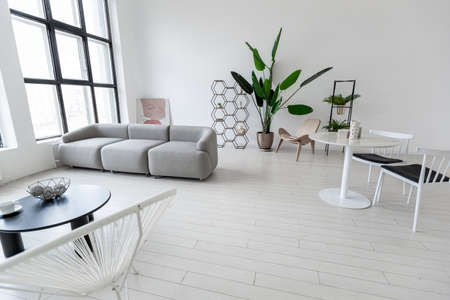
3. Neutral Tones as a Foundation
Neutral tones play a crucial role in modern minimalist interior design. Colors like white, gray, and earthy shades create a clean and timeless aesthetic that enhances simplicity while maintaining warmth and balance. By using these hues as a foundation, spaces feel open, airy, and effortlessly elegant.
Why Neutral Tones Matter
Minimalist design thrives on simplicity, and neutral colors provide the perfect backdrop for achieving this look. These tones allow furniture, textures, and architectural elements to stand out without overwhelming the space.
Common Neutral Colors in Minimalist Design
| Color | Description | Effect on Space |
|---|---|---|
| White | Crisp and clean, often used to enhance brightness. | Makes rooms feel spacious and fresh. |
| Gray | A versatile color that ranges from light to dark tones. | Adds depth while maintaining a modern feel. |
| Beige | A warm neutral that blends well with natural materials. | Creates a cozy and inviting atmosphere. |
| Taupe | A mix of brown and gray, offering subtle sophistication. | Adds elegance without overpowering the space. |
The Balance Between Warm and Cool Neutrals
A well-designed minimalist space often balances warm and cool neutral tones. Warm neutrals like beige and taupe add comfort, while cooler grays and whites maintain a crisp, modern edge. Mixing these shades thoughtfully prevents a room from feeling too stark or too dull.
Using Texture to Enhance Neutral Palettes
A monochromatic neutral palette doesnt have to be boring. Incorporating different textures—such as soft linen curtains, sleek marble countertops, or matte-painted walls—adds depth and visual interest to the space without relying on bold colors.
The Role of Natural Light
Naturally lit spaces enhance the beauty of neutral tones by highlighting their subtle variations throughout the day. Large windows, sheer curtains, and open layouts help maximize daylight, making neutral interiors feel more dynamic and inviting.
Selecting the right neutral shades as a foundation ensures that your minimalist space remains timeless, functional, and effortlessly stylish.
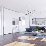
4. Incorporating Accent Colors Strategically
Minimalist design often emphasizes neutral palettes, but that doesn’t mean color has no place in a modern minimalist space. Thoughtfully incorporating accent colors can enhance the overall aesthetic, adding warmth and personality without overwhelming the clean and simple look.
Choosing the Right Accent Colors
Selecting the right accent colors is key to maintaining balance in a minimalist interior. Soft, muted tones like dusty rose, sage green, or deep navy can add depth while still blending harmoniously with a neutral base. For a bolder approach, a single vibrant hue—such as mustard yellow or burnt orange—can create a striking focal point without disrupting the minimalist essence.
Best Ways to Introduce Accent Colors
Accent colors should be used sparingly and strategically to maintain the minimalist aesthetic. Here are some effective ways to introduce them:
| Method | Description |
|---|---|
| Throw Pillows & Textiles | Add subtle pops of color through pillows, blankets, or rugs without making permanent changes. |
| Wall Art & Decor | A single piece of colorful artwork or decorative object can bring vibrancy while keeping walls mostly neutral. |
| Furniture Accents | A statement chair or ottoman in an accent color can serve as a focal point within a minimalist space. |
| Natural Elements | Plants and flowers introduce organic hues that complement the simplicity of minimalist interiors. |
| Lighting Fixtures | Lamps or pendant lights with colored shades can subtly enhance the atmosphere without overpowering the room. |
Maintaining Balance with Neutral Tones
The key to using accent colors effectively in modern minimalism is moderation. Too many bold elements can disrupt the calm and cohesive feel of the space. A good rule of thumb is to use accent colors in 10-20% of the room’s decor while keeping 80-90% of the space grounded in neutrals like white, beige, gray, or soft earth tones.
Tips for Achieving Harmony:
- Stick to one or two accent colors to avoid visual clutter.
- Use color repetition throughout different elements (e.g., matching throw pillows and artwork).
- Opt for natural materials like wood and stone to complement your chosen hues.
- Ensure lighting enhances your accent colors rather than dulling them out.
The Impact of Accent Colors on Mood
Beyond aesthetics, accent colors also influence mood and ambiance. Warmer tones like terracotta or deep red create a cozy atmosphere, while cooler shades like teal or forest green evoke relaxation and tranquility. Choosing colors that align with the intended mood of each space ensures both visual appeal and emotional comfort.
By thoughtfully incorporating accent colors into a modern minimalist interior, you can infuse personality and warmth without straying from the principles of simplicity and elegance. The right balance ensures that color enhances rather than overwhelms, creating a visually appealing yet serene living environment.
5. Balancing Texture and Color
In modern minimalist interior design, achieving a balance between texture and color is essential for creating a visually rich yet uncluttered space. While minimalism often emphasizes simplicity, the thoughtful use of different materials and finishes can add depth and warmth without overwhelming the design.
The Role of Materials in Minimalist Design
Materials play a crucial role in determining the overall aesthetic of a minimalist space. Combining smooth, matte finishes with textured surfaces can create contrast and visual interest while maintaining a clean look. Here are some commonly used materials and their impact:
| Material | Effect on Space |
|---|---|
| Wood (Natural or Stained) | Adds warmth and organic texture |
| Concrete | Provides an industrial, modern feel |
| Glass | Makes spaces feel open and airy |
| Linen or Cotton Fabrics | Adds softness and subtle texture |
| Metal Accents (Brass, Black Steel) | Adds contrast and sophistication |
Selecting Finishes to Enhance Minimalist Aesthetics
The choice of finishes significantly impacts how colors interact within a space. Matte finishes tend to absorb light, making colors appear softer, while glossy or polished surfaces reflect light, adding brightness and dimension. When using a neutral palette, incorporating varied finishes helps prevent the space from feeling flat or monotonous.
Tactile Contrast Through Layering
A well-balanced minimalist design doesn’t rely solely on color but also on layering different textures. For example, pairing smooth leather furniture with a woven wool rug or rough stone accents against sleek cabinetry creates an engaging interplay of materials that enhances the overall atmosphere.
The Influence of Natural Elements
Naturally occurring textures bring authenticity and warmth to minimalist interiors. Incorporating elements such as raw wood, stone, or even indoor plants introduces subtle variations that enrich the sensory experience without disrupting the minimalist philosophy.
Avoiding Overcomplication
The key to successfully balancing texture and color in minimalist interiors is restraint. Every material should serve a purpose while contributing to a cohesive design. By carefully selecting complementary elements, you can achieve a space that feels both serene and visually engaging.