1. Understanding the Psychology of Color
When selecting a color for your living room accent wall, its essential to understand how different hues influence emotions and behaviors. Colors have psychological effects that can shape the atmosphere of a space, making it feel warm and inviting or cool and calming. By knowing how various shades impact mood, you can create a more intentional and harmonious environment in your home.
How Colors Affect Emotions
Each color has unique psychological associations that can evoke specific feelings. Here’s a breakdown of common colors and their effects:
| Color | Psychological Effect | Best Used For |
|---|---|---|
| Red | Energizing, stimulating, increases appetite | Dining rooms, social spaces |
| Blue | Calming, promotes relaxation, enhances focus | Bedrooms, offices |
| Yellow | Cheerful, uplifting, encourages creativity | Kitchens, playrooms |
| Green | Refreshing, balanced, associated with nature | Living rooms, reading areas |
| Purple | Sophisticated, luxurious, inspires creativity | Boutique spaces, accent walls |
| Gray | Neutral, sophisticated, creates balance | Main living areas, modern interiors |
| Orange | Energizing, friendly, promotes enthusiasm | Lounges, workout rooms |
| Pink | Softer shades feel calming; brighter tones add energy | Nurseries, bedrooms |
The Role of Color in Interior Design
The psychology of color plays a crucial role in interior design by helping create specific moods within a space. For example:
- If you want a cozy and inviting atmosphere: Warmer shades like deep reds and earthy oranges can make the space feel welcoming.
- If you prefer a tranquil and relaxing vibe: Cool tones such as blues and greens help foster calmness and peace.
- If you want to make a bold statement: Vibrant hues like bright yellow or deep purple can add personality and energy to your accent wall.
- If youre aiming for a timeless look: Neutral shades like gray or beige provide versatility while still maintaining elegance.
Selecting the Right Hue for Your Living Room Accent Wall
Your choice of color should reflect both your personal style and the function of your living room. Consider these factors when selecting the perfect hue:
Your Living Room’s Purpose
If your living room is primarily used for entertaining guests, opt for warm tones that promote conversation. If it serves as a place to unwind after a long day, cooler tones may be more suitable.
The Amount of Natural Light
The way light interacts with color can dramatically affect its appearance. Rooms with abundant natural light may handle darker shades well, while dimly lit spaces benefit from lighter hues to keep them feeling open and airy.
Your Existing Decor and Furniture
A well-chosen accent wall should complement your existing decor rather than clash with it. Take into account the colors of your furniture, artwork, and textiles when making your decision.
The psychology of color is an invaluable tool when designing your living room. By understanding how different hues influence emotions and behaviors, you can choose an accent wall color that enhances both the aesthetic appeal and functionality of your space.
2. Selecting the Right Hue for Your Space
Choosing the right color for your living room accent wall involves more than just picking your favorite shade. Several factors come into play, including lighting, room size, and existing décor. Lets break down these key considerations to help you make the best choice.
Lighting: How It Affects Color Perception
Lighting plays a crucial role in how a color appears in your space. The same hue can look completely different under various lighting conditions.
| Lighting Type | Effect on Colors |
|---|---|
| Natural Light | Colors appear more true-to-tone but may shift throughout the day. |
| Warm Artificial Light (Incandescent/Bulbs) | Adds a yellowish glow, making warm tones richer and cool tones slightly muted. |
| Cool Artificial Light (LED/Fluorescent) | Enhances cool tones while making warm colors appear washed out. |
Room Size: Creating the Right Atmosphere
The size of your living room also influences which colors will work best for an accent wall.
- Small Rooms: Lighter shades can help create a sense of openness, while darker hues may make the space feel cozier but potentially smaller.
- Large Rooms: Darker or bolder colors can add warmth and make the space feel more inviting without overwhelming it.
Existing Décor: Complementing Your Style
Your accent wall should blend seamlessly with your furniture, flooring, and decorative elements. Consider the dominant tones in your current décor:
- Neutral Décor: Almost any color can work, but soft pastels or deep jewel tones often enhance the overall aesthetic.
- Bold or Patterned Furniture: Opt for a complementary or subdued hue to balance the visual impact.
- Wood Tones: Warm shades like terracotta or mustard pair well with darker woods, while cooler blues or grays contrast nicely with lighter wood finishes.
Final Tip: Test Before You Commit
A great way to ensure you’re choosing the right color is to test paint samples on your wall. Observe how they look at different times of the day and under different lighting conditions before making a final decision.
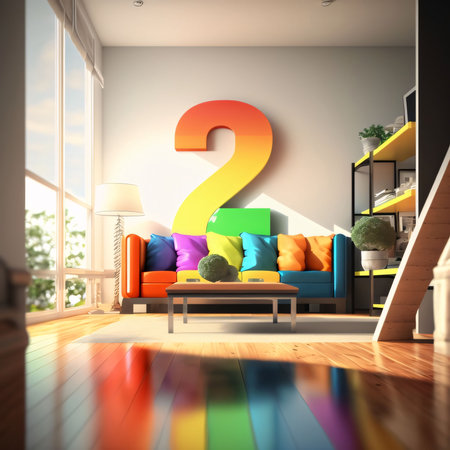
![]()
3. Popular Accent Wall Colors and Their Effects
Choosing the right color for your living room accent wall can significantly impact the overall mood and atmosphere of the space. Different colors evoke different emotions and can influence how you feel in a room. Below, we explore some of the most popular accent wall colors and how they can transform your living area.
Blue: Calm and Serene
Blue is often associated with tranquility and relaxation. It’s a great choice for those who want to create a peaceful environment in their living room. Lighter shades of blue can make a space feel airy and open, while darker blues add depth and sophistication.
Best Uses:
- Ideal for creating a calming retreat
- Pairs well with neutral tones like white, gray, or beige
- Works beautifully in modern or coastal-style interiors
Green: Refreshing and Natural
Green brings a sense of balance and harmony into a space. It is reminiscent of nature, making it an excellent choice for those who want to create a fresh and inviting atmosphere. Softer greens can promote relaxation, while deeper greens add richness and warmth.
Best Uses:
- Great for biophilic design enthusiasts
- Pairs well with wood tones and earthy elements
- Suits both traditional and contemporary decor styles
Red: Bold and Energizing
If you want to make a statement, red is the way to go. This powerful color stimulates energy, passion, and excitement. However, because red is so intense, it’s best used in moderation or as an accent against more neutral surroundings.
Best Uses:
- Adds warmth to a social gathering space
- Pairs well with neutral furniture to balance its intensity
- Ideal for eclectic or modern interiors
Neutral Tones: Timeless and Versatile
If you prefer a more subtle approach, neutral colors like beige, gray, or taupe are perfect choices. They provide flexibility in decor while maintaining an elegant and sophisticated look. Neutrals allow other design elements to shine without overwhelming the space.
Best Uses:
- A great backdrop for colorful furniture or artwork
- Easily adaptable to changing decor trends
- Suits minimalist, Scandinavian, or transitional styles
Comparison of Popular Accent Wall Colors
| Color | Mood/Effect | Best Paired With |
|---|---|---|
| Blue | Calm, serene, relaxing | White, gray, beige |
| Green | Refreshing, natural, balanced | Wood tones, earthy elements |
| Red | Energizing, bold, passionate | Neutral furniture & accents |
| Neutral Tones | Sophisticated, timeless, versatile | Bolder decor pieces & textures |
The color you choose for your accent wall should reflect your personality and the mood you want to create in your living room. Whether you prefer the calming effects of blue or the bold energy of red, selecting the right hue can enhance your space in meaningful ways.
4. Combining Colors for a Cohesive Look
Choosing the right color for your living room accent wall is just the first step. To create a truly harmonious space, you’ll want to pair it with complementary colors, furniture, and decorative elements that enhance the overall design. Here’s how you can achieve a balanced and stylish look.
Selecting Complementary Colors
The key to a cohesive design is understanding how different colors work together. Complementary colors are those that sit opposite each other on the color wheel and naturally enhance one another. For example:
| Accent Wall Color | Complementary Colors |
|---|---|
| Deep Blue | Warm oranges, soft beige, or crisp whites |
| Earthy Green | Tans, warm browns, and muted reds |
| Burgundy Red | Pale golds, creams, and deep charcoal grays |
| Misty Gray | Pale blues, blush pinks, and dark navy tones |
| Warm Beige | Rich chocolates, soft whites, and muted greens |
Coordinating Furniture and Decor
Your furniture and décor should complement the accent wall without overwhelming it. Here are some tips for balancing your space:
- Sofas & Chairs: Choose neutral or subtly contrasting upholstery to keep the space inviting.
- Curtains & Rugs: Use patterns that incorporate both your accent wall color and complementary hues.
- Pillows & Throws: Add pops of color through textiles that tie into the overall palette.
- Wall Art & Accessories: Select artwork or decorative pieces that echo your color scheme without clashing.
- Lamps & Lighting: Warm lighting enhances rich colors, while cooler lighting works well with modern palettes.
Avoiding Common Mistakes
A cohesive design is all about balance. Here are a few things to watch out for:
- Avoid Overloading with Color: Too many bold shades can make the room feel chaotic. Stick to a primary accent color with supporting neutrals.
- Mismatched Undertones: Warm and cool tones can clash if not carefully considered. Ensure all elements share a common undertone.
- Lack of Contrast: While harmony is important, too much similarity can make a room feel flat. Introduce contrast through textures and materials.
The Power of Texture and Materials
A well-designed space isn’t just about color—it’s also about texture. Mixing different materials can add depth and interest to your living room.
| Main Material | Ideal Pairings |
|---|---|
| Smooth Painted Walls | Linen curtains, plush rugs, leather furniture |
| Bare Brick Accent Wall | Metallic fixtures, soft fabric sofas, wooden coffee tables |
| Navy Blue Accent Wall | Lighter wood tones, brass accents, textured cushions |
| Moss Green Accent Wall | Ceramic vases, woven baskets, soft wool throws |
| Pale Gray Accent Wall | Darker furniture pieces, glass decor elements, natural fibers like jute or rattan |
Create a Balanced Living Space
The key to combining colors successfully is finding harmony between your accent wall and surrounding elements. By thoughtfully selecting complementary hues, coordinating furniture choices, and adding varied textures, you can craft a cohesive living room design that feels intentional and inviting.
5. Final Tips for a Successful Accent Wall
Choosing the right color for your living room accent wall is just the first step. To achieve a professional and polished look, you need to pay attention to paint finishes, application techniques, and common pitfalls to avoid. Here are some expert tips to help you get the best results.
Pick the Right Paint Finish
The finish you choose can significantly impact the final look of your accent wall. Some finishes reflect more light, while others provide a more muted effect. Heres a quick guide:
| Finish Type | Characteristics | Best For |
|---|---|---|
| Matte | No shine, hides imperfections well | Creating a soft, elegant feel |
| Eggshell | Slight sheen, easy to clean | A balanced look with durability |
| Satin | More sheen, reflects light subtly | Adding depth and warmth |
| Glossy | High shine, very reflective | A bold statement with a modern touch |
Proper Application Techniques
A flawless accent wall requires careful preparation and proper painting techniques. Follow these steps for a smooth finish:
- Prep the Wall: Clean the surface thoroughly and fill any holes or cracks.
- Tape Off Edges: Use painter’s tape to protect adjacent walls and trim.
- Apply Primer: A good primer ensures even color application and enhances durability.
- Use High-Quality Brushes or Rollers: Invest in quality tools for a streak-free finish.
- Paint in Thin Layers: Apply multiple thin coats instead of one thick coat for better coverage.
- Let It Dry Completely: Allow sufficient drying time between coats to avoid streaks or uneven texture.
Avoid Common Mistakes
Mistakes can ruin an otherwise well-planned accent wall. Watch out for these common errors:
- Selecting the Wrong Color: Always test paint samples on your wall before committing.
- Ignoring Lighting Effects: Consider how natural and artificial light will affect the color throughout the day.
- Poor Surface Preparation: Skipping cleaning or priming can lead to peeling or uneven coverage.
- Using Low-Quality Paint: Cheaper paints may require more coats and won’t last as long.
- Nepglecting Edge Work: Ensure crisp edges by using painter’s tape and removing it carefully after drying.
Final Touches for a Cohesive Look
Your accent wall should blend seamlessly with the rest of your living room decor. Here are some final touches to enhance its impact:
- Add Complementary Decor: Incorporate artwork, mirrors, or shelves that match your color choice.
- Select Matching Furniture: Choose furniture pieces that complement rather than clash with the wall color.
- Use Proper Lighting: Highlight your accent wall with strategically placed lamps or sconces.
A well-executed accent wall can transform your living space, making it more inviting and visually appealing. By choosing the right paint finish, applying it correctly, and avoiding common mistakes, youll achieve a stunning result that enhances your home’s atmosphere.