1. Understanding Color Psychology in Interior Design
Color plays a crucial role in shaping our emotions, behaviors, and overall perception of space. Whether bold or neutral, the colors used in interior design can significantly impact how a room feels and functions.
The Psychological Effects of Colors
Different colors evoke different emotions and reactions. While some hues energize and stimulate, others create a calming and soothing atmosphere. Understanding these effects helps in designing spaces that align with desired moods and functionalities.
| Color Category | Common Colors | Psychological Impact |
|---|---|---|
| Bold Colors | Red, Yellow, Orange, Bright Blue | Energizing, Stimulating, Attention-Grabbing |
| Neutral Colors | White, Beige, Gray, Soft Browns | Calming, Grounding, Versatile |
| Cool Tones | Blue, Green, Purple | Relaxing, Refreshing, Promotes Focus |
| Warm Tones | Red, Orange, Yellow | Energizing, Inviting, Creates Warmth |
The Influence of Color on Space Perception
Apart from affecting emotions, colors also influence how we perceive the size and depth of a space. Lighter colors tend to make a room feel more spacious and airy, while darker tones can create a sense of intimacy and coziness.
Lighter vs. Darker Shades in Interior Spaces
- Lighter Colors: Reflect more light, making rooms feel larger and more open.
- Darker Colors: Absorb light, creating a sense of depth and adding drama to a space.
- Bolder Hues: Can be used as accents to add personality without overwhelming the space.
- Softer Neutrals: Provide flexibility and balance for various design styles.
The Balance Between Bold and Neutral Colors
A well-designed space often incorporates both bold and neutral tones to create contrast and harmony. While bold colors add vibrancy and character, neutral shades provide a foundation that keeps the design cohesive and timeless.
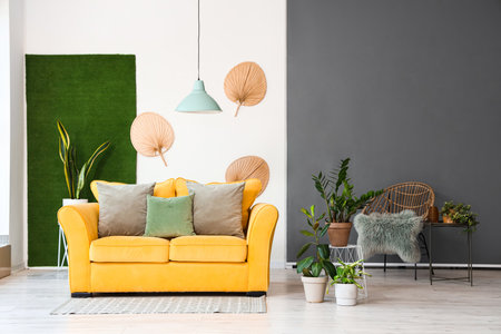
2. The Power of Bold Colors: Energy, Expression, and Personality
Bold colors have a unique way of transforming a space by evoking strong emotions, creating focal points, and adding vibrancy. Whether used in large areas or as accents, these colors can shape the ambiance and character of a room in powerful ways.
How Bold Colors Evoke Strong Emotions
Colors like red, orange, and bright yellow are known for their ability to stimulate energy and excitement. They can make a space feel lively and dynamic, perfect for areas where social interaction or creativity is encouraged. On the other hand, deep blues and rich purples can evoke feelings of sophistication and depth, adding drama to a room.
Common Bold Colors and Their Emotional Impact
| Color | Emotion/Effect | Best Used In |
|---|---|---|
| Red | Passion, energy, warmth | Dining rooms, living spaces |
| Orange | Courage, enthusiasm, warmth | Kitchens, playrooms |
| Yellow | Happiness, positivity, brightness | Kitchens, entryways |
| Blue | Calmness (light shades), intensity (dark shades) | Bedrooms, offices |
| Purple | Luxe feeling, creativity, mystery | Boutique spaces, bedrooms |
The Role of Bold Colors in Creating Focal Points
A well-placed bold color can act as an instant focal point in any room. Whether it’s an accent wall in a deep emerald green or a statement furniture piece in fiery red, these colors draw attention and help define the space. This technique works especially well in minimalist interiors where pops of bold color stand out against neutral backdrops.
Tips for Using Bold Colors as Focal Points:
- Select One Standout Element: Use bold colors on a single wall, furniture piece, or artwork to create impact without overwhelming the space.
- Create Contrast: Pair bold hues with neutral tones like white or beige to make them pop even more.
- Add Texture: Consider using textured wallpapers or painted patterns to enhance visual interest.
- Mood Matching: Choose bold colors that align with the mood you want to create—warm reds for an energetic feel or deep blues for a calming effect.
The Vibrancy Factor: How Bold Colors Bring Life to Spaces
Bolder shades instantly add vibrancy by making spaces feel more dynamic and engaging. This is especially useful in areas meant for entertainment or creativity. Bright hues can also be used strategically to energize dull environments.
The Best Ways to Introduce Vibrancy into a Room:
- Pillows & Accessories: Small doses of bold colors through throw pillows or rugs can liven up a neutral space without commitment.
- Painted Ceilings: A colored ceiling adds unexpected excitement without taking over the entire room.
- Mixed Patterns: Combining bold-colored patterns with neutrals creates a balanced yet lively atmosphere.
- Naturally Bold Elements: Plants with vibrant flowers or brightly colored art pieces can serve as natural sources of bold hues.
The Balance Between Bold Colors and Space Perception
The use of bold colors isn’t just about personality—it also affects how we perceive space. Darker bold shades can make large rooms feel cozier, while brighter tones can make small spaces appear more open. Understanding this balance helps in making informed design choices that enhance both aesthetics and functionality.
A Quick Guide to Using Bold Colors Based on Room Size:
| If Your Space Is… | You Should… | Avoid… |
|---|---|---|
| A Small Room | Add bright accents to make it feel larger. | Darker bold shades on all walls (can feel enclosed). |
| A Large Room | Darker bold tones to create intimacy. | An excess of bright neons (can feel chaotic). |
| An Open Concept Space | Create distinct zones using different bold hues. | Mismatched combinations that clash visually. |
The power of bold colors lies in their ability to infuse life into any space while shaping its emotional tone. Whether youre looking to energize a room or establish a dramatic focal point, the right use of bold colors can make all the difference.
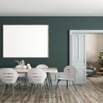
3. The Subtle Influence of Neutral Colors: Balance, Sophistication, and Calm
Neutral colors play a vital role in interior design by creating a serene, timeless aesthetic that enhances spatial perception. Unlike bold colors that evoke strong emotions, neutral shades provide a subtle yet powerful influence on mood and ambiance. Whether used as a primary palette or as a backdrop for accent hues, neutrals contribute to an environment that feels balanced, sophisticated, and calming.
How Neutral Colors Affect Mood
Neutral tones have the ability to create a soothing atmosphere, making them ideal for spaces where relaxation and comfort are priorities. These colors evoke feelings of stability and sophistication while allowing other design elements to take center stage.
| Neutral Color | Psychological Effect | Best Used In |
|---|---|---|
| White | Promotes cleanliness, simplicity, and openness | Kitchens, bathrooms, modern living spaces |
| Beige | Adds warmth and comfort while maintaining neutrality | Living rooms, bedrooms, transitional spaces |
| Gray | Elicits calmness and sophistication with a modern touch | Offices, bedrooms, contemporary interiors |
| Taupe | A mix of gray and brown that provides depth and warmth | Dens, cozy seating areas, elegant dining rooms |
| Cream | Softer than white, offering warmth without starkness | Nurseries, traditional homes, inviting entryways |
The Versatility of Neutral Colors in Design
A key advantage of neutral colors is their versatility. They serve as an excellent foundation for layering different textures and materials while seamlessly adapting to various design styles. Whether paired with vibrant accents or kept minimalistic for a monochromatic look, neutrals allow flexibility in decor.
The Role of Neutrals in Spatial Perception
Lighter neutral shades like white, cream, or soft grays can make a space feel larger by reflecting light. This effect is particularly useful in small rooms or areas with limited natural light. On the other hand, darker neutrals like charcoal or deep taupe add depth and coziness to large spaces without overwhelming the senses.
Tips for Incorporating Neutrals Effectively:
- Add texture: Use wood, stone, fabric, or metal elements to prevent a flat appearance.
- Create contrast: Mix different neutral shades for depth and visual interest.
- Use accent pieces: Introduce pops of color through furniture, artwork, or accessories.
- Select the right undertones: Warm neutrals create inviting spaces, while cool neutrals bring a crisp modern feel.
- Liven up with greenery: Houseplants enhance neutral palettes by adding freshness and vibrancy.
The power of neutral colors lies in their ability to balance aesthetics while maintaining adaptability across different styles. By understanding how they influence mood and space perception, you can create interiors that feel both timeless and welcoming.
4. Combining Bold and Neutral Tones: Achieving Harmony
Creating a well-balanced interior that incorporates both bold and neutral colors requires thoughtful planning. When done correctly, this combination can bring depth, contrast, and personality to a space while maintaining a sense of harmony and visual appeal. Here’s how you can effectively blend these tones for a cohesive look.
Understanding the Role of Bold and Neutral Colors
Before mixing bold and neutral hues, its important to understand their impact:
| Color Type | Effect on Space | Best Used For |
|---|---|---|
| Bold Colors | Add energy, create focal points, and evoke strong emotions. | Accent walls, statement furniture, artwork. |
| Neutral Colors | Provide balance, create a calming atmosphere, and enhance versatility. | Walls, flooring, large furniture pieces. |
Tips for Blending Bold and Neutral Tones
1. Use the 80/20 Rule
A great way to achieve balance is by following the 80/20 rule—use neutral shades for about 80% of the space and introduce bold colors in the remaining 20%. This ensures that vibrant hues don’t overwhelm the room while still making an impact.
2. Select a Dominant Neutral Base
Start with a neutral foundation such as white, beige, gray, or taupe for walls and large furniture pieces. This provides a calm backdrop that allows bold elements to stand out without competing for attention.
3. Introduce Bold Accents Strategically
Add bold colors through smaller design elements like throw pillows, rugs, curtains, or decorative accessories. This makes it easier to update the look over time without committing to dramatic changes.
4. Balance with Texture and Patterns
If you’re using strong colors in furniture or walls, consider incorporating different textures or patterns in neutral tones to soften the contrast. Textured fabrics, wood finishes, or subtle geometric prints can help tie everything together.
5. Experiment with Lighting
The way light interacts with colors can significantly affect how they appear in a room. Natural light enhances neutral tones, while artificial lighting can intensify bold colors. Test different lighting setups to see how your color choices look throughout the day.
6. Create Flow Between Rooms
If you’re decorating multiple rooms with bold and neutral combinations, ensure there’s a common color thread running through them. This could be a repeated accent color or similar undertones that maintain consistency across spaces.
Examples of Well-Balanced Color Combinations
| Neutral Base Color | Bold Accent Color | Suits Best For |
|---|---|---|
| Soft Gray | Navy Blue or Mustard Yellow | Modern and sophisticated interiors. |
| Cream or Beige | Deep Green or Terracotta Red | Warm and inviting spaces. |
| Crisp White | Teal or Burnt Orange | Vibrant yet balanced designs. |
| Taupe or Warm Brown | Burgundy or Emerald Green | Classic and timeless looks. |
Final Thoughts on Creating Balance with Colors
The key to blending bold and neutral tones successfully is intentionality. By carefully selecting where and how you introduce bold colors into a neutral space, you can create an environment that feels both dynamic and harmonious. Whether through accent pieces, textures, or strategic lighting, finding the right balance will ensure your interior remains inviting and visually appealing.
5. Practical Applications: Choosing the Right Palette for Different Spaces
Selecting the right color palette for a room is more than just an aesthetic decision—it can influence mood, energy levels, and even productivity. To create a well-balanced space, its essential to consider the function of the room, lighting conditions, and personal preferences.
Understanding Room Function
Different colors evoke different emotions, making it crucial to align your color choices with the purpose of each space.
| Room Type | Recommended Color Scheme | Effect on Mood |
|---|---|---|
| Living Room | Warm neutrals, soft blues, earthy greens | Creates a welcoming and relaxing atmosphere |
| Bedroom | Pale blues, muted greens, warm taupes | Encourages rest and tranquility |
| Kitchen | Crisp whites, soft yellows, light grays | Energizes while maintaining cleanliness and brightness |
| Home Office | Cools blues, soft greens, subtle grays | Aids concentration and productivity without being overwhelming |
| Dining Room | Burgundy reds, deep greens, warm neutrals | Promotes appetite and conversation |
| Bathroom | Aqua blues, crisp whites, pastel tones | Elicits a sense of freshness and relaxation |
The Impact of Lighting on Color Perception
The way a color appears in a space depends heavily on lighting. Natural light enhances true color tones throughout the day, while artificial lighting can alter the perception of hues.
Key Considerations:
- Northern-facing rooms: Tend to receive cooler natural light; warmer colors help balance the coolness.
- Southern-facing rooms: Get abundant sunlight; neutral tones prevent overwhelming brightness.
- Easterly-facing rooms: Experience bright morning light; soft pastels work well.
- Westerly-facing rooms: Receive warm evening light; deeper shades can create cozy ambiances.
- Lamp and LED lighting: Warm white lights enhance coziness, while cool white lights promote alertness.
Tailoring Colors to Personal Preferences
Your individual taste plays a significant role in color selection. While psychology offers general guidelines, its essential to choose colors that make you feel comfortable and happy in your space.
A Few Tips for Personalizing Your Palette:
- If you love bold colors but fear overwhelming a space, use them as accent walls or décor elements.
- If you prefer neutral tones but want variety, mix different textures and shades within the same color family.
- If youre unsure about commitment to strong colors, start with temporary solutions like artwork or accessories.
- If you want flexibility over time, opt for neutral base colors and introduce seasonal accents through textiles or decor pieces.
The Power of Balance in Design
The key to an effective color scheme is balance. Bold colors should be used strategically to highlight areas without overpowering them. Neutral colors provide versatility and timeless appeal. By carefully considering room function, lighting conditions, and personal style, you can craft spaces that are both visually appealing and emotionally supportive.