1. Understanding Bold Accent Colors
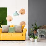
Bold accent colors play a crucial role in modern interior design. They bring energy, depth, and personality to a space, making it more visually engaging and dynamic. Whether used in furniture, walls, or decorative elements, these colors can create striking contrasts and highlight key areas within a room.
What Are Bold Accent Colors?
Bold accent colors are vibrant, eye-catching shades that stand out against neutral backgrounds. These colors include deep blues, rich reds, bright yellows, and emerald greens. When incorporated strategically, they can transform a space by adding character and visual interest.
Why Use Bold Accent Colors?
Using bold accent colors in modern interiors has several benefits:
- Adds Personality: A pop of color can reflect personal style and make a space feel unique.
- Creates Focal Points: Bright colors draw attention to specific areas, such as an accent wall or a statement piece of furniture.
- Enhances Mood: Different colors evoke different emotions—warm tones create coziness, while cool tones promote relaxation.
- Provides Contrast: Against neutral palettes, bold colors create depth and dimension.
Popular Bold Accent Colors and Their Effects
| Color | Effect on Space |
|---|---|
| Deep Blue | Creates a sense of calm and sophistication. |
| Vibrant Red | Adds energy and excitement to the room. |
| Bright Yellow | Brings warmth and positivity to the space. |
| Emerald Green | Elicits feelings of freshness and tranquility. |
How to Incorporate Bold Accent Colors
The key to using bold accent colors effectively is balance. Here are some simple ways to introduce them into your space:
Accent Walls
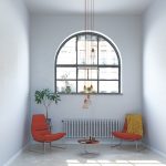
Painting one wall in a bold shade creates a strong focal point without overwhelming the entire room.
Furniture & Decor
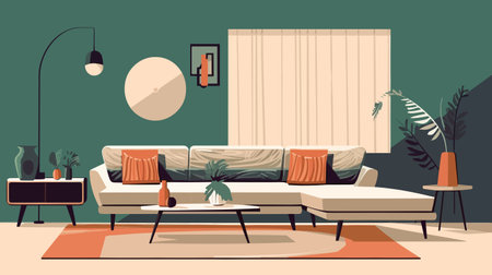
A brightly colored sofa, rug, or artwork can add vibrancy while keeping the rest of the space neutral.
Accessories & Textiles
Pillows, curtains, and throws in bold hues are an easy way to experiment with color without long-term commitment.
Final Tip
If youre hesitant about using bold colors, start small with accessories or a single statement piece before committing to larger changes.
2. Choosing the Right Bold Accent Colors
Adding bold accent colors to your modern interior can bring energy, personality, and depth to your space. However, selecting the right colors requires a balance between creativity and harmony. The key is to choose shades that enhance your overall design aesthetic without overwhelming the space.
Understanding Color Psychology
Before selecting bold accent colors, its helpful to understand their psychological effects. Different colors evoke different emotions and can set the tone for a room.
| Color | Mood & Effect | Best Used In |
|---|---|---|
| Red | Energizing, passionate, stimulating | Living rooms, dining areas |
| Blue | Calming, serene, productive | Bedrooms, offices |
| Yellow | Cheerful, warm, inviting | Kitchens, entryways |
| Green | Refreshing, balanced, natural | Bathrooms, living spaces |
| Purple | Dramatic, luxurious, creative | Accent walls, artistic spaces |
| Orange | Lively, energetic, social | Kitchens, playrooms |
Selecting Complementary Colors
The best way to incorporate bold accent colors is by ensuring they complement your existing color palette. Here are some tips:
- Create Contrast: Pair bold hues with neutral tones like white, gray, or beige to maintain balance.
- Avoid Overloading: Stick to one or two bold accent colors per room to prevent visual clutter.
- Use the 60-30-10 Rule: This classic design principle suggests using 60% as a dominant color (walls), 30% as a secondary color (furniture), and 10% as an accent color (decor items).
- Tie It Together: Use patterns or textures that incorporate both neutral and bold tones to create cohesion.
The Role of Lighting in Bold Colors
The way a bold color appears in your space depends heavily on lighting. Natural light enhances vibrancy, while artificial lighting can alter shades. Always test paint samples in different lighting conditions before committing.
Avoiding Common Mistakes
- Selecting Too Many Bold Colors: Overuse of bright hues can make a room feel chaotic instead of stylish.
- Ineffective Placement: Using bold colors in small or awkward spaces may make them feel more cramped.
- Ignoring Undertones: Warm and cool undertones should align with the rest of your decor for a cohesive look.
- Navigating Trends Carefully: While trendy colors can be exciting, ensure they fit your long-term vision before committing.
The Takeaway
Selecting the right bold accent colors is about striking the perfect balance between expression and harmony. By understanding color psychology, utilizing complementary shades wisely, and considering lighting effects, you can create a visually stunning yet cohesive modern interior.
3. Applying Bold Accents Strategically
Incorporating bold accent colors into modern interiors requires a thoughtful approach to ensure balance and harmony. Whether you’re adding a vibrant feature wall, bold furniture pieces, or striking accessories, strategic placement is key to creating a visually engaging space without overwhelming the design.
Feature Walls: A Statement That Stands Out
A feature wall is one of the most effective ways to introduce bold accent colors into your home. Choosing the right wall to highlight can define the room’s focal point while maintaining cohesion with the surrounding decor. Consider these tips when selecting and designing a feature wall:
| Tip | Description |
|---|---|
| Select the Right Wall | Choose a wall that naturally draws attention, such as behind a bed, sofa, or dining table. |
| Coordinate with Existing Colors | Ensure the bold color complements the rest of the room’s palette for a cohesive look. |
| Add Texture or Patterns | Use wallpaper, paneling, or textured paint to add depth and interest. |
Bold Furniture: Functional and Stylish
If painting a wall feels too permanent, bold-colored furniture is another excellent way to make an impact. A vibrant sofa, accent chair, or statement dining table can serve as a focal point in your space. To prevent clashing, pair bold furniture with neutral backgrounds and subtle decor elements.
Accessories: Small Changes with Big Impact
If you prefer a more flexible approach, bold accent colors can be introduced through accessories like throw pillows, rugs, artwork, and decorative objects. This allows for easy updates when trends change or when you want to refresh your space without major renovations.
The Key to Balance
The secret to successfully applying bold accents is moderation. Too much color can overwhelm a space, while carefully placed accents enhance its overall aesthetic. By using bold hues strategically—whether through walls, furniture, or accessories—you can create a modern interior that feels dynamic yet harmonious.
4. Balancing Bold Colors with Neutrals
When incorporating bold accent colors into modern interiors, its essential to balance them with neutral tones. This approach helps prevent the space from feeling overwhelming while ensuring a cohesive and visually appealing design.
Why Neutral Tones Matter
Neutral tones act as a foundation that allows bold colors to stand out without overpowering the space. They create harmony and provide visual relief, making the room feel inviting rather than chaotic.
Best Neutral Colors to Pair with Bold Accents
The right neutral shade can enhance the vibrancy of bold colors while maintaining balance. Here are some great neutral options:
| Neutral Color | Effect on Bold Accents |
|---|---|
| White | Makes bold colors appear crisp and vibrant |
| Gray | Adds sophistication and softens bright hues |
| Beige | Creates warmth and blends well with earthy tones |
| Black | Adds drama and contrast for a bold statement |
| Navy Blue | A rich alternative to black that enhances depth |
Tips for Achieving Balance
The 60-30-10 Rule
A popular interior design principle, the 60-30-10 rule suggests using:
- 60%: Dominant neutral color (walls, large furniture)
- 30%: Secondary complementary color (curtains, rugs, accent furniture)
- 10%: Bold accent color (pillows, artwork, decorative pieces)
Selecting the Right Placement for Bold Colors
Avoid oversaturating a space with bold hues by strategically placing them in key areas such as throw pillows, statement walls, or decorative accessories. This method keeps the design balanced without overwhelming the room.
The Power of Texture and Material Choices
If using multiple bold colors, introduce different textures like matte, glossy, or woven fabrics to create depth without making the space feel too intense.
A well-balanced combination of neutrals and bold accents ensures a modern interior that feels both dynamic and harmonious. By thoughtfully integrating these elements, you can achieve an inviting and stylish home.
5. The Psychological Effects of Bold Colors
Bold accent colors do more than just add visual interest—they have a significant psychological impact on mood, ambiance, and energy levels in a space. Whether you want to create a calming retreat or an energizing environment, understanding how bold colors influence emotions can help you make intentional design choices.
How Bold Colors Influence Mood
Different colors evoke different emotional responses. Bright, warm tones like red and orange can stimulate excitement and passion, while cooler shades like deep blue or emerald green bring a sense of calm and tranquility.
| Color | Psychological Effect | Best Use in Interiors |
|---|---|---|
| Red | Energizing, passionate, stimulating | Dining rooms, social spaces, accent walls |
| Orange | Warm, inviting, creative | Kitchens, home offices, play areas |
| Yellow | Cheerful, uplifting, optimistic | Kitchens, bathrooms, entryways |
| Blue | Calming, serene, trustworthy | Bedrooms, living rooms, offices |
| Purple | Luxe, mysterious, creative | Boutique spaces, bedrooms, statement areas |
| Green | Refreshing, balanced, natural | Kitchens, wellness spaces, relaxation areas |
| Black/Dark Tones | Dramatic, elegant, grounding | Aesthetic contrast in modern interiors |
The Role of Bold Colors in Ambiance and Energy Levels
The right color choices can completely transform the ambiance of a room. A deep navy wall can create a cozy and sophisticated atmosphere in a bedroom, while bright yellow accents in a kitchen can make the space feel lively and inviting.
Energizing vs. Calming Spaces: Choosing the Right Balance
If youre designing an office or workout space where motivation is key, bold reds and oranges can help increase energy levels. On the other hand, if your goal is to create a relaxing retreat in a bedroom or spa-like bathroom, softer yet bold hues like emerald green or muted purples can provide the perfect balance between vibrancy and tranquility.
Tips for Using Bold Colors Effectively:
- Create contrast: Pair bold accent colors with neutral tones to prevent overwhelming the space.
- Select focal points: Use bold colors strategically on furniture pieces, artwork, or feature walls.
- Mood-enhancing decor: Incorporate colorful accessories such as throw pillows or rugs to subtly influence ambiance without committing to permanent changes.
- Naturally integrate bold hues: Bring in plants or materials that complement bold tones for a cohesive look.
- Avoid overstimulation: In high-energy areas like offices or kitchens, balance bright tones with grounding elements like wood or matte finishes.
The power of bold accent colors lies not only in their ability to enhance aesthetics but also in their profound psychological effects. By using color psychology as a guide in interior design decisions, you can craft spaces that evoke the exact emotions and energy levels needed for each rooms purpose.