1. Understanding Bold and Neutral Colors
When it comes to interior design, color plays a crucial role in shaping the atmosphere of a space. Two primary approaches dominate the conversation: bold colors and neutral colors. Each has its own distinct impact on a rooms ambiance, influencing emotions, perceptions, and overall aesthetics.
What Are Bold Colors?
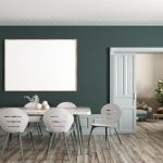
Bold colors are vibrant, striking, and full of personality. They include shades like deep blues, fiery reds, rich greens, and bright yellows. These hues demand attention and create a statement within a space.
Psychological Effects of Bold Colors
Bold colors tend to evoke strong emotions and energy. Depending on the shade, they can inspire excitement, creativity, or even intensity. For example:
| Color | Common Psychological Effect |
|---|---|
| Red | Stimulating, passionate, energetic |
| Blue | Calming but also bold in darker shades |
| Yellow | Cheerful, warm, attention-grabbing |
| Green | Refreshing, balanced, associated with nature |
What Are Neutral Colors?
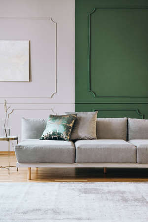
Neutral colors consist of understated tones such as white, beige, gray, taupe, and soft browns. These shades provide a timeless backdrop that allows for flexibility in decor choices.
Psychological Effects of Neutral Colors
Neutral colors create a sense of calmness and sophistication. They are often used to establish balance and enhance spaciousness within a room. Here’s how some popular neutrals influence mood:
| Color | Common Psychological Effect |
|---|---|
| White | Pure, clean, creates openness |
| Beige | Warmth, subtle elegance, inviting |
| Gray | Sophisticated, modern, versatile |
| Browns/Taupe | Earthy, grounding, cozy |
The Influence of Color on Ambiance
The choice between bold and neutral colors significantly affects how a space feels. Bold colors add drama and personality but may require careful balancing to avoid overwhelming the senses. On the other hand, neutral tones offer versatility and tranquility but can sometimes feel too subdued if not complemented with texture or accent pieces.
Key Differences Between Bold and Neutral Colors in Interior Design
| Aspect | Bold Colors | Neutral Colors |
|---|---|---|
| Mood & Emotion | Energizing, expressive, dramatic | Calming, balanced, sophisticated |
| Aesthetic Impact | Makes a strong statement; adds vibrancy to spaces | Tends to be timeless and adaptable to different styles |
| Main Use Cases | Accent walls, statement furniture pieces, art elements | Main wall colors, base furniture tones, backgrounds for layering décor |
| Design Flexibility | Bolder choices may limit future decor changes due to their strong presence | Easier to adapt over time with changing trends and preferences |
Final Thoughts on Understanding Color Choices in Interior Design
The battle between bold and neutral colors is not about choosing one over the other but understanding how each contributes uniquely to interior design. Whether you prefer the vibrancy of bold tones or the serenity of neutrals depends on your style preference and the atmosphere you want to create in your home.
2. The Power of Bold Colors in Interior Design
Bold colors have the power to transform a space, creating an atmosphere that is energetic, dramatic, and full of personality. Unlike neutral tones, which provide a calming and versatile backdrop, bold colors demand attention and make a strong statement. Whether used on walls, furniture, or décor accents, they can instantly change the mood of a room.
Why Choose Bold Colors?
Incorporating bold colors into interior design can bring several benefits. They add depth, create focal points, and reflect personal style in a way that neutrals often cannot. Heres a quick comparison of how bold and neutral colors impact a space:
| Aspect | Bold Colors | Neutral Colors |
|---|---|---|
| Atmosphere | Energetic, lively, dramatic | Calm, balanced, timeless |
| Focal Points | Create strong visual interest | Allow other elements to stand out |
| Expression of Personality | Bolder self-expression and uniqueness | Subtle elegance and versatility |
| Risk Level | Can be overwhelming if overused | Safe and adaptable to any design style |
Best Practices for Using Bold Colors Effectively
1. Start Small with Accents
If youre hesitant about using bold colors, start by incorporating them through accessories like throw pillows, rugs, artwork, or lamps. This allows you to experiment without committing to large surfaces.
2. Use Bold Colors as Focal Points
A single bold-colored wall or a statement piece of furniture can serve as the focal point of a room. This keeps the design balanced while still making an impact.
3. Pair with Neutrals for Balance
To prevent overwhelming the space, mix bold hues with neutral tones like white, gray, or beige. This creates contrast and ensures that the bold color stands out without overpowering the room.
4. Consider Lighting Conditions
The way light interacts with color is crucial in interior design. Natural light can enhance bright hues, while artificial lighting may alter their appearance. Always test paint samples or fabric swatches under different lighting conditions before finalizing your choice.
5. Stick to a Cohesive Color Palette
Selecting a well-coordinated color scheme ensures that bold shades work harmoniously together rather than clashing. Use color theory principles to combine complementary or analogous colors effectively.
Final Thoughts on Bold Colors in Interior Design
When used thoughtfully, bold colors can breathe life into any space, making it feel dynamic and expressive. By following best practices—such as balancing them with neutrals and considering lighting conditions—you can harness their full potential without overwhelming your design.

3. The Timeless Appeal of Neutral Colors
When it comes to interior design, neutral colors have long been a favorite choice for homeowners and designers alike. Their ability to create a calm, elegant, and versatile space makes them an essential element in many design styles. But what exactly makes neutral color palettes so enduring? Lets explore why these shades continue to dominate the world of interior design.
The Versatility of Neutral Colors
One of the biggest advantages of neutral tones is their versatility. Whether youre designing a modern minimalist space or a cozy traditional home, neutrals provide a perfect foundation that complements any style. They can be easily paired with bold accents, natural textures, or layered tones to create depth and warmth.
Sophistication and Elegance
Neutral colors exude a sense of sophistication and timelessness that bold hues often struggle to achieve. Shades like beige, gray, taupe, and white create an elegant ambiance without overwhelming the senses. This refined look is one reason why high-end homes and luxury interiors often lean toward neutral palettes.
Long-Lasting Appeal
Trendy colors come and go, but neutrals remain a staple in interior design. Because they dont go out of style quickly, they offer longevity that can save homeowners time and money on frequent redecorating. Whether its a simple refresh with new decor or a full renovation, neutral walls and furnishings provide flexibility for evolving tastes.
Comparison: Bold vs. Neutral Colors
| Aspect | Bold Colors | Neutral Colors |
|---|---|---|
| Aesthetic Impact | Dramatic and eye-catching | Subtle and sophisticated |
| Lifespan in Design Trends | Tends to be trend-driven | Timeless and enduring |
| Flexibility in Decor Updates | Might limit future decor changes | Easily adaptable to new styles |
| Mood & Atmosphere | Energizing and bold | Calming and inviting |
4. Finding the Perfect Balance
Striking the right balance between bold and neutral colors is key to creating a harmonious space that feels both dynamic and inviting. While bold colors add energy and personality, neutral tones provide stability and sophistication. The trick is to blend these elements in a way that enhances the overall design without making the space feel overwhelming.
Use the 60-30-10 Rule
A simple yet effective way to achieve balance is by following the 60-30-10 rule. This guideline helps distribute colors proportionally throughout a room:
| Color Category | Percentage | Description |
|---|---|---|
| Dominant Color (Neutral) | 60% | The main background color, often used on walls, large furniture, or flooring. |
| Secondary Color (Complementary Bold or Neutral) | 30% | An accent color applied through furniture, rugs, or cabinetry. |
| Accent Color (Bold) | 10% | A pop of vibrant color introduced through décor, pillows, artwork, or accessories. |
Create Contrast with Textures and Materials
If you’re hesitant about using too much bold color, consider incorporating different textures and materials instead. A deep navy velvet sofa paired with neutral linen curtains or a bright red ceramic vase on a muted wooden table can create striking contrast without overpowering the space.
Select Bold Colors Strategically
Bolder hues work best when they are used intentionally. Instead of painting an entire room in a bright shade, try using bold colors in specific areas:
- Feature Walls: A single accent wall in a rich color can serve as a focal point without dominating the entire room.
- Furniture Pieces: A bold-colored sofa or chair adds character while still being easy to complement with neutrals.
- Décor Elements: Throw pillows, artwork, and decorative objects allow for easy experimentation with bold shades.
Tie Everything Together with Patterns
If you’re blending bold and neutral tones, patterns can help bridge the gap. Striped rugs, floral curtains, or geometric wallpaper featuring both color schemes can unify the look effortlessly.
5. Which One Reigns Supreme?
When it comes to interior design, the choice between bold and neutral colors ultimately depends on personal preference, lifestyle, and the overall design vision. Both options have their unique advantages and drawbacks, making it essential for homeowners and designers to weigh their options carefully.
Comparing Bold vs. Neutral Colors
To help you decide which color approach best suits your space, lets break down the benefits and drawbacks of both bold and neutral color schemes.
| Color Type | Benefits | Drawbacks |
|---|---|---|
| Bold Colors | – Creates a striking, high-impact look – Adds personality and energy to a space – Can define a room’s mood and style |
– May overwhelm small spaces – Can be challenging to pair with other elements – Trends change quickly, requiring updates |
| Neutral Colors | – Timeless and versatile – Enhances natural light and makes spaces feel larger – Provides a calm and sophisticated atmosphere |
– Can feel bland or uninspiring if not styled properly – Requires more effort to add visual interest through textures and accessories – Might not fully express bold personalities |
Finding the Right Balance
The best approach may not be choosing one over the other but rather blending both bold and neutral tones strategically. A neutral base with bold accents—such as vibrant furniture, statement walls, or colorful decor—can bring excitement without overwhelming the space. On the other hand, layering different shades of neutrals with texture variations can create depth while maintaining a timeless aesthetic.
Consider Your Lifestyle & Design Goals
Your choice should reflect your lifestyle and how you want your space to feel. If you love dynamic, creative environments, bold colors may be the way to go. If you prefer a serene, adaptable setting that evolves easily over time, neutrals might be your best bet. Ultimately, its about finding the perfect balance that aligns with your personal style.