1. Understanding Warm and Cool Tones
When designing a space, understanding the difference between warm and cool tones is essential. Colors have a profound impact on how a room feels, influencing mood, energy levels, and even perceived temperature. By learning how warm and cool tones work, you can create a balanced and inviting environment.
What Are Warm and Cool Tones?
Colors are generally categorized as either warm or cool based on their position on the color wheel. Warm tones include shades of red, orange, and yellow, while cool tones encompass blues, greens, and purples. Each group has distinct characteristics that affect how a space is perceived.
| Warm Tones | Cool Tones |
|---|---|
| Red, Orange, Yellow | Blue, Green, Purple |
| Create a cozy and energetic atmosphere | Evoke calmness and tranquility |
| Makes spaces feel smaller and more intimate | Makes spaces feel larger and more open |
| Adds warmth to a room’s ambiance | Adds a refreshing and airy feel |
The Psychological Effects of Warm and Cool Tones
The colors in your home do more than just look good—they can influence emotions and behavior. Warm tones tend to be energizing and stimulating, making them great for social areas like living rooms and dining rooms. On the other hand, cool tones promote relaxation and concentration, making them ideal for bedrooms and offices.
How Warm Tones Affect a Space
If you want to create an inviting and lively atmosphere, warm colors are an excellent choice. They evoke feelings of comfort, passion, and excitement. However, using too many warm tones without balance can make a space feel overwhelming or too intense.
How Cool Tones Affect a Space
Cool colors bring a sense of peace and serenity to a room. They help spaces feel more spacious and airy while reducing stress. Too many cool tones without contrast may make a room feel cold or uninviting.
The Role of Neutral Colors in Balancing Tones
If you’re unsure how to balance warm and cool tones effectively, neutral colors like white, gray, beige, or taupe can help bridge the gap. These colors provide harmony in design by softening contrasts and creating a seamless transition between different hues.
2. The Role of Contrast and Harmony
Creating a well-balanced interior requires a thoughtful approach to contrast and harmony. Warm and cool tones each bring unique qualities to a space, and when combined strategically, they can enhance the overall atmosphere. The key is to mix these tones in a way that feels natural and cohesive rather than chaotic.
Understanding Contrast
Contrast is essential in interior design because it adds depth and visual interest. When warm and cool tones are placed together, they create a dynamic effect that makes a room feel more engaging. For example, pairing warm wood furniture with cool-toned walls can make both elements stand out beautifully.
Examples of Effective Contrast
| Warm Elements | Cool Counterparts |
|---|---|
| Beige or tan upholstery | Blue or gray accent pillows |
| Walnut or oak wood furniture | Slate-colored walls or rugs |
| Copper or brass light fixtures | Pale blue or green walls |
| Burgundy or terracotta decor pieces | Navy or teal accents |
The Importance of Harmony
If contrast creates excitement, harmony ensures that the space remains inviting rather than overwhelming. The secret to achieving harmony is to balance the intensity of warm and cool tones so that no single element dominates the room.
Tips for Achieving Harmony
- Select a Dominant Tone: Decide whether warm or cool tones will be the primary color scheme, then use the opposite tone as an accent.
- Create Gradual Transitions: Use neutral shades like white, beige, or gray to soften the transition between warm and cool colors.
- Add Texture: Mixing materials such as wood, metal, and fabric can help blend different tones seamlessly.
- Avoid Overloading: Too much contrast can feel chaotic. Stick to a balanced ratio, such as 70% dominant tone and 30% contrasting elements.
The interplay between contrast and harmony allows you to craft spaces that feel both vibrant and cohesive. By strategically mixing warm and cool tones, you can design interiors that are visually appealing while maintaining a comfortable atmosphere.
3. Choosing the Right Color Palette
Selecting a well-balanced color palette that incorporates both warm and cool tones can transform your space into a visually harmonious and inviting environment. To achieve this balance, consider factors such as natural light, room functionality, and personal preferences.
Understanding Warm and Cool Tones
Before choosing your color palette, its essential to understand the difference between warm and cool tones:
| Warm Tones | Cool Tones |
|---|---|
| Reds, oranges, yellows | Blues, greens, purples |
| Create a cozy and inviting atmosphere | Evoke calmness and spaciousness |
| Work well in social areas like living rooms | Suits bedrooms and offices for a relaxing feel |
Considering Natural Light
The amount of natural light in a room significantly impacts how colors appear. Rooms with plenty of sunlight can handle cooler tones without feeling too cold, while dimly lit spaces benefit from warm hues to create a cozy ambiance.
If Your Room Gets Plenty of Sunlight:
- You can incorporate cooler tones like soft blues or greens to balance the brightness.
- Add warmth through furniture or decor accents to maintain harmony.
If Your Room Lacks Natural Light:
- Select warm neutrals like beige or terracotta to enhance coziness.
- Avoid overly cool shades that may make the space feel cold.
Selecting Colors Based on Room Functionality
The purpose of the room should also guide your color choices. Different spaces serve different needs, so balancing warm and cool tones accordingly is key.
Living Areas (e.g., Living Room, Dining Room)
- A mix of warm tones (such as earthy browns or muted reds) with cool-toned accents (like deep blue or sage green) creates an inviting yet sophisticated space.
- If you have an open-concept layout, ensure consistency by using a balanced blend throughout.
Kitchens and Bathrooms
- Crisp whites or cool grays work well for a fresh, clean look while adding wood textures or brass fixtures introduces warmth.
- Avoid overly warm shades that may make small spaces feel cramped.
Bedrooms and Offices
- Softer cool tones such as lavender or light blue promote relaxation.
- Add warmth with bedding, rugs, or wooden furniture for a cozy touch.
Tying Everything Together
A well-balanced color palette doesn’t mean splitting warm and cool tones evenly—it’s about creating contrast and harmony. Use neutral shades as a foundation and layer in pops of warm or cool colors through furniture, textiles, and accessories.
4. Incorporating Textures and Materials
When balancing warm and cool tones in interior design, textures and materials play a crucial role in enhancing the overall harmony of a space. By thoughtfully selecting fabrics, finishes, and surfaces, you can create depth, contrast, and cohesion between different color temperatures.
How Textures Influence Warm and Cool Tones
The texture of a material affects how it interacts with light, which in turn influences the perception of warmth or coolness. For example, rougher textures tend to absorb more light, making them feel warmer, while smoother surfaces reflect light, often giving off a cooler impression.
| Texture Type | Effect on Warm and Cool Tones |
|---|---|
| Soft & Plush (Velvet, Wool) | Adds warmth by creating a cozy and inviting atmosphere. |
| Smooth & Glossy (Glass, Metal) | Enhances cooler tones by reflecting light and adding a sleek feel. |
| Naturally Textured (Wood, Stone) | A versatile choice that can lean warm or cool depending on the finish. |
| Matte & Rough (Brick, Concrete) | Tends to absorb light, making warm tones feel richer and cool tones feel grounded. |
Selecting Materials for Balance
The right combination of materials helps bridge the gap between warm and cool tones. Here are some ways to achieve balance:
1. Mix Natural and Synthetic Elements
A blend of organic materials like wood or linen with modern elements such as metal or glass creates a visually appealing contrast that harmonizes warm and cool tones.
2. Layer Different Fabrics
Curtains, throw pillows, rugs, and upholstery can introduce varied textures that soften stark contrasts between warm and cool hues.
3. Use Reflective Surfaces Strategically
If your space leans too warm, incorporating reflective surfaces like mirrors or polished metals can help introduce a cooling effect without changing the color palette.
4. Incorporate Natural Finishes
Matted wood, woven textiles, or stone accents add an organic touch that makes both warm and cool tones feel more cohesive.
The Power of Contrast and Depth
A well-balanced design isn’t just about colors—it’s also about how those colors interact through texture. A smooth leather couch paired with a chunky knit throw blanket combines both warm and cool elements seamlessly. Likewise, sleek tile flooring can be softened with a plush area rug to prevent the space from feeling too cold.
By carefully selecting textures and materials, you can enhance the dynamic interplay between warm and cool tones in your interior design. This thoughtful approach adds depth and dimension while ensuring your space feels inviting yet balanced.
5. Real-Life Applications and Design Tips
Balancing warm and cool tones in interior design requires thoughtful planning and an understanding of how different colors interact in a space. Below are practical applications and expert tips to help you seamlessly integrate these tones into various areas of your home.
Living Room: Creating a Cozy Yet Refreshing Space
The living room is often the heart of the home, making it important to strike the right balance between warmth and coolness. A great way to achieve this is by using a neutral base and layering warm and cool elements.
Tips for a Balanced Living Room
- Neutral Foundation: Start with neutral walls (beige, light gray, or off-white) to create a versatile backdrop.
- Warm Accents: Incorporate wooden furniture, warm-toned throw pillows, or gold/brass decor.
- Cool Contrast: Use blue or green upholstery, metallic finishes, or glass accessories to balance the warmth.
Kitchen: A Harmonious Blend of Warmth and Freshness
The kitchen should feel inviting yet fresh. Mixing warm wood finishes with cooler countertops or backsplashes can create a dynamic look.
Material Combinations for Kitchens
| Warm Elements | Cool Elements |
|---|---|
| Wood Cabinets | Marble or Quartz Countertops |
| Copper or Brass Fixtures | Stainless Steel Appliances |
| Terracotta Tiles | White or Blue Backsplash |
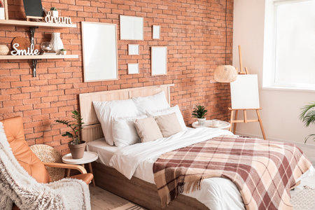
Bedroom: A Tranquil Retreat with Balanced Hues
A bedroom should be both relaxing and visually appealing. The right combination of warm and cool tones can enhance comfort and style.
Tone Pairing Ideas for Bedrooms
- Bedding Choices: Soft blue or gray bedding paired with beige or blush-colored sheets.
- Lamps & Lighting: Warm lighting fixtures combined with cool-toned nightstands or rugs.
- Drapery & Walls: Light neutral wall colors complemented by deep blue or soft green curtains.
Bathroom: A Spa-Like Balance of Warmth and Coolness
The bathroom should evoke cleanliness while maintaining warmth. A mix of natural textures and cool surfaces helps achieve this effect.
Spa-Inspired Bathroom Design Tips
- Tiling Options: Use cool-toned tiles (white, gray, or soft blue) with warm wooden vanities or accents.
- Aesthetic Decor: Incorporate woven baskets, candles, and plush towels in warm hues to contrast with cool marble surfaces.
- Metallic Finishes: Mix chrome fixtures with brass or gold accents to enhance balance.
No matter which room youre designing, understanding how warm and cool tones interact will help you create spaces that feel both inviting and stylish. By carefully selecting colors, materials, and finishes, you can achieve a harmonious atmosphere tailored to your personal style.