1. Understanding Warm and Cool Tones
When designing a space, understanding the difference between warm and cool tones is essential. These color categories not only influence the aesthetics of a room but also affect the mood, perception, and overall ambiance.
What Are Warm and Cool Tones?
Warm tones are colors that create a sense of coziness and energy. They include shades of red, orange, yellow, and earthy neutrals like beige and brown. On the other hand, cool tones evoke calmness and relaxation. These include blues, greens, purples, and grays.
How Warm and Cool Tones Affect Mood
The psychological impact of colors plays a crucial role in interior design. Choosing the right balance between warm and cool tones can influence how people feel in a space.
| Warm Tones | Cool Tones |
|---|---|
| Create a cozy, welcoming atmosphere | Promote relaxation and tranquility |
| Evoke energy and enthusiasm | Encourage focus and concentration |
| Often used in social spaces like living rooms or dining areas | Ideal for bedrooms, offices, or bathrooms |
Perception and Space Impact
Colors also affect how we perceive the size of a room. Warm tones tend to make spaces feel more intimate by bringing walls visually closer, while cool tones can make a room appear larger by creating an airy, open feel.
By understanding these fundamental differences, you can make informed design choices that enhance both functionality and aesthetics in any interior space.
2. The Psychology of Color Temperature
Color plays a significant role in shaping our emotions and behaviors. When designing an interior space, understanding the psychological effects of warm and cool tones can help create a balanced and inviting environment. By strategically mixing these colors, you can influence mood, enhance comfort, and define the overall atmosphere of a room.
Warm vs. Cool Tones: How They Affect Mood
Warm and cool tones evoke different emotional responses. Knowing how they affect mood can help guide your design choices.
| Tone Type | Common Colors | Emotional Impact | Best Used In |
|---|---|---|---|
| Warm Tones | Red, Orange, Yellow, Earthy Browns | Energizing, Welcoming, Stimulating | Living Rooms, Dining Areas, Social Spaces |
| Cool Tones | Blue, Green, Purple, Soft Grays | Calming, Refreshing, Focus-Inducing | Bedrooms, Offices, Bathrooms |
The Role of Warm Tones in Interior Design
Warm tones create a sense of coziness and intimacy. They work well in spaces where social interaction is encouraged. For example:
- A deep red accent wall can make a dining room feel more lively and engaging.
- An earthy brown sofa adds warmth to a living room, making it feel more inviting.
- A golden-yellow kitchen backsplash brings energy and brightness to the space.
The Role of Cool Tones in Interior Design
Cool tones are ideal for creating a serene and relaxing environment. They are often used in spaces where focus or rest is needed:
- A soft blue bedroom promotes relaxation and better sleep.
- A green-toned home office enhances concentration and productivity.
- Pale gray walls in a bathroom create a spa-like atmosphere.
The Key to Balance: Mixing Warm and Cool Tones
The best interiors use both warm and cool tones to create harmony. Here are some simple ways to achieve balance:
- Add contrast: Pair warm-colored furniture with cool-toned walls for visual interest.
- Create flow: Use warm accents in predominantly cool rooms (e.g., wooden decor in a blue space).
- Lighter vs. darker shades: Mix light cool hues with deeper warm tones to maintain balance without overwhelming the space.
A well-planned mix of warm and cool tones ensures that your space feels both inviting and visually dynamic. By understanding the psychology behind color temperature, you can design interiors that not only look stunning but also enhance well-being.
3. Techniques for Blending Warm and Cool Tones
Successfully mixing warm and cool tones in your interior design requires a thoughtful approach. By focusing on contrast, layering, and proportion, you can create a balanced and visually appealing space that feels both inviting and modern.
Using Contrast to Create Depth
Contrast is a key principle when blending warm and cool tones. Pairing opposite shades enhances the visual appeal and makes each element stand out.
Effective Contrast Combinations
| Warm Tone | Cool Tone |
|---|---|
| Terracotta | Navy Blue |
| Beige | Slate Gray |
| Mustard Yellow | Sage Green |
| Copper | Teal |
Selecting complementary contrasts ensures your space remains dynamic without feeling overwhelming.
Layering Textures for Cohesion
A mix of textures helps unify warm and cool tones. Combining different materials adds depth and prevents the colors from clashing.
Texture Layering Ideas
- Wood & Metal: Warm wooden furniture with cool metallic accents like brushed nickel or chrome.
- Soft & Hard Surfaces: A plush beige rug against sleek concrete flooring balances warmth and coolness.
- Naturals & Synthetics: Linen curtains paired with glass or acrylic decor pieces provide contrast while maintaining harmony.
Maintaining Proper Proportion
The right balance between warm and cool tones ensures a cohesive look. Using the 60-30-10 rule can guide your color distribution effectively.
The 60-30-10 Rule in Color Mixing
| % of Space | Description |
|---|---|
| 60% | Main color (dominant tone in walls, large furniture, or flooring) |
| 30% | Secondary color (contrasting elements like curtains, rugs, or accent walls) |
| 10% | Accent color (decorative items such as pillows, artwork, or accessories) |
This method ensures no single tone overpowers the design, creating a well-balanced aesthetic.
Tying Everything Together with Accessories
The final step in blending warm and cool tones is through carefully chosen accessories that bridge the gap between colors.
Accessory Ideas for Harmony
- Pillows & Throws: Mix warm-colored pillows on a cool-toned sofa for contrast.
- Lamps & Lighting: Warm light fixtures soften cooler wall tones.
- Artwork & Decor: Select art pieces that incorporate both warm and cool hues to unify the palette.
- Naturals Elements: Plants add an organic touch that complements both warm woods and cool metals.
A strategic mix of accessories refines your overall aesthetic while ensuring the space feels cohesive and inviting.
4. Material and Texture Considerations
When blending warm and cool tones in interior design, materials and textures play a crucial role in achieving balance and harmony. The right combination can enhance depth, richness, and cohesion, ensuring that the space feels inviting and visually dynamic.
The Role of Materials in Tone Mixing
Different materials naturally carry warm or cool undertones. Using them strategically helps to reinforce the desired aesthetic while preventing one temperature from overpowering the other.
| Material | Tone | Best Used For |
|---|---|---|
| Wood (Walnut, Oak) | Warm | Flooring, furniture, accents |
| Marble (Carrara, Calacatta) | Cool | Countertops, backsplashes, tabletops |
| Metal (Brass, Copper) | Warm | Lighting fixtures, hardware, decor elements |
| Stainless Steel | Cool | Kitchens, appliances, modern accents |
| Linen & Cotton Fabrics | Cools or Warms Depending on Color | Sofas, curtains, bedding |
| Ceramic & Porcelain Tiles | Cools or Warms Depending on Finish | Bathrooms, kitchens, accent walls |
The Impact of Texture on Warm and Cool Tones
The texture of a material influences how colors interact with light and space. Soft and plush textures tend to feel warmer and cozier, while smooth and reflective surfaces often appear cooler and more refined.
Smooth vs. Textured Finishes
- Smooth Finishes: Glossy tiles, polished stone, glass—these reflect more light and enhance cooler tones.
- Textured Surfaces: Woven fabrics, distressed wood, matte finishes—these absorb light and create warmth.
Achieving Balance Through Layering
A successful mix of warm and cool tones is often achieved by layering different textures. For example:
- A marble coffee table (cool) paired with a wool rug (warm) creates contrast.
- Sleek metal fixtures (cool) combined with wooden cabinetry (warm) add dimension.
- Linen curtains (neutral) soften the transition between bold warm and cool elements.
Selecting the Right Combinations for Your Space
If your space leans heavily towards one temperature—whether warm or cool—you can introduce complementary materials to maintain balance. For instance:
- A room with predominantly warm wood tones can benefit from cool-toned stone or stainless steel elements to break up the warmth.
- A minimalist cool-toned space with concrete floors can be warmed up with textured wool throws or brass lighting fixtures.
- A neutral palette can be enriched by mixing both warm and cool textures through upholstery choices like velvet sofas with sleek leather chairs.
The key is to experiment with materials that bring out the best in both warm and cool tones while maintaining a cohesive look. Thoughtful material selection ensures that your space remains visually interesting without feeling overwhelming.
5. Real-World Applications and Inspiration
Finding the right balance between warm and cool tones can transform any space into a harmonious, inviting environment. Let’s explore real-world examples, design inspirations, and professional tips to help you effectively implement this approach in different interior settings.
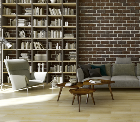
Living Room: Cozy Yet Contemporary
A well-balanced living room combines warm and cool elements to create a welcoming yet modern feel. For example, pairing a soft gray sofa (cool tone) with mustard yellow throw pillows (warm tone) adds depth and warmth without overwhelming the space.
Pro Tip:
- Use neutral walls as a backdrop and layer warm and cool accents through furniture, textiles, and artwork.
- Incorporate natural materials like wooden coffee tables or metal light fixtures to enhance the mix of tones.
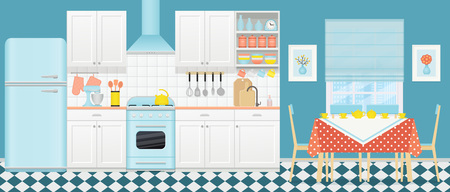
Kitchen: Fresh Yet Inviting
The kitchen benefits from a mix of warm wood finishes with cool-toned cabinetry or countertops. A white marble countertop (cool) paired with walnut cabinets (warm) creates a sophisticated yet approachable look.
Pro Tip:
- If your kitchen has stainless steel appliances (cool), balance them with warm lighting or wooden bar stools.
- Add greenery for a fresh, organic element that bridges the temperature contrast.
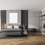
Bedroom: Serene and Balanced
The bedroom should feel restful but not monotonous. A navy blue accent wall (cool) combined with beige or terracotta bedding (warm) introduces depth while maintaining coziness.
Pro Tip:
- Select curtains that complement both warm and cool shades in your space to tie everything together.
- Add metallic accents like brass lamps for warmth or chrome details for a cooler touch.
Bathroom: Crisp Yet Comfortable
A bathroom can feel either too cold or overly warm if not balanced correctly. White subway tiles (cool) offset by wooden vanities (warm) ensure the space remains fresh without feeling sterile.
| Cool Elements | Warm Elements |
|---|---|
| Ceramic tiles | Bamboo accessories |
| Chrome faucets | Candle lighting |
| Pale blue walls | Taupe towels |
Pro Tip:
- If using predominantly cool tones, introduce warmth through soft textures like rugs or woven baskets.
- Dimmable lighting can help adjust the ambiance based on time of day or mood preference.