1. Understanding Warm and Cool Colors
When designing a space, color plays a crucial role in setting the mood and creating harmony. One of the fundamental concepts in color theory is the distinction between warm and cool colors. Understanding these categories can help you make informed decisions about your interior design choices.
What Are Warm and Cool Colors?
Warm colors are those that evoke feelings of warmth, energy, and coziness. They include shades of red, orange, and yellow. On the other hand, cool colors create a sense of calmness, relaxation, and spaciousness. These include shades of blue, green, and purple.
Comparison of Warm and Cool Colors
| Warm Colors | Cool Colors |
|---|---|
| Red | Blue |
| Orange | Green |
| Yellow | Purple |
The Psychological Effects of Warm and Cool Colors
The colors you choose for a space can influence emotions and behaviors. Warm colors tend to be stimulating and inviting, making them great for social spaces like living rooms and dining areas. Cool colors have a calming effect, making them ideal for bedrooms, bathrooms, and offices where relaxation and focus are important.
How Color Affects Mood
| Color Type | Mood Effect | Best Used In |
|---|---|---|
| Warm Colors | Energizing, Cozy, Stimulating | Living Rooms, Dining Areas, Kitchens |
| Cool Colors | Calming, Relaxing, Refreshing | Bedrooms, Bathrooms, Offices |
The Influence of Light on Color Perception
The way we perceive warm and cool colors can also be affected by lighting. Natural light enhances the true appearance of colors throughout the day, while artificial lighting can shift their tone. For example, warm-toned lighting (such as incandescent bulbs) will make cool colors appear slightly warmer, whereas cool-toned lighting (such as LED daylight bulbs) can make warm colors seem less intense.
Tips for Choosing the Right Lighting
- If using warm colors: Opt for soft white or warm white bulbs to maintain a cozy atmosphere.
- If using cool colors: Consider daylight or cool white bulbs to enhance the refreshing effect.
- If balancing both: Use adjustable lighting options to shift between warm and cool tones as needed.
A solid understanding of warm and cool colors helps you make intentional design choices that enhance the overall mood of your space. By considering their psychological effects and how lighting influences perception, you can create an environment that feels just right for your needs.
2. Choosing the Right Balance
Finding the perfect balance between warm and cool colors is essential for creating a space that feels inviting and visually harmonious. Too much of one can overwhelm the room, while the right mix can enhance both comfort and style. Here are some techniques to help you achieve a well-balanced look.
Understanding Warm vs. Cool Ratios
A good rule of thumb is to decide which temperature—warm or cool—will be dominant in your space. A common approach is the 70/30 or 60/40 rule, where one color group takes up the majority while the other serves as an accent.
| Balance Approach | Description |
|---|---|
| 70% Warm / 30% Cool | This creates a cozy and inviting atmosphere with warm tones like beige, terracotta, or gold dominating, while cooler shades like blue or gray add contrast. |
| 60% Cool / 40% Warm | A cooler-dominant scheme promotes relaxation and openness, with blues and greens leading the way, complemented by warm accents such as wood tones or soft pinks. |
| Equal Mix (50/50) | A balanced blend of warm and cool tones can create a dynamic and versatile space, but careful planning is needed to avoid visual chaos. |
Selecting Anchor Colors and Accents
Your anchor color will set the overall mood of the space, while accents provide contrast and depth. For example:
- If you choose a warm anchor color like mustard yellow, balance it with cool-toned furniture or decor in navy blue or teal.
- If you prefer a cooler base such as soft gray, introduce warmth through wooden furniture, brass fixtures, or peach-toned textiles.
The Role of Neutrals in Balance
Neutrals like white, beige, gray, and taupe act as bridges between warm and cool tones. They help soften contrasts and ensure that neither side feels too overpowering. Consider using neutral walls or flooring to allow both warm and cool elements to shine without clashing.
3. Using Color to Define Function
Color plays a powerful role in shaping how a space feels and functions. By carefully selecting warm or cool colors, you can enhance different areas of your home based on their purpose. Whether you need an energizing workspace or a peaceful retreat, the right color choices can make a significant difference.
Creating an Energizing Workspace
If you want to boost focus and motivation in a home office or study area, consider using warm tones like shades of yellow, orange, or red. These colors stimulate creativity and encourage productivity. However, too much intensity can feel overwhelming, so balance bold hues with neutral tones.
Designing a Calming Retreat
For relaxation areas such as bedrooms or reading nooks, cooler shades like blue, green, and soft purples work best. These colors create a serene environment that helps reduce stress and promote restful sleep. Pairing them with natural textures and soft lighting further enhances the calming effect.
Choosing Colors for Social Spaces
Living rooms and dining areas should feel inviting and comfortable. Warm neutral shades like beige, terracotta, or soft golds help create a cozy atmosphere where people naturally gather. If you prefer cooler tones, consider muted blues or greens to maintain a welcoming yet refreshing feel.
Quick Guide: Best Colors for Different Spaces
| Space | Recommended Colors | Effect |
|---|---|---|
| Home Office | Warm yellows, oranges, light reds | Energizing, boosts focus |
| Bedroom | Soft blues, greens, lavender | Calming, promotes relaxation |
| Living Room | Warm neutrals, muted blues or greens | Inviting, comfortable for gatherings |
| Dining Area | Terracotta, warm beige, deep reds | Coziness, encourages conversation |
The Right Balance Matters
No matter which colors you choose, balance is key. Combining warm and cool tones in the right proportions ensures that your space remains visually appealing and functional. Try adding accents in contrasting shades to bring harmony without overpowering the room’s intended purpose.
4. Incorporating Textures and Materials
When designing a space with warm and cool colors, textures and materials play a crucial role in balancing the overall look and feel. The right combination can enhance how these colors interact, making the space feel more cohesive and visually appealing.
How Textures Affect Warm and Cool Colors
Different textures can either amplify or soften the effect of warm and cool colors. Rough textures absorb light and create a sense of warmth, while smooth surfaces reflect light, often making cool colors feel even cooler. Understanding this interaction helps in achieving a harmonious design.
| Texture Type | Effect on Warm Colors | Effect on Cool Colors |
|---|---|---|
| Rough (e.g., brick, woven fabric) | Makes warm tones feel cozier and more grounded | Adds depth to cool tones, preventing them from feeling too sterile |
| Smooth (e.g., glass, polished metal) | Tones down the intensity of warm hues for a refined look | Makes cool tones appear even more crisp and modern |
| Soft (e.g., velvet, plush rugs) | Adds comfort and enhances the inviting nature of warm colors | Makes cool colors feel more luxurious rather than cold |
Selecting Materials for a Balanced Space
The materials you choose also impact how warm and cool colors work together. Natural materials like wood and stone can bridge the gap between these color temperatures, creating a well-rounded environment.
Best Materials for Warm Colors
- Wood: Rich-toned woods like walnut or oak enhance warmth.
- Ceramic: Earthy ceramic tiles complement warm shades beautifully.
- Linen: Adds softness while maintaining an organic, cozy feel.
Best Materials for Cool Colors
- Glass: Reflects light, making cool colors appear airy and fresh.
- Metal: Stainless steel or brushed nickel pairs well with blues and grays.
- Marble: White or gray marble reinforces the sleekness of cool tones.
Tying Everything Together
A successful design balances both warm and cool elements through strategic use of textures and materials. Mixing rough natural elements with sleek modern surfaces prevents a space from feeling one-dimensional. Try layering different textures—like pairing a soft wool rug with a polished coffee table—to create depth while maintaining harmony between warm and cool tones.
5. Practical Tips and Real-Life Examples
Creating a balanced space with warm and cool colors doesnt have to be complicated. By following some practical guidelines and looking at real-life examples, you can easily achieve a harmonious atmosphere in your home.
Understanding the 80/20 Rule
A simple way to balance warm and cool tones is by using the 80/20 rule. This means selecting one color temperature as the dominant theme (80%) and using the other as an accent (20%). For example:
| Main Color Temperature (80%) | Accent Color Temperature (20%) | Example Application |
|---|---|---|
| Warm (earthy browns, soft oranges) | Cool (muted blues, greens) | A cozy living room with warm beige walls and cool blue throw pillows |
| Cool (light grays, blues) | Warm (mustard yellow, terracotta) | A modern bedroom with gray walls and a warm-toned rug |
Selecting the Right Color Combinations
The key to making warm and cool tones work together is choosing complementary shades that enhance rather than clash. Here are some tried-and-true combinations:
- Navy Blue & Burnt Orange: A sophisticated pairing ideal for offices or formal spaces.
- Sage Green & Warm Beige: Creates a calming yet inviting feel in bedrooms or reading nooks.
- Pale Blue & Soft Coral: A fresh and cheerful combination perfect for kitchens or bathrooms.
Using Accessories to Balance Colors
If youre hesitant about committing to bold wall colors, start small with decor elements. Use pillows, rugs, artwork, or curtains to introduce warm or cool accents. This approach allows for flexibility while maintaining harmony.
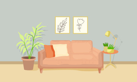
Real-Life Example: A Balanced Living Room
A homeowner wanted a cozy yet refreshing living space. They painted the walls in a soft taupe (warm), added a navy blue sofa (cool), and incorporated gold-framed artwork (warm) with pale blue cushions (cool). The result? A well-balanced room that feels both inviting and elegant.
Avoiding Common Mistakes
Mistakes can happen when mixing warm and cool tones. Here are some things to watch out for:
- Avoid Overpowering One Temperature: Too much warmth can feel overwhelming, while excessive cool tones may seem uninviting.
- Mismatching Undertones: Pay attention to undertones—some warm shades have cool undertones and vice versa.
- Lack of Neutrals: Incorporating neutral colors like white, gray, or beige helps bridge the gap between warm and cool hues.
The right balance of warm and cool colors can transform any space into a visually appealing and comfortable environment. By applying these tips and experimenting with different combinations, you’ll create a harmonious interior that reflects your style.