1. Understanding Warm and Cool Colors
When designing a space, color plays a crucial role in setting the mood and atmosphere. One of the most fundamental aspects of color theory is the distinction between warm and cool colors. Understanding how these colors work can help you create a balanced and inviting environment.
What Are Warm and Cool Colors?
Colors are generally categorized into two main groups: warm and cool. This classification is based on their visual and psychological effects.
| Color Type | Examples | Psychological Effect |
|---|---|---|
| Warm Colors | Red, Orange, Yellow | Energizing, Cozy, Inviting |
| Cool Colors | Blue, Green, Purple | Calming, Refreshing, Serene |
The Psychological Effects of Warm and Cool Colors
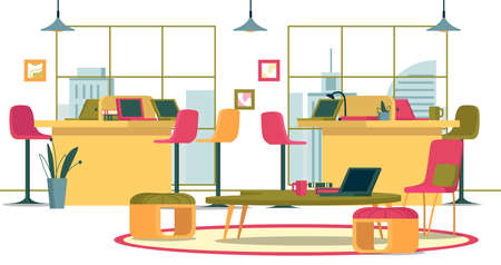
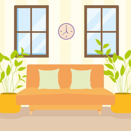
The way we perceive colors is deeply connected to our emotions. Warm colors tend to evoke feelings of warmth, comfort, and energy. They are often used in spaces where social interaction or stimulation is desired, such as living rooms or dining areas.
On the other hand, cool colors create a sense of calmness and relaxation. These shades are ideal for bedrooms, bathrooms, or any area where tranquility is the goal.
The Influence of Color Temperature on Space
The temperature of a color can affect how we experience a room. For example:
- A predominantly warm palette: Can make a large space feel cozier and more intimate.
- A predominantly cool palette: Can make a small space feel more open and airy.
- A mix of both: Creates balance and harmony within a space.
Choosing the Right Balance
A well-balanced combination of warm and cool tones can help achieve both comfort and sophistication in your design. In upcoming sections, we’ll explore how to effectively incorporate these colors into different spaces to enhance their overall aesthetic and functionality.
2. The Emotional Impact of Color in Interior Design
Color plays a crucial role in shaping the atmosphere of a space. The right combination of warm and cool colors can influence emotions, energy levels, and overall comfort. Understanding how different color temperatures affect mood can help you create the perfect ambiance for your home.
How Warm and Cool Colors Affect Mood
Warm colors, such as reds, oranges, and yellows, are often associated with energy, excitement, and warmth. They can make a space feel inviting and cozy but may also create a sense of urgency if used excessively. On the other hand, cool colors like blues, greens, and purples tend to have a calming effect. They promote relaxation and tranquility, making them ideal for bedrooms or spaces meant for unwinding.
Comparison of Warm vs. Cool Colors
| Color Type | Common Shades | Emotional Effect | Best Used In |
|---|---|---|---|
| Warm Colors | Red, Orange, Yellow | Energizing, Inviting, Stimulating | Kitchens, Dining Rooms, Social Spaces |
| Cool Colors | Blue, Green, Purple | Calming, Relaxing, Refreshing | Bedrooms, Bathrooms, Offices |
Creating Balance with Color Temperatures
The key to a well-designed space is balancing warm and cool tones to achieve the desired emotional effect. For example:
- If your living room feels too cold with blue walls, add warm-colored accents like orange cushions or wooden furniture.
- A bedroom dominated by warm tones can be softened with cool blue or green bedding for a more restful feel.
- Kitchens benefit from a mix of both—warm tones encourage social interaction while cooler shades keep the space feeling fresh.
Tips for Using Color to Set the Right Mood
No matter which color palette you choose, consider these tips to enhance your interior design:
1. Use Lighter Shades for an Airy Feel
Pale blues and soft yellows can make small rooms feel larger and more open.
2. Incorporate Neutrals for Balance
If bold colors feel overwhelming, neutral shades like beige or gray can help tone them down.
3. Experiment with Accent Colors
Pillows, rugs, and artwork allow you to introduce warm or cool tones without committing to large-scale changes.
4. Consider Lighting Conditions
The way natural and artificial light interacts with colors can change their appearance throughout the day.
Selecting the right balance between warm and cool colors allows you to craft an environment that aligns with your desired mood and energy level. By understanding their emotional impact, you can transform any room into a harmonious space that feels just right.
3. Creating Harmony: Blending Warm and Cool Tones
Finding the perfect balance between warm and cool colors can transform any space into a visually appealing and comfortable environment. When blended thoughtfully, these tones create a dynamic yet cohesive look that enhances the overall design without feeling chaotic.
Understanding the Role of Warm and Cool Colors
Warm colors like reds, oranges, and yellows bring energy and coziness, while cool colors such as blues, greens, and purples introduce calmness and relaxation. The key to creating harmony is ensuring neither overpowers the other.
Tips for Successfully Combining Warm and Cool Colors
- Choose a Dominant Tone: Decide whether warm or cool tones will be the primary focus and use the other as an accent to maintain balance.
- Use Neutrals as a Bridge: Incorporate neutral shades like beige, gray, or white to seamlessly connect warm and cool colors.
- Follow the 60-30-10 Rule: Use 60% of one color family, 30% of the opposite tone, and 10% as an accent for a well-proportioned look.
- Consider Lighting: Natural and artificial lighting can influence how colors appear—test your palette in different lighting conditions before finalizing your choices.
Examples of Well-Balanced Color Combinations
| Warm Color | Cool Color | Neutral Connector |
|---|---|---|
| Terracotta Orange | Sage Green | Cream White |
| Golden Yellow | Navy Blue | Soft Gray |
| Burgundy Red | Pale Teal | Taupe Beige |
Avoiding Common Mistakes
Overloading with Bold Colors
Avoid using too many bold warm and cool tones together, as this can make the space feel overwhelming. Instead, balance vibrant hues with softer or muted shades.
Lack of Cohesion
If your space feels disjointed, incorporate repeating elements like patterns, textures, or similar undertones to unify the design.
Ineffective Placement
The placement of warm and cool tones matters. Use cooler shades in areas meant for relaxation (like bedrooms) and warmer tones in social spaces (like living rooms) to enhance their functionality.
4. Best Practices for Choosing a Color Palette
Selecting the right color palette for your space is more than just picking your favorite shades—it’s about creating a balanced and functional environment. Here are some practical tips to help you choose colors that work well together, considering factors like lighting, room size, and function.
Consider the Lighting
Lighting plays a huge role in how colors appear in a room. Natural light brings out true colors, while artificial lighting can alter their appearance.
| Light Source | Effect on Colors |
|---|---|
| Natural Light | Shows colors in their truest form; varies throughout the day. |
| Warm Artificial Light (Incandescent, Warm LED) | Makes warm tones richer and cool tones appear duller. |
| Cool Artificial Light (Fluorescent, Cool LED) | Enhances cooler tones but can make warm colors look washed out. |
Think About Room Size
The size of a room should influence your color choices. Lighter shades tend to open up a space, making it feel larger, while darker colors create a cozy and intimate atmosphere.
- Small rooms: Use light and neutral colors to give the illusion of more space.
- Large rooms: Darker or bolder colors can add warmth and make the space feel more inviting.
Select Colors Based on Function
The purpose of a room should guide your color decisions. Different hues evoke different moods and energy levels.
| Room Type | Suggested Colors & Effects |
|---|---|
| Living Room | Warm neutrals, soft blues, or earthy greens for a welcoming and relaxing feel. |
| Bedroom | Pale blues, muted greens, or lavender for a calm and restful atmosphere. |
| Kitchen | Crisp whites, warm yellows, or light grays for a bright and clean look. |
| Bathroom | Aqua blues, soft grays, or pastel tones to create a spa-like retreat. |
| Home Office | Sage green, deep blue, or muted orange to enhance focus and productivity. |
Create a Balanced Color Scheme
A good rule of thumb is the 60-30-10 rule:
- 60%: Dominant color (walls and large surfaces).
- 30%: Secondary color (furniture and textiles).
- 10%: Accent color (decorative pieces).
Test Before Committing
Narrow down your choices and test paint samples on the walls at different times of the day to see how they look under various lighting conditions. This ensures you’ll be happy with your final decision!
The right color palette can transform any space into a comfortable and visually appealing area. By considering lighting, room size, and function, you can create a harmonious environment that perfectly suits your needs.
5. Inspiration and Real-Life Applications
Finding the right balance between warm and cool colors can transform a space, making it feel inviting, spacious, or cozy, depending on the desired effect. Lets explore some real-world examples and expert recommendations for using warm and cool palettes in different interior design styles.
Modern Minimalism
Modern minimalist interiors often feature neutral bases with subtle warm or cool accents to create depth and contrast.
| Warm Palette | Cool Palette |
|---|---|
| Beige walls with terracotta decor | Gray walls with blue-toned furniture |
| Wood finishes for warmth | Glass and metal elements for a sleek feel |
| Soft lighting with warm bulbs | Crisp LED lighting for a cooler ambiance |
Classic Traditional Spaces
A traditional home benefits from a well-balanced combination of warm and cool tones to maintain a timeless aesthetic.
- Warm Approach: Rich reds, golds, and deep browns for an elegant, inviting atmosphere.
- Cool Approach: Soft blues, greens, and grays to create a fresh yet sophisticated look.
- Balanced Mix: A neutral backdrop with both warm wood furniture and cool-toned textiles.
Scandinavian Simplicity
The Scandinavian style embraces light, airy spaces with a mix of warm and cool colors to enhance coziness while maintaining brightness.
A common approach is to use a primarily neutral base—such as white or light gray walls—then layer in warmth through natural materials like wood and textiles.
Example Color Combinations:
- Creamy white walls + light oak flooring + soft blue accents
- Pale gray walls + natural linen fabrics + muted green decor
- Breezy white interiors + leather furniture + navy details
Dramatic Contemporary Designs
If you prefer bold contrasts, contemporary design allows for striking combinations of warm and cool tones.
Tips for Using Contrasts Effectively:
- Select one dominant tone: Use either warm or cool as the primary color scheme, then introduce accents from the opposite side.
- Add visual interest: Pair deep charcoal walls (cool) with brass fixtures (warm) for a high-end look.
- Create depth: Use layering techniques such as soft rugs over sleek concrete floors or plush velvet chairs against steel-framed windows.
The Perfect Balance for Your Space
The key to successfully using warm and cool palettes is understanding how they influence mood and perception. Whether you prefer cozy traditional aesthetics or sleek modern minimalism, finding the right balance will help create a space that feels just right for you. Experiment with different combinations until you achieve the perfect harmony!