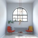
1. The Rise of Warm and Earthy Tones
As we move into 2025, warm and earthy tones are becoming the top choice for accent colors in interior design. Inspired by nature, shades like terracotta, burnt orange, and deep ochre are making their way into homes, bringing a sense of comfort and grounding energy to spaces.
Why Are These Colors Trending?
The shift towards warm, nature-inspired hues is largely influenced by a growing desire for coziness and connection to the natural world. With more people embracing organic materials and sustainable living, these earthy tones complement wood finishes, stone textures, and neutral palettes beautifully.
Popular Warm Accent Colors in 2025
| Color | Description | Best Used In |
|---|---|---|
| Terracotta | A rich, clay-like shade that adds warmth and depth. | Living rooms, kitchens, accent walls |
| Burnt Orange | A bold yet cozy hue that enhances energy and vibrancy. | Pillows, rugs, statement furniture |
| Deep Ochre | A muted golden tone that brings a sophisticated earthiness. | Bedrooms, dining areas, decorative accents |
How to Incorporate These Hues in Your Space
If youre looking to refresh your home with these trending colors, start small with accent pieces like throw pillows or artwork. For a bolder approach, consider painting an accent wall or incorporating terracotta tiles into your kitchen backsplash. Pairing these hues with neutral tones such as beige or soft gray can create a balanced and timeless aesthetic.
Pairing Warm Tones with Other Colors
To make these earthy shades stand out while maintaining harmony in your space, consider pairing them with complementary colors:
- Terracotta + Soft Beige: Creates a cozy and inviting atmosphere.
- Burnt Orange + Deep Green: A vibrant yet grounded combination inspired by autumn landscapes.
- Deep Ochre + Charcoal Gray: Adds sophistication and contrast to modern interiors.
The Future of Warm Accent Colors
With their versatility and ability to evoke warmth and relaxation, these earthy hues are expected to remain popular well beyond 2025. Whether through subtle decor elements or bold design statements, embracing warm tones can help create a welcoming environment that feels both stylish and timeless.
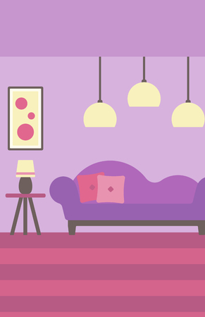
2. Cooling Down: The Shift Away From Pastel Shades
In 2025, interior design is moving away from the soft and airy pastels that have dominated for years. Instead, we’re seeing a growing preference for bolder, more saturated hues that bring depth, personality, and warmth to spaces. While pastels once created a light and delicate atmosphere, homeowners and designers are now gravitating toward colors that make a stronger statement.
Why Are Pastels Losing Popularity?
Pastel shades, such as baby blue, soft pink, and mint green, were once favored for their calming effect and versatility. However, they often lack the richness and dimension needed to create a truly dynamic space. With changing preferences toward more expressive interiors, muted tones are giving way to deeper and more intense color choices.
What’s Replacing Soft Pastels?
The trend is shifting towards bold accent colors that create contrast and visual impact. These richer tones help define spaces while adding warmth and character. Here’s a comparison of what’s fading out versus what’s trending in:
| Fading Out | Trending In |
|---|---|
| Pale Pink | Deep Terracotta |
| Pastel Blue | Saturated Navy |
| Misty Lavender | Dramatic Plum |
| Mint Green | Mossy Olive |
| Pale Yellow | Golden Ochre |
The Impact on Interior Spaces
Bolder colors bring a fresh energy into homes, allowing for greater creativity in design. Instead of pastel walls that blend into the background, deep hues serve as focal points. Whether through accent walls, furniture pieces, or décor elements, these richer shades create more engaging environments.
How to Incorporate This Trend?
- Add Depth with Accent Walls: A single deep-toned wall can transform an entire room without overwhelming it.
- Select Bold Upholstery: Sofas or chairs in rich hues provide warmth while maintaining sophistication.
- Mix Textures: Pairing bold colors with different materials like velvet or wood enhances the overall aesthetic.
- Create Balance: Use neutral tones alongside saturated shades to maintain harmony in your space.
A New Era of Color Expression
The shift away from pastels marks a desire for more engaging and expressive interiors. By embracing richer colors, homeowners can craft spaces that feel inviting, stylish, and full of personality.
3. Bold and Unexpected: The Statement Colors of 2025
As we move into 2025, accent colors are taking a bold turn. Instead of muted tones or predictable neutrals, we’re seeing a surge in deep, rich hues that bring energy and personality into spaces. These statement colors are making their mark in interior design, adding depth and vibrancy to modern homes.
Unconventional Choices Taking Center Stage
Forget safe color palettes—2025 is all about embracing the unexpected. Designers are leaning into dramatic, eye-catching shades that create a striking contrast with neutral backdrops. Here are some of the standout statement colors leading the way:
| Color | Description | Best Used In |
|---|---|---|
| Deep Teal | A rich blend of blue and green that adds sophistication and depth. | Accent walls, kitchen cabinets, upholstery |
| Rich Purple | A luxurious hue that brings drama and warmth. | Velvet furniture, bedroom walls, decorative accents |
| Vibrant Emerald | A bold green shade that evokes nature and elegance. | Bathroom tiles, statement furniture, artwork |
The Impact of Bold Colors in Interior Design
The rise of these striking colors reflects a shift toward more expressive and personalized interiors. Homeowners and designers alike are moving away from overly safe choices and opting for hues that reflect individuality. Whether used as an accent or a dominant feature, these bold shades add richness and character to any space.
How to Incorporate Statement Colors Without Overwhelming Your Space
If you’re hesitant about using such bold hues, start small. Introduce deep teal through decorative pillows or a single piece of furniture. Try rich purple in a cozy reading nook or vibrant emerald in your bathroom accessories. The key is balance—pairing these strong colors with softer neutrals will keep the look fresh and sophisticated.
4. Neutral Foundations with a Pop of Color
One of the standout trends in 2025 is the use of neutral color palettes as a foundation, complemented by bold accent colors. Homeowners are opting for soft, timeless neutrals like warm whites, beiges, and light grays as their primary backdrop, allowing vibrant hues to shine in strategic areas. This approach creates a well-balanced and modern aesthetic without overwhelming the space.
Why Neutral Bases Work
Neutral tones provide versatility and longevity, making them an ideal choice for walls, large furniture pieces, and flooring. They create a calming environment while giving homeowners flexibility to update accent colors over time without a major redesign.
How to Add Pops of Color
The key to using bold colors effectively is strategic placement. Instead of painting entire rooms in bright shades, designers recommend introducing color through smaller yet impactful elements such as:
- Throw pillows and blankets
- Artwork and decorative accents
- Accent furniture pieces like chairs or side tables
- Kitchens with colorful backsplashes or cabinet interiors
- Statement lighting fixtures
Popular Neutral & Accent Color Combinations for 2025
| Neutral Base | Accent Colors |
|---|---|
| Warm White | Cobalt Blue, Burnt Orange |
| Light Gray | Moss Green, Deep Aubergine |
| Soft Beige | Saffron Yellow, Rich Teal |
| Taupe | Cranberry Red, Midnight Blue |
Tips for Achieving Balance
Avoid overpowering your space by maintaining an 80/20 rule—80% neutral tones and 20% bold accents. This ensures that the overall design remains cohesive while still incorporating personality and vibrancy.
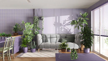
5. Sustainability and Nature-Inspired Hues
As we move into 2025, sustainability continues to be a driving force in interior design. Homeowners and designers alike are embracing eco-conscious choices, and this shift is influencing color trends in significant ways. Colors that reflect the beauty of the natural world—such as moss green, clay brown, and deep ocean blues—are becoming go-to accent shades for creating serene and grounded spaces.
Why Nature-Inspired Colors Are Trending
The increased focus on sustainability has led to a preference for colors that evoke a sense of calm and connection to nature. These hues not only align with eco-friendly materials and furnishings but also promote a more relaxing and restorative atmosphere at home.
Popular Nature-Inspired Accent Colors for 2025
| Color | Description | Best Use |
|---|---|---|
| Moss Green | A soft, earthy green reminiscent of lush forests. | Perfect for accent walls, textiles, and indoor plants. |
| Clay Brown | A warm, organic brown inspired by natural clay and terracotta. | Works well in furniture, decorative elements, and statement pieces. |
| Deep Ocean Blue | A rich, deep blue reflecting the depths of the sea. | Ideal for bold accents like cabinetry, rugs, or artwork. |
How to Incorporate These Colors into Your Space
If youre looking to embrace these nature-inspired hues in your home, start small with accessories like throw pillows, vases, or wall art. For a bolder statement, consider painting an accent wall or incorporating furniture pieces in these shades. Pairing them with neutral tones like beige, soft white, or muted grays can enhance their natural beauty while keeping the overall look balanced and timeless.