1. Understanding Bold and Neutral Colors
Choosing the right color scheme for your home starts with understanding the differences between bold and neutral colors. Each type of color brings a unique energy and aesthetic to a space, influencing mood, style, and functionality.
What Are Bold Colors?
Bold colors are rich, vibrant, and full of personality. These shades stand out and create a strong visual impact. They can add excitement, warmth, or drama to a room depending on how they are used.
Characteristics of Bold Colors:
- High Energy: Bold colors like red, orange, and bright blue bring energy and liveliness to a space.
- Attention-Grabbing: These hues naturally draw the eye and can be used to highlight focal points.
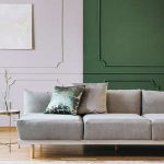
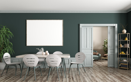
- Dramatic Effect: Dark bold tones such as deep emerald green or navy blue create a moody and luxurious feel.
- Expressive: Bold colors allow homeowners to showcase their personality through design.
What Are Neutral Colors?
Neutral colors provide a timeless and versatile foundation for any home. These shades are subtle and often serve as a backdrop that complements different styles and decor elements.
Characteristics of Neutral Colors:
- Calming Influence: Soft tones like beige, gray, and white promote relaxation and tranquility.
- Easily Adaptable: Neutrals work well with various decor styles, from modern to rustic.
- Create an Open Feel: Light neutrals make small spaces appear larger and airier.
- Tonal Balance: Different shades of neutrals can be layered to create depth without overwhelming the space.
The Impact of Color on Mood
The colors you choose for your home can influence emotions and behavior. Here’s how bold and neutral colors affect mood:
| Color Type | Mood & Emotional Impact |
|---|---|
| Bold Colors | Energizing, exciting, stimulating creativity, making a strong statement. |
| Neutral Colors | Sophisticated, calming, promoting relaxation, creating a welcoming atmosphere. |
The Aesthetic Effects on Your Home
The right color choice enhances the overall ambiance of your home. Bold colors add character and vibrancy but should be used thoughtfully to avoid overwhelming the space. Meanwhile, neutral colors create balance and flexibility, making them ideal for long-term design choices.
Which One Should You Choose?
Your decision depends on personal style, the function of each room, and how much change you’re willing to commit to over time. In the next section, we’ll explore how to determine which color scheme best suits your home’s needs.
How to Determine Your Personal Style
Choosing between bold and neutral color schemes starts with understanding your personal style. Your home should reflect your personality, lifestyle, and design preferences. Ask yourself a few key questions to determine which palette suits you best.
Consider Your Lifestyle
Your daily routine and household dynamics play a major role in selecting the right colors. If you have a busy household with kids or pets, neutral tones may provide a timeless and calming atmosphere. On the other hand, if you love entertaining guests and want to create a vibrant space, bold colors can make a strong impact.
Evaluate Your Preferences
Think about how different colors make you feel. Do bright, dramatic shades energize you? Or do soft, muted tones bring you comfort? Consider your emotional connection to colors when making your decision.
| Preference | Best Color Choice |
|---|---|
| I love high-energy, dynamic spaces. | Bold Colors |
| I prefer calm, relaxing environments. | Neutral Colors |
| I enjoy contemporary and trendy designs. | Bold Colors |
| I like classic and timeless aesthetics. | Neutral Colors |
Define Your Décor Goals
Your long-term vision for your home will also influence your color choices. If you want flexibility to change décor frequently, neutral tones offer versatility. However, if youre looking for a bold statement that reflects a distinct personality, vibrant hues might be the way to go.
A Few Questions to Ask Yourself:
- Do I want my home to feel cozy and inviting or energetic and exciting?
- Am I comfortable committing to bold colors for a long time?
- Will I be updating my décor frequently?
- What mood do I want each room to convey?
Your answers will help guide you toward a color scheme that aligns with both your personal taste and practical needs.
3. The Role of Lighting and Space
When choosing between bold and neutral colors for your home, lighting and space play a crucial role in how those colors will look and feel. Both natural and artificial lighting, along with the size and layout of a room, can impact the perception and effectiveness of your chosen color scheme.
How Lighting Affects Color Perception
Lighting changes how we see colors, making them appear brighter, darker, warmer, or cooler depending on the light source. Here’s how different types of lighting influence your color choices:
| Lighting Type | Effect on Colors |
|---|---|
| Natural Light (Daylight) | Makes colors appear true to their original shade; changes throughout the day from warm (morning/evening) to cool (midday). |
| Warm Artificial Light (Incandescent & Warm LED) | Adds a yellow or orange tint, making warm tones more vibrant and cool tones appear muted. |
| Cool Artificial Light (Fluorescent & Cool LED) | Adds a blueish tone, enhancing cool colors while making warm hues look duller. |
The Impact of Room Size and Layout
The dimensions and arrangement of a space also affect how colors are perceived. Here are some key considerations:
- Small Rooms: Lighter neutral shades help create an open, airy feel, while bold colors can make the space feel more enclosed but also cozier.
- Large Rooms: Bold colors work well to add warmth and character; neutrals help maintain balance without overwhelming the space.
- Narrow or Long Spaces: Darker shades on shorter walls can create depth, while lighter tones on longer walls prevent a tunnel-like effect.
Tips for Balancing Color with Lighting and Space
#1 Test Colors in Different Lighting Conditions
A paint swatch might look perfect in-store but appear completely different under your homes lighting. Test samples at different times of the day to see how they change.
#2 Use Mirrors to Enhance Light
If your space lacks natural light, strategically placing mirrors can reflect both natural and artificial light to brighten up darker areas.
#3 Layer Your Lighting
A combination of ambient, task, and accent lighting helps maintain color consistency throughout the day while adding depth to your design.
A Quick Tip:
If youre unsure about committing to bold colors on walls, start with accent pieces like pillows, rugs, or artwork. This allows flexibility without overwhelming the space.
4. Combining Bold and Neutral for Balance
Finding the right balance between bold and neutral colors is key to creating a home that feels both dynamic and harmonious. By thoughtfully blending these tones, you can achieve a look that is stylish, inviting, and well-coordinated.
Use Accent Walls to Add Depth
An easy way to incorporate bold colors without overwhelming your space is by using an accent wall. Choose one wall in a room to paint in a vibrant shade while keeping the other walls neutral. This technique creates a focal point and adds personality without making the space feel too intense.
Mix Furniture Pieces Strategically
Furniture plays a crucial role in balancing bold and neutral tones. A brightly colored sofa or armchair can stand out beautifully against a backdrop of neutral walls and flooring. Conversely, if your walls are bold, opt for furniture in softer shades to create contrast.
Incorporate Accessories for Flexibility
If you prefer flexibility in your decor, use accessories like rugs, pillows, curtains, and artwork to introduce bold colors. These elements allow you to experiment with different hues without committing to large-scale changes.
Color Combination Ideas
| Bold Color | Neutral Pairing | Best Use |
|---|---|---|
| Navy Blue | Beige or Light Gray | Sofas, accent walls, rugs |
| Emerald Green | Cream or Soft White | Curtains, chairs, decorative accents |
| Burgundy Red | Taupe or Charcoal Gray | Pillows, artwork, statement furniture |
| Mustard Yellow | Pale Gray or Warm White | Lamps, throw blankets, small decor pieces |
Create Cohesion Throughout Your Home
The key to successfully mixing bold and neutral colors is consistency. Use similar shades across different rooms to maintain flow and avoid clashing styles. For instance, if you have navy blue accents in your living room, carry that color into your bedroom through bedding or decorative elements.
Lighting Matters
The way colors appear in your home depends on lighting. Natural light enhances bright colors, while artificial lighting can change their intensity. Test paint samples under different lighting conditions before committing to ensure the perfect balance between bold and neutral tones.
5. Practical Tips for Choosing the Right Colors
Selecting the perfect color scheme for your home can be exciting but also overwhelming. To make the process easier, consider these practical tips to ensure your chosen palette enhances your space beautifully.
Test Colors Before Committing
Paint swatches can look different under various lighting conditions. Here’s how you can test colors effectively:
- Use Sample Paints: Apply small patches of paint on different walls to see how the color appears throughout the day.
- Check in Different Lighting: Observe how natural daylight and artificial lighting affect the shade.
- Compare with Furniture: Ensure the color complements your existing furniture and décor.
Consider Current Trends vs. Timeless Choices
If youre torn between bold and neutral colors, understanding trends versus timeless options can help:
| Bold Colors | Neutral Colors |
|---|---|
| Add personality and energy | Create a calm, balanced atmosphere |
| Might go out of style quickly | Tend to remain stylish for years |
| Work well as accent colors | A great base for layering textures and patterns |
Think About Long-Term Appeal
Your color choice should align with both your current tastes and future plans. Ask yourself:
- Will I still love this color in a few years?
- If I sell my home, will this color appeal to buyers?
- Can I easily update décor without repainting?
Create a Cohesive Flow Between Rooms
If youre painting multiple rooms, maintaining a consistent flow is important. Try these strategies:
- Select a Base Color: Use one primary neutral tone throughout and add bold accents where needed.
- Create Transitions: Use variations of the same hue for a seamless look.
- Avoid Overloading with Bold Tones: Too many bright colors can feel overwhelming.
The Power of Accent Walls
If youre hesitant about bold colors, an accent wall is a great way to introduce vibrancy without overpowering a room. Some effective placement ideas include:
- The Wall Behind Your Bed: Adds depth and focus in a bedroom.
- A Living Room Focal Point: Highlights fireplaces or built-in shelves.
- An Entryway Statement: Creates an inviting first impression.
Taking time to test colors, consider trends, and plan for long-term satisfaction will help you achieve a color scheme that enhances your homes appeal effortlessly.