Understanding Warm and Cool Tones
If you’ve ever felt instantly relaxed by a soft blue living room or energized by a vibrant red kitchen, you’ve already experienced the power of color theory in action. At its core, color theory is all about how colors interact and affect our moods, making it a key player in any design project. When we talk about warm and cool tones, we’re referring to the basic way colors are grouped based on how they make us feel. Warm tones—think rich reds, sunny yellows, and earthy oranges—bring to mind cozy American autumns with falling leaves and pumpkin patches. These shades create an inviting, comfortable vibe that’s perfect for spaces where you want people to feel at home. On the other side of the spectrum, cool tones like calming blues, serene greens, and crisp purples are reminiscent of clear summer skies or tranquil lakes. These colors set a chic and refreshing mood, ideal for creating peaceful retreats within your home. Understanding the distinction between these two groups is the first step in using color to shape your space’s personality—from cozy to chic.
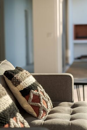
2. How Warm Tones Create Coziness
Warm tones—think reds, yellows, and oranges—have a special way of transforming a space into a welcoming haven. These colors mimic the natural hues of sunlight and fire, making them ideal for evoking feelings of comfort and relaxation. Imagine stepping into a living room during fall: deep red throw pillows on a soft beige couch, golden light from a table lamp reflecting off burnt orange curtains, and a rustic wooden coffee table in the center. The entire atmosphere radiates warmth, inviting you to curl up with a good book or share stories with friends.
In classic American kitchens, warm tones are often found in honey-colored wood cabinets, sunflower yellow walls, or even a splash of red on barstools or decorative plates. These elements instantly make the heart of the home feel more approachable and lively—a space where families gather for Sunday breakfast or bake cookies during the holidays.
Common Settings Enhanced by Warm Tones
| Setting | Warm Tone Features | Mood Created |
|---|---|---|
| Fall Living Room | Burgundy throws, pumpkin-hued rugs, amber lighting | Inviting, snug, perfect for relaxing |
| Classic American Kitchen | Yellow walls, cherry wood cabinets, red accents | Cheerful, lively, family-focused |
| Café-Inspired Breakfast Nook | Terracotta tiles, mustard cushions, brass fixtures | Cozy, casual, energizing |
The psychological effects of these hues go beyond aesthetics. Red is known to stimulate conversation and appetite—no wonder it’s a favorite in dining areas. Yellow brings sunshine indoors, fostering positivity even on gloomy days. Orange combines the energy of red with the cheerfulness of yellow, creating an uplifting vibe that can transform any ordinary gathering into something memorable.
By thoughtfully incorporating warm tones into your décor—whether through accent walls, upholstery choices, or small accessories—you create spaces that feel lived-in and loved. It’s this sense of coziness that makes people want to linger longer, truly enjoying their time at home.
3. Chic Vibes: The Power of Cool Tones
When it comes to creating a chic, sophisticated atmosphere, nothing beats the subtle impact of cool tones. Colors like blues, greens, and purples have long been favored in American interior design for their ability to evoke a sense of tranquility and elegance. In modern apartments across cities like New York or Los Angeles, you’ll often find deep navy accent walls paired with crisp white trim, instantly elevating the space while keeping it calm and inviting.
Cool tones are also a staple in coastal-inspired décor—a look that’s become especially popular in American beach towns from Cape Cod to Malibu. Soft seafoam greens, gentle sky blues, and muted lavenders mimic the serene hues of the ocean and sky, bringing the refreshing feel of the coast indoors. These shades work beautifully with natural textures like light woods, linen fabrics, and rattan accents, creating a laid-back yet refined vibe.
Whether you’re designing a sleek city loft or a breezy suburban retreat, incorporating cool tones can help set the mood for relaxation and sophistication. Mix and match these hues in your living room through throw pillows, area rugs, or wall art for an effortless update. Even small touches—like a vase in emerald green or artwork featuring abstract blue patterns—can transform a space, making it feel more curated and polished without sacrificing comfort.
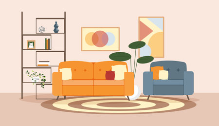
4. Mixing and Matching: Perfect Tone Combinations
Blending warm and cool tones is an art form that can elevate your space from predictable to magazine-worthy. To keep things cohesive, the key is balance and intentional contrast—think of it like creating a recipe where every ingredient plays a vital role. Let’s break down some practical strategies for mixing these tones, inspired by current American interior design trends.
Start with a Dominant Tone
Choose either warm or cool as your primary palette base. For example, if you’re drawn to the cozy charm of farmhouse style—a favorite across the U.S.—consider starting with warm neutrals like taupe or creamy white, then layer in cool accents through textiles or accessories.
Use the 70/30 Rule
A popular designer tip is the 70/30 rule: use about 70% of one tone (warm or cool) and 30% of the other. This ratio ensures one tone leads while the other supports, making the mix feel intentional rather than chaotic.
Popular Pairings Table
| Tone Combo | Main Elements | Accent Ideas | Design Style Reference |
|---|---|---|---|
| Warm Base + Cool Accents | Beige sofa, oak wood floors | Navy throw pillows, teal vases | Modern Farmhouse, Transitional |
| Cool Base + Warm Accents | Gray walls, slate tile | Rust orange rug, brass lamps | Mid-Century Modern, Urban Loft |
| Balanced Mix | Sage green cabinetry, walnut shelves | Cream ceramics, blush artwork | California Casual, Eclectic Boho |
Create Visual Flow with Patterns and Textures
Pepper in patterns and textures that bridge both warm and cool hues. For instance, a geometric rug combining soft blues (cool) and terracotta (warm) can tie together different elements in an open-concept living area. Layering materials—like pairing sleek metal fixtures (cool) with woven baskets (warm)—adds depth without overwhelming the senses.
Pro Tips for Cohesive Blending:
- Edit ruthlessly: Too many competing tones can feel cluttered; stick to a tight palette.
- Add natural greenery: Plants are neutral ground—they harmonize any scheme while adding freshness.
- Tie spaces together: Repeat at least one accent color throughout adjoining rooms for a seamless look.
- Pay attention to undertones: Even whites and grays have warm or cool casts—choose accordingly to avoid clashing.
Merging warm and cool tones is all about thoughtful curation. By following these tips and referencing popular American styles, you’ll create spaces that feel inviting yet modern—perfectly straddling the line between cozy and chic.
5. Lighting Matters: Enhancing Your Color Palette
When it comes to setting the perfect mood at home, lighting is just as crucial as your choice of paint or décor. The way colors appear in your living space can dramatically shift based on the type of lighting you use. In American homes, where open-concept layouts and large windows are common, understanding how natural and artificial light affect color temperature will help you fine-tune the vibe from cozy to chic.
Natural Light: The Great Revealer
Natural sunlight brings out the truest tones in your color palette. North-facing rooms tend to feel cooler and can enhance blues and greens, while south-facing spaces bathe everything in a warm glow, making reds and oranges pop. If you want a balanced look throughout the day, choose paint samples and fabrics that look good in both bright daylight and overcast conditions—a tip especially helpful for homes with big windows or skylights.
LED Lights: Modern Versatility
Many U.S. households have switched to LED bulbs for their energy efficiency, but LEDs come in a wide range of color temperatures. “Daylight” LEDs (5000K-6500K) highlight cool tones, giving your space a crisp, contemporary feel—perfect for home offices or modern kitchens. For living rooms or bedrooms where you want warmth and relaxation, opt for “soft white” LEDs (2700K-3000K), which flatter cozy hues like beige, terracotta, or soft blush.
Soft White Bulbs: Cozy Ambiance
If curling up with a good book is your idea of the perfect night in, soft white bulbs are your best friend. They amplify warm tones and add an inviting ambiance that’s ideal for family rooms, dens, or anywhere you want to unwind after a long day. These bulbs pair beautifully with rustic décor or farmhouse-inspired interiors that are so popular across the U.S.
Tips for Tailoring Lighting to Your Lifestyle
Layering different light sources—like overhead fixtures, table lamps, and sconces—lets you easily shift from functional brightness during busy mornings to a softer ambiance for evening relaxation. Use dimmers wherever possible; they’re widely available in U.S. hardware stores and let you adjust intensity based on time of day or mood. Finally, always test paint swatches under various lights before committing; what looks chic under store lights may feel too stark or too cozy at home.
6. Quick Fixes: Easy Decor Ideas for Any Room
Looking to refresh your space without a complete overhaul? Small changes can make a big impact, especially when you play with both warm and cool tones. Here are some easy, budget-friendly ideas that work in any room—plus, you can find everything from major U.S. retailers like Target, Walmart, HomeGoods, and Wayfair.
Throw Pillows: Mix & Match
Swap out your throw pillows for instant style. Choose plush velvet or knit pillows in warm hues like burnt orange or mustard for a cozy vibe on your sofa or bed. To balance it out and add a chic touch, mix in a few cool-toned pillows—think deep blues or soft grays. Don’t be afraid to play with patterns; geometric prints in cool tones can elevate an otherwise neutral setup.
Rugs: Ground Your Space
An area rug is a quick way to change the mood of any room. For warmth, opt for earthy reds or golden yellows; these look great in living rooms and bedrooms alike. If you want a more modern, breezy feel, try rugs in shades of navy, teal, or icy blue. Layering two smaller rugs—a warm one over a cool base—can create depth and visual interest.
Wall Art: Express Yourself
Art instantly personalizes your space. Pick up canvas prints or framed posters featuring warm landscapes or abstract art with bold oranges and reds for energy. For something calming, look for coastal scenes or minimalist pieces in soothing blues and greens. Stores like Michaels and local online sellers on Etsy offer tons of options that ship nationwide.
Lamps & Lighting: Set the Mood
Lighting is often overlooked but makes a huge difference. Add table lamps with terracotta or gold bases for warmth, or go with sleek chrome or glass fixtures for a cool touch. Bulbs also matter—soft white gives off cozy vibes, while daylight bulbs feel crisp and chic.
Little Details Matter
Don’t forget about the small stuff! Warm-toned vases, candle holders, or picture frames add personality to shelves and coffee tables. Cool-toned trays or decorative bowls can tie together your entryway or dining table.
The best part? You don’t have to choose one side—mixing warm and cool accents creates balance and allows you to update your home’s look seasonally or whenever the mood strikes. With accessible options all across the U.S., making these simple changes is just a shopping trip (or online order) away!