Understanding Accent Colors in Modern Design
When it comes to crafting inviting, inspiring spaces, accent colors play a pivotal role in both interior and graphic design. But what exactly are accent colors, and why do they matter? In simple terms, accent colors are bold or contrasting hues used sparingly to add interest and energy to a space or visual composition. While the main color palette provides harmony and balance, accent colors serve as the spark that brings a room or design to life. Designers carefully select these shades to highlight architectural features, draw attention to key elements, or break up monotony within a color scheme. In modern American homes and branding, accent colors can be found in throw pillows, artwork, statement furniture, or even digital buttons and logos. Their strategic use is essential for creating environments that not only look visually appealing but also feel dynamic and emotionally engaging. Ultimately, accent colors are more than just decorative touches—they shape how we experience and connect with the spaces around us.
Color Psychology 101: The Emotional Impact of Color
When it comes to shaping the mood and ambiance of a space, color holds undeniable power. Whether youre updating your living room or designing a new office, understanding how color influences our emotions is key to making thoughtful choices—especially when it comes to accent colors. Color psychology explores the way different hues evoke specific feelings, behaviors, and even physiological responses. In American interior design, these principles are often used to create spaces that feel welcoming, energetic, calming, or sophisticated depending on their purpose.
Let’s break down some of the most common accent colors and the emotional associations they tend to trigger:
| Accent Color | Emotional Response | Common Use in Interiors |
|---|---|---|
| Blue | Calm, Trust, Serenity | Bedrooms, Bathrooms, Offices |
| Yellow | Energy, Optimism, Warmth | Kitchens, Entryways |
| Green | Balance, Renewal, Freshness | Living Rooms, Home Offices |
| Red | Passion, Excitement, Urgency | Dining Rooms, Accent Walls |
| Orange | Enthusiasm, Creativity, Fun | Kitchens, Playrooms |
| Purple | Luxe, Calmness, Creativity | Bedrooms, Creative Studios |
The emotional impact of color isn’t just theory—it’s something we experience daily. For example, a pop of yellow in an entryway can make guests feel instantly welcomed and uplifted. On the other hand, a deep blue accent wall in a bedroom helps set a tranquil vibe that encourages relaxation. By learning the basics of color psychology and how different hues can shape our moods and perceptions, you’ll be better equipped to use accent colors intentionally in your own spaces.
3. Choosing Accent Colors: What Works for Different Spaces
When it comes to creating the right mood and ambiance in your home, choosing accent colors that fit each space’s purpose is key. Accent colors aren’t just about style—they help define how a room feels and functions. For American homes, where open layouts and multi-use spaces are common, picking the right pop of color can elevate comfort and productivity.
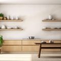
Living Rooms: Welcoming and Social
The living room is often the heart of the home, a place for relaxing, entertaining, and gathering with family or friends. Warm accent colors like burnt orange, mustard yellow, or soft terracotta can create a cozy, inviting atmosphere. If you prefer a modern touch, deep navy or emerald green accents add sophistication without overpowering the space. The goal is to encourage conversation and comfort—think throw pillows, area rugs, or an accent wall for that perfect welcoming vibe.
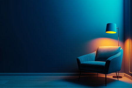
Bedrooms: Calm and Restful
Bedrooms call for a more tranquil ambiance. Cool accent colors such as muted blues, sage green, or lavender are ideal choices for promoting relaxation and restful sleep. These shades work beautifully on bedding, curtains, or small decor items. Soft neutrals paired with these calming tones help set the scene for winding down at night—a must-have in today’s fast-paced lifestyle.
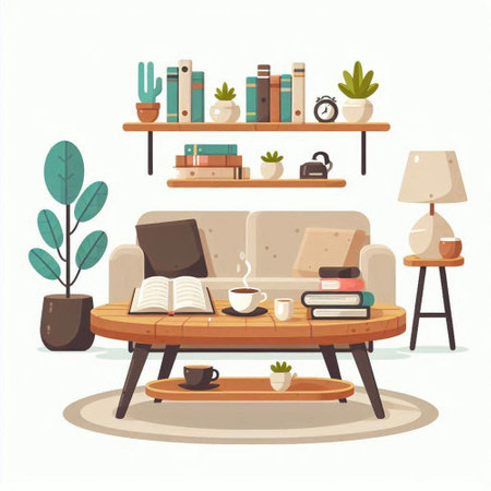
Workspaces: Focused and Energizing
Whether you have a dedicated home office or a small nook for productivity, accent colors here should support concentration and motivation. Pops of energetic colors like teal, sunny yellow, or vibrant green can boost creativity and alertness without causing distraction. Consider adding these hues through desk accessories, storage bins, or artwork. In American culture—where remote work is increasingly common—these uplifting touches make your workspace both inspiring and functional.
Balancing Color with Purpose
The psychology of accent colors means not every shade works everywhere. Understanding the function of each room helps you select accents that not only look good but also feel right. When you align color choices with ambiance goals—welcoming in the living room, soothing in the bedroom, energizing in the workspace—you create harmonious interiors that support both well-being and daily life.
4. Cultural Considerations: How America Sees Color
Accent colors have a unique psychological impact, but in the United States, their meaning and effect can vary widely depending on cultural perspectives and even regional preferences. While certain colors may universally evoke similar feelings—like blue being calming or red being energizing—their use as accent colors in American homes or commercial spaces often reflects deeper cultural influences. For example, Americans might associate green with eco-friendliness and health, while gold could be linked to luxury or achievement, shaped by national holidays, history, and popular culture.
Regional Preferences Across the U.S.
America’s vast geography means color preferences can shift dramatically from coast to coast. Urban environments on the East Coast might favor cooler accent tones like navy or steel blue for a sophisticated vibe, while Southwestern interiors often embrace warm accents such as terracotta or turquoise, reflecting local landscapes and heritage. In the Pacific Northwest, earthy greens and grays are common, mirroring the natural environment and values of sustainability.
Common Accent Colors and Their Regional Associations
| Region | Popular Accent Colors | Cultural Associations |
|---|---|---|
| Northeast | Navy Blue, Burgundy | Sophistication, Tradition |
| Southwest | Terracotta, Turquoise | Warmth, Heritage, Nature |
| Midwest | Sunflower Yellow, Rustic Red | Hospitality, Comfort, Farm Life |
| West Coast | Seafoam Green, Coral | Relaxation, Creativity, Modernity |
| Pacific Northwest | Moss Green, Slate Gray | Sustainability, Calmness |
The Influence of American Holidays and Traditions
American holidays and traditions also play a significant role in how accent colors are perceived. For instance, red and green dominate during the winter holiday season and are associated with warmth and festivity. Orange is a popular accent in autumn due to Halloween and Thanksgiving. These associations influence how people feel about using these colors in their daily environments—sometimes making them seasonal favorites rather than year-round choices.
Understanding these regional and cultural nuances is essential for anyone looking to create an ambiance that feels both inviting and locally resonant. Whether designing a home or a retail space, recognizing how accent colors are seen through the lens of American culture ensures that your color choices truly support the mood you aim to achieve.
5. Eco-Friendly Choices for Accent Colors
As awareness of environmental impact grows, more Americans are seeking sustainable ways to add accent colors to their homes. Choosing eco-friendly options isn’t just about protecting the planet—it also creates a healthier living space for you and your family. Traditional paints and finishes often contain volatile organic compounds (VOCs) that can negatively affect mood, air quality, and overall well-being. Instead, look for non-toxic, low-VOC, or zero-VOC paints when selecting your accent colors. Brands like Benjamin Moore’s Natura or Sherwin-Williams Harmony offer vibrant hues without the harsh chemicals, allowing you to set the right tone in a space while caring for your health and the environment.
Beyond paint, consider incorporating accent colors through sustainable decor choices. Reclaimed wood shelves painted in rich, earthy tones, upcycled furniture with pops of color, or textiles made from organic cotton or recycled materials can all add personality and warmth. These eco-conscious accents not only support mood-boosting color psychology but also reflect a mindful approach to design—one that values both style and sustainability.
Ultimately, choosing green design solutions for your accent colors means every brushstroke and decor piece contributes to a positive ambiance. It’s a simple way to make your home feel uplifting and uniquely yours while embracing responsible living—an approach that’s increasingly important in American homes today.
6. Real-Life Examples: Transforming Mood with Accents
Accent colors aren’t just a theory—they have made noticeable impacts in the world of American interior design and business environments. Let’s explore how real-life homes and businesses across the United States use accent colors to shape mood and atmosphere.
Modern Farmhouse Living Rooms
In many popular American homes, especially those inspired by the modern farmhouse trend, designers often incorporate navy blue or deep green accents through throw pillows, area rugs, or feature walls. These hues introduce a sense of calm and grounded energy to living spaces that might otherwise feel overly neutral or sterile. Homeowners frequently report that these accent choices create a welcoming ambiance that invites relaxation and conversation.
Coffee Shops and Co-Working Spaces
Across cities like Portland, Austin, and Seattle, independent coffee shops leverage cheerful yellows or lively corals as accent colors—on chairs, mugs, or art pieces—to spark creativity and boost customers’ moods. Similarly, co-working spaces in tech hubs favor pops of energetic teal or orange against a backdrop of clean whites and grays. Business owners note increased customer satisfaction and engagement when these accent palettes are thoughtfully applied.
Retail Stores: Inviting Browsing with Color
Major retail brands in the U.S., such as Target or boutique clothing stores, use carefully selected accent colors to encourage shoppers to linger. A splash of red on signage or fitting room doors energizes the space and can subtly prompt action—like making a purchase—while soft lavender displays in beauty sections promote a sense of luxury and calm.
Case Study: The Eco-Friendly Office
A San Francisco-based sustainable design firm transformed their workspace using nature-inspired accent colors: leafy green meeting rooms foster focus and rejuvenation, while sunlit yellow break areas support positivity during busy days. Employees reported feeling more inspired and less fatigued—a testament to the power of strategic color choices in everyday settings.
The Takeaway
From cozy homes to bustling businesses, these real-world examples show how accent colors are more than decorative details—they’re tools for shaping our experiences and emotions within a space. By observing how American designers apply them, we can see tangible proof of their psychological influence on mood and ambiance.
7. Tips for Experimenting with Accent Colors at Home
Bringing the psychology of accent colors into your home doesn’t have to mean a total makeover or unnecessary waste. You can easily refresh your space and influence the mood without committing to permanent changes. Here are some practical, eco-friendly ideas:
Start Small and Flexible
Begin by introducing accent colors through easily changeable items like throw pillows, blankets, or area rugs. These pieces let you experiment with different shades and swap them out seasonally or whenever you crave a new vibe.
Use Art and Decorative Objects
Wall art, vases, and picture frames are perfect for playing with accent colors. They add personality and can be moved between rooms, helping you find the right balance without creating waste.
Go Green—Literally
Plants are a wonderful way to introduce pops of color while also improving indoor air quality. Choose planters in your chosen accent hue for an added design boost that’s both natural and sustainable.
Test With Paint Samples
If you’re considering painting an accent wall, try sample pots first. Paint a small area or even use removable wallpaper to see how the color feels at different times of day before making any big decisions.
Switch Up Soft Goods
Bedding, curtains, and table linens offer another low-commitment avenue to test accent colors. Opt for organic or recycled materials to keep things environmentally friendly.
Repurpose and Upcycle
Breathe new life into old furniture with a fresh coat of paint in your chosen accent color, or reupholster chairs using leftover fabric. This not only reduces waste but gives your home a unique, personal touch.
Trust Your Instincts
The beauty of experimenting is that there are no hard rules—trust how certain colors make you feel in your space. Make gradual changes, observe the impact on your mood and ambiance, and adjust as needed until your home feels just right.