Introduction to Color Theory in American Interiors
Color is one of the most powerful tools in interior design, shaping not only the visual appeal but also the atmosphere of a space. In American interiors, designers often rely on a thoughtful mix of bold and neutral hues to strike the perfect balance between energy and comfort. Understanding color theory—the way colors interact, complement, or contrast with one another—lays the groundwork for successful design decisions. By mastering these principles, you can create inviting, stylish rooms that feel both contemporary and timeless. Whether it’s a splash of vibrant blue against creamy whites or earthy neutrals paired with pops of mustard or emerald, American homes celebrate individuality while maintaining harmony. This approach allows homeowners to express their personalities while embracing a sense of warmth and welcome unique to modern American living.
Bold Colors: Adding Personality and Energy
Across the United States, bold colors are more than just a design trend—theyre an invitation to express individuality and create vibrant, memorable interiors. From sun-drenched yellows in a California kitchen to daring navy accent walls in a Brooklyn loft, Americans use vivid hues as tools to highlight focal points, infuse personality, and make powerful design statements. Bold colors can transform a simple room into a dynamic space that reflects personal taste and lifestyle. Whether it’s a cheerful turquoise entryway or a dramatic emerald green sofa, these choices help define the mood and purpose of each space.
How Americans Incorporate Bold Colors at Home
American homeowners often use bold colors strategically rather than saturating entire rooms. Accent walls, statement furniture pieces, and colorful décor items are popular methods for introducing energy without overwhelming the senses. This approach ensures that bold hues remain inviting and balanced within the overall interior scheme.
Popular Ways to Use Bold Colors
| Application | Examples | Benefits |
|---|---|---|
| Accent Walls | Deep blue behind the bed, terracotta in the dining room | Creates a strong focal point; adds depth |
| Statement Furniture | Crimson velvet sofa, canary yellow armchair | Infuses personality; anchors the room visually |
| Artwork & Décor | Colorful abstract paintings, patterned pillows | Easily updated; introduces trends without commitment |
| Kitchens & Bathrooms | Cobalt blue cabinets, coral backsplash tiles | Adds playfulness to functional spaces; unexpected flair |
The Impact of Bold Colors on Interior Atmosphere
Choosing bold colors isn’t just about aesthetics—it’s about emotion and atmosphere. Warm shades like red and orange encourage conversation and energy, making them perfect for social spaces. Cooler tones like teal or indigo promote relaxation while still feeling modern and fresh. By thoughtfully mixing these lively hues with neutral backdrops, American homes achieve both vibrancy and harmony—creating places that feel authentically personal yet naturally balanced.

3. Embracing Neutrals for Calm and Versatility
Neutrals are the unsung heroes of interior design, especially in American homes where comfort and adaptability take center stage. Shades like soft whites, warm beiges, gentle grays, and earthy taupes create a soothing backdrop that allows your living spaces to breathe. These calming colors not only foster a sense of tranquility but also visually expand rooms, making them feel more open and inviting—a key consideration for both cozy apartments and spacious family houses across the country.
One of the greatest strengths of neutral palettes is their flexibility. They serve as a blank canvas for personal expression, allowing you to introduce bold accents without overwhelming the space. In addition, neutrals effortlessly adapt to changing seasons and trends, so your home always feels fresh yet timeless. Whether you’re layering textures with linen sofas or pairing wood finishes with creamy walls, these hues bring subtle sophistication and unity to any interior.
By thoughtfully incorporating neutrals into your design, you lay a solid foundation for mixing in vibrant pops of color or eye-catching accessories later on. This approach not only keeps your space feeling balanced but also makes it easy to update over time—perfect for American lifestyles that value both style and practicality.
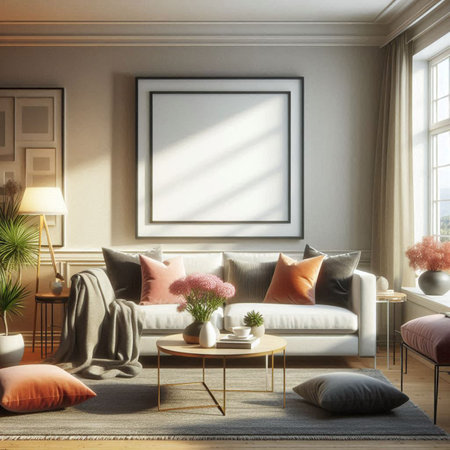
4. Strategies for Mixing Bold and Neutral Tones
Creating a harmonious blend of bold and neutral colors in interior design is all about balance, intention, and a touch of creativity. Whether you’re aiming for a cozy living room or an energizing workspace, using both vibrant hues and subtle shades can elevate your home’s atmosphere while reflecting your personality. Here are some practical strategies for mixing bold and neutral tones that are both stylish and eco-conscious.
Accent Walls: The Art of Subtle Drama
One effective way to introduce bold colors without overwhelming your space is by painting an accent wall. Choose a rich hue—like deep emerald green or navy blue—to highlight one wall while keeping the others neutral. This technique adds depth and visual interest, making your room feel dynamic yet grounded. For a sustainable option, consider using low-VOC or recycled-content paints that are better for indoor air quality and the environment.
Statement Furniture: Let Your Pieces Speak
Bold-colored furniture pieces—such as a mustard-yellow sofa or a teal armchair—can serve as eye-catching focal points. Pair them with neutral backdrops (think soft grays, whites, or earth tones) to ensure the statement piece stands out without clashing. Not only does this approach create visual intrigue, but opting for sustainably sourced materials or vintage finds also supports eco-friendly living.
Eco-Friendly Décor Choices
Mixing bold and neutral colors doesn’t stop at paint and furniture. Accessories like throw pillows, rugs, and art prints offer opportunities to layer in color thoughtfully. When possible, select items made from organic fabrics, recycled materials, or locally crafted goods to minimize your environmental footprint.
Quick Reference Guide: Blending Bold & Neutral Colors
| Technique | Bolder Color Example | Neutral Pairing | Sustainable Tip |
|---|---|---|---|
| Accent Wall | Cobalt Blue | Warm Beige | Low-VOC Paints |
| Statement Furniture | Rust Orange Sofa | Soft Gray Rug | Reclaimed Wood Frame |
| Textiles & Accessories | Lime Green Throw Pillows | Cream Linen Couch | Organic Cotton Covers |
| Artwork & Decor Items | Burgundy Abstract Prints | Sandy White Walls | Locally Made Art Pieces |
The Takeaway: Balance with Intention
By combining bold accents with calming neutrals—and considering eco-friendly choices—you can create spaces that feel fresh, inviting, and mindful of our planet. Remember, it’s not just about color; it’s about crafting an environment that supports well-being and sustainability.
5. Regional and Cultural Influences in Color Preferences
When it comes to mixing bold and neutral colors in interior design, regional and cultural influences across the United States play a significant role in shaping distinctive color palettes. The diverse geography and rich heritage of America are reflected in the way people decorate their homes, creating unique interpretations of balance between vibrant hues and calming neutrals.
East Coast Elegance
On the East Coast, especially in cities like New York and Boston, there’s an affinity for classic, sophisticated color schemes. Interiors often feature crisp whites, deep navies, and rich grays as a neutral foundation, accented with bold pops of emerald green or burgundy. This approach draws from the region’s colonial history and urban energy, blending tradition with modern flair.
West Coast Relaxed Vibes
In contrast, West Coast interiors—think California and Oregon—embrace a laid-back, nature-inspired palette. Soft sandy beiges, warm taupes, and creamy whites serve as soothing backdrops for lively shades like ocean blues or sun-kissed terracottas. The influence of coastal landscapes and multicultural communities encourages mixing bold statement pieces with earthy neutrals for effortless harmony.
The Southwest’s Vibrant Heritage
The American Southwest celebrates its desert roots with a fearless use of color. Terracotta oranges, turquoise blues, and sun-baked reds are paired with muted adobe tones to reflect the area’s Native American and Hispanic influences. Here, bold colors aren’t just accents—they’re integral to expressing the region’s identity while maintaining visual balance through grounding neutrals.
Cultural Diversity Across America
America’s melting pot of cultures further diversifies color preferences. African American households may incorporate rich jewel tones layered over soft grays or creams, inspired by heritage textiles. Asian American homes might blend minimalist neutrals with strategic bursts of red or jade green for luck and prosperity. Latinx families often embrace lively yellows or cobalt blues balanced with calming whites or tans. These cultural traditions infuse personal meaning into design choices, proving that mixing bold and neutral colors is not just about style—it’s a reflection of community and heritage.
Eco-Friendly Choices: Sustainable Paints and Materials
When mixing bold and neutral colors in your home, it’s important to think about the impact of your choices—not just on style, but also on the environment. Choosing eco-friendly materials is an easy way to support both a healthy planet and a healthier lifestyle.
Low-VOC Paints: A Cleaner Way to Add Color
If you’re looking to make a statement with bold accent walls or refresh your space with calming neutrals, opt for low-VOC (volatile organic compounds) or zero-VOC paints. These paints release fewer chemicals into the air, making your indoor environment safer for you, your family, and even pets. Many American brands now offer a wide range of vibrant and muted shades in eco-conscious formulas—so you never have to sacrifice style for sustainability.
Sustainable Soft Furnishings
Textiles are another area where you can embrace eco-friendly choices. Look for curtains, rugs, pillows, and throws made from organic cotton, linen, hemp, or recycled fibers. These natural materials not only pair beautifully with both bold and neutral palettes, but they also reduce your home’s environmental footprint. Consider supporting local artisans or American-made brands that prioritize fair labor practices and responsible sourcing.
Eco-Chic Accessories
Even the small accents matter when achieving balance in interior design. Choose décor items like baskets, lampshades, or planters crafted from renewable resources such as bamboo, jute, or reclaimed wood. These pieces add warmth and texture while staying true to environmentally friendly values.
Creating a Healthy & Stylish Home
The beauty of mixing bold and neutral colors is that it gives you endless creative freedom—and choosing sustainable materials adds another thoughtful layer to your design story. By highlighting environmentally conscious selections throughout your space, you create a stylish home that reflects modern American values: mindful living, health, and lasting comfort.
7. Conclusion: Finding Your Unique Balance
At the end of the day, mixing bold and neutral colors in your home is all about expressing who you are and what matters most to you. There’s no one-size-fits-all formula—your space should tell your story. Start by reflecting on your lifestyle, your favorite hues, and how you want your home to feel for both yourself and your guests. Don’t be afraid to try out unexpected combinations or layer different textures and materials for added depth. Remember, balance doesn’t mean everything has to be perfectly symmetrical; it means creating a comfortable atmosphere where every color choice feels intentional and authentic.
Personalizing your space with a mix of bold statements and calming neutrals allows you to cultivate an environment that feels welcoming and genuinely yours. Consider incorporating sustainable materials, vintage finds, or handcrafted pieces that not only support eco-friendly living but also add character and meaning to your design. By making thoughtful color decisions, you can create a home that reflects your values—whether that means a lively gathering spot filled with energy or a serene retreat for relaxation.
Ultimately, let your intuition guide you as you experiment with color. Trust your instincts, have fun with the process, and remember that the best spaces are those that make you feel truly at home. With mindful choices and a willingness to explore, you’ll find the perfect balance that turns your house into a reflection of your unique style and spirit.