1. Understanding Modern Kitchen Color Trends
When designing a modern kitchen, selecting the right color palette is crucial to achieving a sleek and stylish look. The latest trends in kitchen colors focus on creating a balance between aesthetics and functionality, ensuring that your space feels inviting while maintaining a contemporary appeal.
Popular Modern Kitchen Color Schemes
Modern kitchens often feature a mix of neutral tones, bold accents, and natural hues. These combinations help create a clean and sophisticated environment. Below are some popular color schemes used in contemporary kitchen designs:
| Color Scheme | Description |
|---|---|
| Neutral Tones | Shades like white, gray, and beige provide a timeless and elegant foundation. |
| Bold Accents | Pops of deep blue, emerald green, or mustard yellow add personality and contrast. |
| Earthy Hues | Tones like terracotta, olive green, and warm browns bring warmth and a natural touch. |
| Monochromatic Styles | A single-color scheme with varying shades creates depth and sophistication. |
The Role of Color in Contemporary Design Aesthetic
The right color palette enhances the overall design aesthetic of a modern kitchen by influencing mood, perception of space, and functionality. Heres how different colors contribute to a contemporary look:
- Lighter shades: Make the space feel more open, airy, and spacious.
- Darker tones: Add depth and drama for a bold statement.
- Naturally inspired colors: Create a calming atmosphere with organic elements.
- Pops of vibrant hues: Infuse energy and personality into the kitchen.
The Influence of Materials on Color Perception
The materials used in cabinetry, countertops, and backsplashes can impact how colors appear in your kitchen. Matte finishes tend to soften colors for a subtle look, while glossy surfaces enhance brightness and reflection. Natural materials like wood or stone introduce texture that can complement or contrast with your chosen color palette.
Selecting the Right Colors for Your Space
Your choice of colors should align with your personal style while considering current trends. Whether you prefer a minimalist approach with neutral tones or enjoy experimenting with bold hues, selecting the right combination will ensure your kitchen remains stylish and functional for years to come.
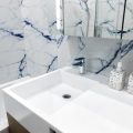
2. Neutral Tones: A Timeless Foundation
Neutral colors are a staple in modern kitchen design, offering a clean and timeless backdrop that complements various styles. Shades like white, gray, and beige create a versatile foundation, allowing you to experiment with different materials, textures, and accent colors.
Why Choose Neutral Colors?
Neutral tones provide a balanced and sophisticated look while maintaining flexibility in your kitchen design. They make the space feel open, bright, and inviting. Whether you prefer a sleek contemporary aesthetic or a cozy farmhouse vibe, neutral shades can adapt seamlessly.
Popular Neutral Shades for Modern Kitchens
| Color | Description | Best Pairings |
|---|---|---|
| White | A classic choice that enhances brightness and cleanliness. | Wood accents, black hardware, marble countertops |
| Gray | A versatile shade that ranges from soft dove gray to deep charcoal. | Navy blue cabinets, brass fixtures, concrete surfaces |
| Beige | A warm neutral that adds subtle coziness without overpowering the space. | Natural wood tones, cream-colored backsplashes, matte black finishes |
How to Incorporate Neutrals in Your Kitchen
- Cabinetry: Opt for white or light gray cabinets for a fresh and airy feel.
- Counters & Backsplashes: Use neutral-toned quartz or marble to maintain an elegant look.
- Walls & Flooring: Soft beige or light gray walls pair well with wood or stone flooring.
- Accents & Decor: Introduce texture through wooden shelves, metal fixtures, and subtle pops of color in accessories.
A neutral color palette serves as the perfect canvas for creating a stylish and adaptable kitchen. By carefully selecting complementary elements, you can achieve a space that feels both modern and timeless.
3. Bold Accents: Adding Personality to Your Space
When designing a modern kitchen, incorporating bold accent colors can bring depth and personality to the space. While neutral tones provide a clean and timeless foundation, strategic pops of color can make your kitchen feel more dynamic and visually engaging.
Why Use Bold Accent Colors?
Accent colors help create contrast, draw attention to key features, and add a touch of uniqueness to your kitchen design. Whether used on cabinetry, backsplashes, or decor elements, these shades can make a significant impact without overwhelming the entire space.
Popular Bold Accent Colors for Modern Kitchens
| Color | Effect on Kitchen Design |
|---|---|
| Deep Blue | Adds sophistication and pairs well with white or light gray elements. |
| Emerald Green | Brings a fresh, natural feel while complementing wood tones and brass hardware. |
| Matte Black | Cultivates a sleek, modern aesthetic and contrasts beautifully with lighter surfaces. |
How to Incorporate Bold Accents
Cabinetry
If youre looking for a dramatic change, consider painting lower cabinets in deep blue or emerald green while keeping upper cabinets neutral. This creates balance while still allowing the bold color to shine.
Backsplash & Countertops
A bold backsplash in a striking hue can serve as a focal point in your kitchen. Alternatively, choosing countertops with subtle veining in complementary colors can subtly tie everything together.
Furniture & Decor
If you prefer flexibility, introduce bold accents through barstools, pendant lights, or small appliances. These elements can be easily swapped out if you decide to update the look later.
Fixtures & Hardware
Add contrast by selecting matte black faucets, cabinet handles, or lighting fixtures. These details enhance the contemporary appeal without overpowering the space.
4. Material and Finish Coordination
Creating a cohesive modern kitchen color palette goes beyond just selecting paint colors—it also involves coordinating materials and finishes. The right combination of cabinetry, countertops, and backsplashes can enhance the overall aesthetic and ensure a seamless, contemporary look.
Choosing Cabinetry Colors and Finishes
Cabinetry is one of the most prominent features in a kitchen, so its color and finish play a significant role in setting the tone. Here are some popular modern choices:
| Finish Type | Description | Best Color Pairings |
|---|---|---|
| Matte | Sleek, non-reflective surface that offers a soft, sophisticated look. | Neutral shades like white, gray, or deep navy for a modern feel. |
| Glossy | A high-shine finish that reflects light, making spaces feel larger. | Bolder colors like black or dark green combined with metallic accents. |
| Wood Grain | A natural finish that adds warmth and texture to the space. | Lighter wood tones pair well with white or soft pastels for a Scandinavian look. |
Selecting Countertops That Complement Your Palette
Your countertop choice should balance aesthetics and functionality. Consider these options:
- Quartz: Available in various hues with subtle veining, quartz pairs well with both bold and neutral cabinetry colors.
- Marble: A timeless option featuring natural patterns that work beautifully with minimalist color schemes.
- Concrete: Ideal for an industrial-modern vibe, concrete countertops complement darker cabinetry tones.
- Butcher Block: A warm, natural option that works well with white or muted pastel cabinets.
The Role of Backsplashes in Tying Everything Together
The backsplash acts as a bridge between your cabinetry and countertops. Choose materials and colors that enhance the entire kitchen design:
- Sleek Subway Tiles: White subway tiles offer a classic yet modern touch that pairs well with almost any color scheme.
- Mosaic Tiles: Great for adding texture and depth when using neutral-toned cabinets and countertops.
- Natural Stone Slabs: A continuous stone slab creates a luxurious and seamless appearance that enhances minimalistic kitchens.
- Matted Glass Panels: A contemporary choice that reflects light subtly while maintaining an ultra-modern aesthetic.
Tips for Achieving a Cohesive Look
A well-coordinated modern kitchen blends different elements harmoniously. Keep these tips in mind:
- Create Contrast Wisely: If you have dark cabinets, opt for lighter countertops to maintain balance.
- Add Texture Through Finishes: Mix matte and glossy surfaces to create depth without overwhelming the space.
- Select a Unifying Element: Whether it’s metallic hardware or a specific accent color, use it consistently across different materials.
The right material and finish coordination can transform your kitchen into a sleek, stylish space while ensuring all elements work together effortlessly. By carefully selecting cabinetry finishes, countertops, and backsplashes that complement each other, you can achieve a truly modern aesthetic.
5. Lighting and Its Impact on Color Perception
Lighting plays a crucial role in how colors appear in your modern kitchen. The same paint color can look entirely different under natural daylight, warm incandescent bulbs, or cool LED lights. Understanding these variations will help you choose the right shades and create the perfect ambiance.
How Different Types of Lighting Affect Colors
Each type of lighting affects colors differently. Heres a quick comparison:
| Lighting Type | Effect on Colors |
|---|---|
| Natural Daylight | Shows the truest color but changes throughout the day. |
| Warm Incandescent | Enhances warm tones (reds, yellows) and mutes cooler shades. |
| Cool LED | Brings out cooler tones (blues, grays) and can make warm colors look dull. |
| Fluorescent | Tends to add a greenish or bluish tint to colors. |
Tips for Optimizing Lighting in Your Kitchen
Use Layered Lighting
A combination of ambient, task, and accent lighting ensures that your kitchen colors look great in all situations. Consider pendant lights over islands, under-cabinet lighting for workspaces, and recessed lighting for overall brightness.
Test Paint Samples Under Different Lights
Before committing to a color, test samples on your walls and observe them at different times of the day under various lighting conditions. This helps prevent surprises once the kitchen is fully painted.
Choose Adjustable LED Bulbs
Dimmable LEDs with adjustable color temperatures allow you to change the warmth or coolness of your kitchen’s lighting based on your preference and time of day.
Balance Natural Light
If your kitchen has large windows, take advantage of natural light but be mindful of how it shifts throughout the day. Use sheer curtains or blinds to control excessive brightness while maintaining a natural glow.
By considering how lighting influences color perception, you can ensure your modern kitchen looks exactly as you envisioned—whether bathed in morning sunlight or illuminated by sleek pendant lights in the evening.
6. Creating a Balanced and Functional Color Palette
Choosing the right color palette for your modern kitchen isnt just about aesthetics; its also about creating a space that feels inviting, functional, and cohesive. A well-balanced color scheme helps enhance the overall design while ensuring practicality in daily use. Here are some expert tips to help you achieve the perfect balance.
Understanding Color Balance in a Modern Kitchen
A balanced kitchen color palette involves a mix of primary, secondary, and accent colors. The goal is to create harmony while allowing certain elements to stand out. Heres a simple way to distribute colors effectively:
| Color Type | Purpose | Examples |
|---|---|---|
| Primary Color | Main background shade used for walls or cabinets | White, Light Gray, Soft Beige |
| Secondary Color | Adds depth and contrast, often seen on countertops or backsplashes | Navy Blue, Charcoal Gray, Warm Taupe |
| Accent Color | Pops of color that bring personality and vibrancy | Moss Green, Deep Blue, Burnt Orange |
Selecting Colors for Both Style and Functionality
The colors you choose should not only look great but also be practical for everyday use. For example:
- Lighter shades: Make the space feel open and airy but may require more frequent cleaning.
- Darker hues: Add drama and sophistication but can make smaller kitchens feel compact.
- Neutral tones: Offer timeless appeal and flexibility for future updates.
- Pops of bold colors: Bring energy and personality without overwhelming the space.
Tying Everything Together with Finishes and Textures
A modern kitchen isnt just about color—it’s also about how finishes and textures interact with those colors. Consider these combinations:
- Satin or matte cabinet finishes: Work well with soft neutrals for a sleek, modern appearance.
- Glossy backsplashes: Reflect light and add depth, making darker colors appear more dynamic.
- Naturally textured materials: Wood grains or stone surfaces introduce warmth to cooler color schemes.
Avoiding Common Mistakes When Choosing a Kitchen Palette
The wrong color choices can make even a well-designed kitchen feel off-balance. Here’s what to avoid:
- Lack of contrast: Using all similar shades can make the space feel flat—mix light and dark tones for depth.
- Narrowing your options too early: Test multiple shades under different lighting conditions before finalizing your choices.
- Ignoring the bigger picture: Ensure your kitchens color palette complements adjoining spaces for a seamless flow.
A well-balanced kitchen color palette combines aesthetics with functionality, making it both visually appealing and practical for daily life. By carefully selecting primary, secondary, and accent colors while considering finishes and textures, you can create a modern kitchen that looks stunning and serves your needs effortlessly.