1. Understanding Warm and Cool Colors
When designing a space that feels timeless, it’s important to understand the basics of warm and cool colors. These two color families play a major role in setting the mood and atmosphere of any room, especially in American interiors where comfort and versatility are highly valued.
What Are Warm and Cool Colors?
Warm colors are hues that remind us of sunlight and heat. They include shades like red, orange, yellow, and variations of these tones. Cool colors, on the other hand, bring to mind water, sky, and nature. These include blues, greens, purples, and their variations.
Common Examples in American Interiors
| Warm Colors | Typical Uses | Cool Colors | Typical Uses |
|---|---|---|---|
| Beige | Living rooms, bedrooms for cozy vibes | Sage Green | Kitchens, bathrooms for a fresh look |
| Terracotta | Entryways, accent walls for warmth | Navy Blue | Bedrooms, home offices for calmness |
| Soft Yellow | Kitchens for cheerful energy | Pale Gray | Living areas for a modern feel |
| Burgundy Red | Dens or dining rooms for richness | Powder Blue | Kids rooms or bathrooms for serenity |
The Psychological Effects of Color Choices
The colors you choose can change how a space feels without moving a single piece of furniture. Warm colors tend to make rooms feel inviting, energetic, and intimate—perfect for gathering spots like family rooms or kitchens. Cool colors usually create a sense of calm, spaciousness, and relaxation—great for bedrooms or bathrooms where you want to unwind.
How Warm and Cool Colors Shape Atmosphere
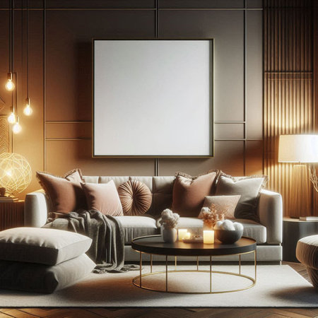
In American homes, blending both warm and cool colors is a popular way to keep spaces feeling balanced and welcoming. For example, pairing a navy blue sofa (cool) with gold throw pillows (warm) makes a living room feel lively but not overwhelming. Using these color families thoughtfully helps set the right tone for each area of your home while contributing to that sought-after timeless look.
2. Benefits of a Timeless Aesthetic
Why Timeless Interiors Stand the Test of Time
When you skillfully blend warm and cool colors, you create spaces that feel balanced and comfortable. In American homes, this balance is key to designing interiors that never go out of style. Here’s why timeless design remains popular across trends in the U.S.:
Adaptability to Changing Trends
Timeless interiors don’t tie themselves to one specific trend or era. By using both warm and cool tones, your home can easily adapt if you want to update accessories or switch up your décor later on. For example, swapping out throw pillows or wall art lets you freshen up your space without needing a complete makeover.
Longevity and Enduring Appeal
American homeowners value longevity in their investments. When you use a timeless color palette, your space looks beautiful year after year. The combination of warm and cool hues helps rooms avoid feeling dated, so you won’t have to redecorate every time styles change.
Value in American Homes
A timeless look adds value to your home because it appeals to a wide range of people. If you ever decide to sell, potential buyers are more likely to be attracted to spaces that feel inviting and well-balanced.
Key Benefits of a Timeless Aesthetic
| Benefit | Description |
|---|---|
| Adaptability | Easily updates with new accents or furniture, staying relevant through changing trends. |
| Longevity | Maintains visual appeal over the years, reducing the need for frequent redesigns. |
| Home Value | Makes properties more attractive to future buyers by appealing to broad tastes. |
The right mix of warm and cool colors creates harmony in any room, helping your home feel current but never trendy. This approach ensures comfort, beauty, and practicality for years to come.
3. Strategies for Mixing Warm and Cool Tones
Expert Techniques for a Balanced Palette
Blending warm and cool colors is a key strategy to create interiors that feel inviting yet fresh, offering a look that stands the test of time. American designers often use this approach to achieve versatility in living rooms, kitchens, and bedrooms. Here are some expert tips on how to successfully mix these tones:
1. Start With a Dominant Tone
Choose whether you want your space to feel warmer or cooler overall. For example, if you love a cozy vibe, start with warm neutrals like beige or taupe for your main elements (walls, flooring). If you prefer a crisp atmosphere, begin with cool grays or soft blues.
2. Use the 70/30 Rule
A popular American design trick is the 70/30 rule: let one color temperature dominate about 70% of your room, while the other makes up about 30%. This keeps the palette from feeling chaotic and helps maintain harmony.
| Room Element | Warm Color Example | Cool Color Example |
|---|---|---|
| Main Walls | Creamy Beige | Pale Blue |
| Sofa/Furniture | Taupe or Terracotta | Charcoal Gray or Navy |
| Accents (Pillows, Art) | Burnt Orange or Mustard Yellow | Sage Green or Teal |
3. Balance With Neutrals
Neutrals like white, gray, and natural wood tones are essential for bridging the gap between warm and cool hues. They soften transitions and prevent any single tone from overpowering the space.
4. Layer Textures and Patterns
Mixing textures—like a wool throw on a leather couch or linen curtains with metallic accents—helps blend color temperatures visually. Patterns that combine both warm and cool shades (like geometric rugs or printed pillows) also pull your palette together.
Real-Life American Design Examples
- Modern Farmhouse Living Room: A stone-gray sectional (cool) paired with caramel leather chairs (warm), anchored by an off-white area rug and black metal accents.
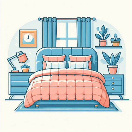
- California Casual Bedroom: Soft sand-colored walls (warm), navy blue bedding (cool), and driftwood nightstands for a relaxed but balanced aesthetic.
- Urban Loft Kitchen: White cabinets (neutral), slate tile backsplash (cool), and copper pendant lights (warm) for an inviting yet modern look.
Pro Tip:
If you’re ever unsure about mixing colors, bring in small accessories first—like vases, throws, or art—to test combinations before committing to larger pieces.
4. Selecting Materials and Finishes
Choosing Furniture That Mixes Warm and Cool Tones
When picking out furniture, think about the main color temperature of your space. If your walls or floors are warm (like beige or wood tones), try adding a sofa or chairs in cool grays, blues, or greens to balance things out. On the other hand, if your room feels cool due to gray walls or tile, bring in warmth with leather chairs, walnut tables, or brass accents.
| Common Material | Warm Examples | Cool Examples |
|---|---|---|
| Wood | Walnut, cherry, oak | Ash, maple with gray stain |
| Metal | Brass, gold-tone steel | Chrome, brushed nickel |
| Upholstery | Tan leather, rust-colored velvet | Navy blue linen, charcoal fabric |
| Stone/Tile | Cream travertine, terracotta | Slate, white marble with gray veining |
Textiles: The Easy Way to Blend Temperatures
Pillows, throws, rugs, and curtains are great for introducing both warm and cool hues. For example, pair a deep blue rug with cream or caramel pillows. Look for patterns that mix colors—like a geometric rug with both navy and mustard—or layer different colored throws on a neutral sofa for an inviting look.
Textile Combinations to Try:
- Cream or tan throw blankets with teal accent pillows
- Burgundy and sage green patterned area rug with gray furniture
- Navy blue curtains paired with a soft beige sofa
- Mustard yellow pillows on a slate blue armchair
Finishes That Unify Warm and Cool Elements
Select finishes that tie together the different color temperatures in your room. For example, use mixed-metal fixtures—such as combining brushed nickel (cool) cabinet pulls with brass (warm) lighting. Matte black hardware works well as a neutral bridge between warm woods and cool wall colors. In kitchens and bathrooms commonly found in U.S. homes, consider pairing white or gray cabinetry (cool) with butcher-block countertops (warm) for balanced contrast.
Quick Tips for Mixing Materials:
- Limit each finish to two or three types per room to avoid visual clutter.
- If you have mostly cool-toned materials, add warmth with natural woven baskets or wood picture frames.
- If your space feels too warm, cool it down with glass tabletops or chrome lamps.
- Repeat both warm and cool materials at least twice in the room to create harmony.
This approach helps you achieve a timeless look that feels comfortable and inviting—never too trendy or stark.
5. Personalizing Your Timeless Space
Layering Your Personality into a Balanced Design
Creating a timeless look by blending warm and cool colors doesnt mean your home has to feel generic or impersonal. In fact, one of the best ways to make your space truly yours is by weaving in elements that reflect your story, values, and style—while still maintaining that carefully curated balance.
Incorporating Regional Influences
Think about what makes your region special. Maybe you live on the West Coast and love laid-back, coastal vibes. Or perhaps youre in New England and want to honor classic colonial details. You can highlight these influences through textiles, artwork, or even subtle architectural touches. Here’s how to keep it cohesive:
| Region | Warm Element | Cool Element |
|---|---|---|
| Southwest | Terracotta pottery | Turquoise accents |
| Pacific Northwest | Natural wood tones | Sage green textiles |
| Northeast | Creamy white trim | Navy blue pillows |
| Southeast | Brass fixtures | Pale blue walls |
Displaying Family Heirlooms or Personal Treasures
Your favorite family pieces—like grandma’s quilt, vintage photos, or a collection of ceramics—can easily find a place in a timeless room. The key is to group them thoughtfully with other decor items that share similar tones or textures. For example, an antique wooden rocking chair (warm) can be paired with a cool-toned throw blanket for balance.
Tips for Blending Old & New
- Mix metallic finishes (like gold and nickel) but keep the shapes simple for harmony.
- Create gallery walls with both modern art and black-and-white family photos.
- Use neutral backgrounds so special pieces stand out without overwhelming the room.
- If you have a bold heirloom rug, balance it with more understated, cool-toned furniture.
Staying True to Your Style Without Losing Balance
The trick is to layer personal items as accents rather than letting them dominate the whole palette. Make sure each piece fits within the overall color story—whether it’s warm, cool, or a beautiful mix of both. This approach keeps your home inviting and unique while achieving that timeless look everyone loves.