1. Understanding Warm and Cool Tones
When designing a space, understanding the differences between warm and cool tones is essential. Colors play a significant role in setting the mood, influencing emotions, and enhancing the overall aesthetic of a room. By learning how these tones work, you can create a balanced and inviting interior.
What Are Warm and Cool Tones?
Warm tones typically include shades of red, orange, yellow, and earthy neutrals like brown or beige. These colors evoke feelings of energy, warmth, and coziness. On the other hand, cool tones consist of blues, greens, purples, and grayish hues that promote calmness, relaxation, and sophistication.
Comparison of Warm and Cool Tones
| Tone Type | Common Colors | Mood & Effect |
|---|---|---|
| Warm Tones | Red, Orange, Yellow, Beige | Cozy, Inviting, Energetic |
| Cool Tones | Blue, Green, Purple, Gray | Calm, Relaxing, Sophisticated |
The Impact of Warm and Cool Tones in Interior Design
The choice between warm and cool tones can significantly affect the perception of space. Warm colors tend to make a room feel smaller and more intimate, making them ideal for living rooms or dining areas where social interaction is encouraged. In contrast, cool tones create an open and airy feel, perfect for bedrooms or offices where relaxation and focus are key.
Selecting the Right Tone for Your Space
When choosing color tones for your home or office, consider the function of each space:
- If you want a cozy atmosphere: Opt for warm hues like deep reds or soft yellows.
- If you prefer a refreshing ambiance: Choose cool shades such as light blues or greens.
- If you seek balance: Mix both tones strategically by using warm accents in a cool-toned room or vice versa.
The Role of Lighting in Color Perception
Naturally occurring and artificial lighting can alter how colors appear in a room. Warm lighting enhances red and yellow undertones, making spaces feel even cozier. Meanwhile, cooler lighting highlights blue and green shades for a crisp and modern look. Considering lighting when selecting your color palette ensures harmony throughout your design.
Experimenting with Warm and Cool Combinations
A well-balanced mix of warm and cool tones can add depth and dimension to any space. Try pairing warm wood finishes with cool-toned walls or using accent decor like pillows or rugs to introduce contrasting colors subtly. The key is to experiment until you find a combination that feels right for your personal style.
2. The Psychology of Color Temperature
Understanding color temperature is essential when mixing warm and cool tones in interior design. Colors have the power to influence mood, perception, and the overall ambiance of a space. By selecting the right balance of warm and cool tones, you can create an environment that feels inviting, energetic, or calming.
How Color Temperature Affects Mood
Warm colors, such as reds, oranges, and yellows, tend to evoke feelings of warmth, energy, and comfort. They are often used in spaces where social interaction and coziness are desired, like living rooms and dining areas. On the other hand, cool colors like blues, greens, and purples create a sense of calmness and relaxation. These shades are commonly found in bedrooms and bathrooms to promote tranquility.
Perception of Space with Warm and Cool Tones
The temperature of a color also impacts how we perceive space. Warm tones can make a room feel more intimate and cozy by visually bringing walls closer together. Cool tones, however, create an airy and spacious effect, making them ideal for small rooms or areas where you want to enhance openness.
Comparison of Warm vs. Cool Colors in Interior Design
| Color Type | Psychological Effect | Best Used In |
|---|---|---|
| Warm Colors (Red, Orange, Yellow) | Energizing, Welcoming, Stimulating | Living Rooms, Dining Areas, Kitchens |
| Cool Colors (Blue, Green, Purple) | Calming, Relaxing, Refreshing | Bedrooms, Bathrooms, Offices |
Balancing Warm and Cool Tones for Harmony
A well-balanced interior combines both warm and cool tones to create visual harmony. For example, pairing a warm-toned wooden floor with cool blue walls can add contrast while maintaining a comfortable atmosphere. Similarly, adding warm accent pieces like throw pillows or artwork to a predominantly cool-toned room prevents it from feeling too cold or sterile.
Using Lighting to Adjust Color Temperature
Lighting plays a crucial role in how color temperature is perceived. Warm lighting enhances reds and oranges for a cozier feel, while cool lighting brings out blues and greens for a crisp ambiance. Choosing the right light temperature helps reinforce your desired mood within a space.
3. Balancing Warm and Cool Shades
Achieving the right balance between warm and cool tones is key to creating a space that feels both inviting and visually dynamic. Too much warmth can make a room feel overly cozy or even cramped, while an excess of cool shades may create a sterile or unwelcoming atmosphere. The goal is to strike the perfect equilibrium where both tones complement each other harmoniously.
Understanding the Role of Each Tone
Before mixing warm and cool shades, its important to understand their impact on a space:
| Tone Type | Characteristics | Common Uses |
|---|---|---|
| Warm Tones | Evoke energy, comfort, and coziness | Living rooms, dining areas, bedrooms |
| Cool Tones | Create a calm, refreshing, and spacious feel | Kitchens, bathrooms, offices |
The 60-30-10 Rule for Balance
A helpful approach when mixing warm and cool tones is the 60-30-10 rule. This guideline helps maintain visual harmony:
- 60% – Dominant Color: Choose either a warm or cool shade as the primary base.
- 30% – Secondary Color: Use the opposite tone to create contrast and depth.
- 10% – Accent Color: Add pops of a complementary shade through décor elements like pillows, rugs, or artwork.
Tips for Seamless Integration
Selecting a Neutral Base
A neutral foundation—such as beige, gray, or white—can help bridge the gap between warm and cool tones, making transitions feel natural.
Mimicking Nature’s Balance
Naturally occurring color combinations—like blue skies with sandy beaches or green forests with warm autumn leaves—serve as great inspiration for blending these tones effectively.
Lighter vs. Darker Shades
If using darker warm colors (e.g., deep reds), balance them with lighter cool tones (e.g., soft blues) to prevent an overpowering effect.
The Power of Lighting
The type of lighting in your space can influence how warm and cool tones interact. Natural light enhances cooler shades, while warm artificial lighting can make cooler hues feel cozier.
4. Practical Applications in Different Spaces
Mixing warm and cool tones can transform the look and feel of any room. Here’s how top interior designers apply this technique in living rooms, kitchens, and bedrooms.
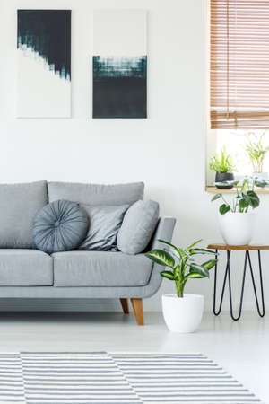
Living Rooms: Creating a Balanced Atmosphere
The living room is often the heart of the home, making it an ideal space to blend warm and cool tones. Designers achieve balance by pairing warm-toned furniture with cool wall colors or vice versa.
| Warm Elements | Cool Elements |
|---|---|
| Beige or caramel sofas | Pale blue or gray walls |
| Wood coffee tables | Navy throw pillows |
| Cream-colored rugs | Sleek metal decor accents |
Kitchens: Enhancing Functionality with Contrast
Kitchens benefit from the visual contrast of warm and cool tones, creating a welcoming yet modern environment. Many designers use warm wood cabinetry with cooler countertops or backsplash tiles.
| Warm Features | Cool Features |
|---|---|
| Wooden cabinets | White marble countertops |
| Copper light fixtures | Sleek stainless steel appliances |
| Terracotta floor tiles | Pale blue or gray backsplashes |
Bedrooms: Setting a Relaxing Mood
A well-balanced bedroom should feel cozy yet refreshing. Designers often incorporate warm textiles with cooler wall colors to promote relaxation.
| Warm Accents | Cool Accents |
|---|---|
| Cream or taupe bedding | Pale blue or lavender walls |
| Brass bedside lamps | Crisp white linens and curtains |
| A deep red area rug | A charcoal gray accent wall |
Tips for Achieving the Right Balance
- Create contrast: Use warm furniture against cool backgrounds for depth.
- Add texture: Layer different materials like wood, metal, and textiles to create interest.
- Aim for harmony: Keep a consistent ratio of warm to cool tones for a cohesive look.
- Use lighting strategically: Warm lighting can soften cool tones, while natural light enhances both.
- Add greenery: Plants work as neutral elements that tie warm and cool shades together.
No matter the space, blending warm and cool tones can create a visually appealing and comfortable environment. By following these design principles, you can achieve a harmonious look that feels inviting yet stylish.
5. Expert Recommendations and Common Mistakes
Mixing warm and cool tones can bring balance and depth to a space, but it requires careful consideration. Top interior designers emphasize the importance of selecting the right color combinations while avoiding common design pitfalls. Below are expert recommendations along with mistakes to avoid when working with warm and cool tones.
Expert Recommendations
1. Establish a Dominant Tone
Before mixing warm and cool colors, decide which tone will be dominant in your space. A balanced mix is great, but one should take the lead to create a cohesive look.
2. Use Neutrals as a Bridge
Neutral colors such as white, gray, and beige help blend warm and cool tones seamlessly, preventing harsh contrasts.
3. Consider Lighting Conditions
The way natural and artificial light interacts with your color choices can impact the overall feel of the room. Test paint samples under different lighting conditions before making final decisions.
4. Incorporate Texture for Harmony
If you’re mixing warm and cool tones, use varied textures like wood, metal, or fabric to add depth and create visual interest.
5. Follow the 80/20 Rule
A common strategy is to use 80% of one temperature (warm or cool) and 20% of the other to maintain balance without overwhelming the space.
Common Mistakes to Avoid
| Mistake | Description |
|---|---|
| Lack of a Clear Plan | Diving into a mix of warm and cool tones without a plan can result in an uncoordinated design that feels chaotic. |
| Ineffective Contrast | Poor contrast between warm and cool colors can make the space feel disjointed rather than harmonious. |
| Ignoring Undertones | Tones have subtle undertones that might clash if not carefully considered—always compare swatches before making selections. |
| Overuse of Bold Colors | Avoid using too many bold warm and cool tones together; instead, let neutrals provide balance. |
| Mismatched Furniture & Decor | Your furniture and decor should complement your chosen color palette rather than compete with it. |
Final Thoughts from Designers
The key to successfully mixing warm and cool tones lies in balance, planning, and attention to detail. By following expert recommendations and avoiding common mistakes, you can create a space that feels inviting, cohesive, and visually appealing.