1. Understanding the Psychology of Colors
Choosing the right color scheme for your small home office isnt just about aesthetics—it can significantly impact your mood, productivity, and focus. Different colors have unique psychological effects, influencing how you feel and work in your space. Lets explore how various colors can affect your home office environment.
How Colors Influence Mood and Productivity
Colors can evoke different emotions and mental states. Some promote concentration and efficiency, while others encourage relaxation or creativity. Here’s a quick guide to common colors used in home offices and their effects:
| Color | Effect | Best For |
|---|---|---|
| Blue | Enhances focus, promotes calmness, and reduces stress. | High-concentration tasks, analytical work. |
| Green | Creates balance, reduces eye strain, and promotes a sense of stability. | Long working hours, maintaining energy levels. |
| Yellow | Sparks creativity, boosts positivity, and encourages motivation. | Creative professions, brainstorming spaces. |
| Gray | A neutral choice that provides sophistication but may feel dull if overused. | A minimalist aesthetic, balancing bold accents. |
| White | Makes a space feel open and clean but may feel too sterile without accent colors. | A clutter-free workspace, small rooms needing brightness. |
| Red | Energizing and stimulating but can be overwhelming in large amounts. | A touch of excitement in creative spaces, accent walls. |
Selecting the Right Color for Your Needs
The best color for your small home office depends on the type of work you do and the atmosphere you want to create. If you need to stay calm and focused, blue or green might be ideal. If creativity is your priority, consider yellow accents. For a modern and professional look, neutral tones like gray or white work well with colorful accessories.
The Importance of Balance
Avoid using a single color excessively—too much of one shade can be overwhelming or uninspiring. Consider combining colors strategically to achieve the right balance. For example:
- A blue-gray combination: Professional yet calming.
- A white base with yellow accents: Clean with a touch of energy.
- A green workspace with wooden elements: Natural and soothing.
Your Personal Preference Matters
No matter what psychology suggests, personal preference plays a key role. Choose shades that make you feel comfortable and motivated while keeping functionality in mind.
2. Considering Natural and Artificial Lighting
Lighting plays a crucial role in how colors appear in your small home office. The same shade of paint can look entirely different under natural daylight compared to artificial lighting. Understanding how light impacts color perception will help you choose the right shades that maintain their intended look throughout the day.
How Natural Light Affects Colors
Natural light changes throughout the day, which can make your wall colors appear different depending on the time. Here’s a general guide:
| Time of Day | Lighting Characteristics | Best Color Choices |
|---|---|---|
| Morning (East-facing rooms) | Soft, warm sunlight | Light blues, soft yellows, warm neutrals |
| Midday (South-facing rooms) | Bright, intense light | Cool tones like soft grays, muted greens, and off-whites |
| Afternoon (West-facing rooms) | Strong, warm light with orange tones | Neutral colors like taupe, beige, or soft pastels |
| Evening (North-facing rooms) | Cooler, dimmer light | Warmer hues like creamy whites, soft terracotta, or warm grays |
The Role of Artificial Lighting
If your home office doesn’t get much natural light or you work at night, artificial lighting will significantly impact how colors appear. Different types of bulbs emit different color temperatures:
| Light Type | Color Tone | Recommended Colors |
|---|---|---|
| Warm White (2700K-3000K) | Slight yellow tint, cozy feel | Creams, warm grays, soft blues |
| Cool White (3500K-4100K) | Crisper but slightly blue-toned | Pale greens, muted purples, neutral whites |
| Daylight (5000K-6500K) | Mimics natural daylight, bright and clear | Bolder hues like deep blues, crisp whites, and charcoal grays |
Testing Your Color Choices Under Different Lighting Conditions
Before committing to a paint color, test it under both natural and artificial lighting. Here are a few simple steps:
- Use Paint Samples: Get sample swatches and apply them to your walls.
- Observe Throughout the Day: Check how the color looks in the morning, afternoon, and evening.
- Turn On Your Office Lights: See how the color appears under artificial lighting.
Pro Tip: Choosing Flexible Shades
If your office has mixed lighting conditions throughout the day, consider versatile shades like greige (a mix of gray and beige) or muted earth tones that adapt well to different lighting.
Selecting the right color scheme for your small home office involves more than just picking a favorite shade. By understanding how lighting affects color perception, you can create a workspace that looks great no matter the time of day.
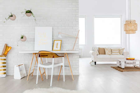
3. Optimizing Space with Light and Neutral Tones
Choosing the right colors for a small home office can significantly impact how spacious and comfortable the space feels. Light and neutral tones are excellent choices because they create an illusion of a larger, airier workspace. By strategically selecting these colors, you can make your office feel open and inviting rather than cramped.
How Light Colors Enhance Space
Light colors reflect more natural and artificial light, making a room feel brighter and more expansive. Darker shades, on the other hand, tend to absorb light, which can make a small office feel even smaller.
Best Light and Neutral Colors for a Small Office
| Color | Effect on Space |
|---|---|
| Soft White | Makes the room feel bright, clean, and open. |
| Pale Gray | Adds depth without making the space feel overwhelming. |
| Beige | Creamy and warm, creating a cozy yet spacious atmosphere. |
| Pale Blue | Elicits a calming effect while keeping the space light. |
| Sage Green | A subtle earthy tone that brings freshness without overpowering the space. |
Tips for Using Light and Neutral Tones Effectively
1. Use a Monochromatic Palette
Avoid too many contrasting colors in a small space. Instead, stick to different shades of the same color to maintain harmony and openness.
2. Pair with Reflective Surfaces
Add mirrors or glossy furniture to enhance the light-reflecting properties of your chosen color scheme.
3. Incorporate Natural Light
If possible, position your desk near a window and use sheer curtains to allow ample sunlight to enter the room.
4. Add Texture for Depth
If youre concerned about the space looking too plain, introduce textures like linen curtains, woven rugs, or wood accents to add warmth without cluttering the area.
4. Incorporating Accent Colors for Personality and Energy
Adding accent colors to your small home office is a great way to bring personality and energy into the space without overwhelming it. The key is to use these colors strategically to enhance creativity while maintaining a balanced work environment.
Why Use Accent Colors?
Accent colors help break up monotony, highlight key areas, and create visual interest. When used correctly, they can boost focus, motivation, and overall mood. Since your home office is a space where productivity matters, choosing the right accent colors is essential.
Best Ways to Incorporate Accent Colors
You don’t need to paint an entire wall to introduce an accent color. There are plenty of subtle yet effective ways to integrate them into your workspace:
| Accent Color Element | How It Enhances Your Space |
|---|---|
| Furniture | A brightly colored chair or desk can add energy and contrast without overwhelming the room. |
| Decor Items | Pillows, rugs, or curtains in bold hues can introduce color in a controlled way. |
| Wall Art | A colorful painting or framed print adds personality while keeping walls mostly neutral. |
| Shelving & Accessories | Add books, organizers, or decorative objects in your chosen accent color for subtle pops of interest. |
| Lighting | Lamps with colorful shades or bases provide both function and a stylish design element. |
Selecting the Right Accent Color for Your Office
The best accent color depends on the atmosphere you want to create. Here are some popular choices and their effects:
- Blue: Promotes calmness and focus, great for high-concentration tasks.
- Yellow: Encourages creativity and positivity, ideal for brainstorming sessions.
- Green: Provides balance and reduces eye strain, perfect for long working hours.
- Red: Adds energy and urgency but should be used sparingly to avoid overstimulation.
- Purple: Inspires creativity and sophistication, excellent for artistic workspaces.
- Orange: Brings warmth and enthusiasm but works best in small doses.
Tips for Maintaining Balance with Accent Colors
The key to using accent colors effectively is moderation. Stick to the 60-30-10 rule: 60% of your office should feature a dominant neutral color (like white or gray), 30% should be a secondary color (such as soft blue or beige), and 10% should be your accent color. This balance ensures that your workspace remains visually appealing without becoming too distracting.
No matter which accent color you choose, make sure it complements your overall design theme while reflecting your personality. By thoughtfully integrating these colors into your small home office, you can create a space that feels both inspiring and functional.
5. Coordinating Colors with Furniture and Decor
Choosing the right color scheme for your small home office isn’t just about picking wall paint—it’s also about ensuring that your furniture, décor, and accessories work together harmoniously. A well-coordinated space can create a balanced and visually appealing environment that enhances productivity and comfort.
Matching Colors with Furniture
Your furniture plays a significant role in defining the overall look of your office. Consider the materials and finishes of your desk, chair, and shelves when selecting colors for your walls and accents. Here are some common furniture types and their best complementary colors:
| Furniture Type | Recommended Color Palette |
|---|---|
| Light Wood (Oak, Maple) | Soft neutrals like beige, warm gray, or muted greens |
| Dark Wood (Walnut, Mahogany) | Lighter shades such as off-white, soft blues, or pale yellows |
| White or Minimalist Furniture | Bolder accent colors like deep navy, terracotta, or sage green |
| Metal & Industrial Style | Crisp whites, charcoal grays, or earthy tones for contrast |
Selecting Colors That Enhance Décor
Your décor elements—such as rugs, curtains, artwork, and plants—should also align with your chosen color scheme. If you prefer a neutral base, use décor pieces to introduce pops of color without overwhelming the space.
Accent Colors vs. Primary Colors
- Primary Colors: These are the dominant shades in your space (walls, large furniture). Stick to two or three complementary hues to maintain cohesion.
- Accent Colors: Use these in smaller details like cushions, lamps, or decorative items. They should complement but not overpower the primary palette.
Tying Everything Together for a Cohesive Look
A cohesive home office design feels intentional rather than mismatched. To achieve this:
- Create a Mood Board: Gather fabric swatches, paint samples, and images of furniture to visualize how everything fits together.
- Stick to a Consistent Undertone: Whether warm (beiges, golds) or cool (blues, grays), keeping undertones consistent ensures harmony.
- Add Texture for Depth: Layering different textures—wood grain, woven fabrics, metal finishes—keeps the space visually interesting even with a simple color scheme.
A well-planned color palette that complements your furniture and décor will help you create an inviting and stylish small home office that enhances both focus and creativity.