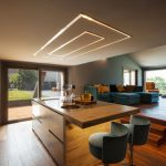
1. The Importance of a Cohesive Indoor-Outdoor Color Palette
Creating a seamless color transition between indoor and outdoor spaces enhances the overall aesthetic of your home. When colors flow naturally from one area to another, it creates a sense of harmony, expands the visual perception of space, and strengthens the connection to nature.
Enhancing Visual Flow
A well-planned color palette helps the eye move smoothly between indoor and outdoor areas, making spaces feel larger and more cohesive. Instead of abrupt color changes that can disrupt the design, using complementary tones ensures a continuous and pleasant visual experience.
Creating a Sense of Harmony
Using colors inspired by nature—such as earth tones, soft greens, blues, and neutral shades—can create a calming atmosphere. These hues blend effortlessly with natural surroundings, making both indoor and outdoor spaces feel connected rather than separate.
Maximizing Connection to Nature
A thoughtful color scheme allows your home to feel more integrated with its environment. Whether through large windows, sliding doors, or an open patio concept, maintaining consistent colors between inside and outside spaces reinforces a strong indoor-outdoor connection.
Recommended Color Schemes
| Indoor Colors | Outdoor Complement |
|---|---|
| Soft Beige | Sandstone or Light Brown |
| Sage Green | Olive or Forest Green |
| Pale Blue | Navy or Sky Blue |
| Warm Gray | Charcoal or Stone Gray |
| Terracotta | Rust or Deep Red Clay |
Tips for Achieving a Unified Look
- Select colors that complement your homes architecture and surroundings.
- Use similar undertones across indoor and outdoor areas to maintain consistency.
- Add natural materials like wood and stone to enhance the organic feel.
- Consider how lighting affects colors in different spaces throughout the day.
- Incorporate accent pieces such as cushions, rugs, or planters to reinforce the palette.
2. Choosing Colors Inspired by Nature
When selecting a color palette that seamlessly connects indoor and outdoor spaces, nature is the best source of inspiration. By incorporating hues found in natural elements, you can create a harmonious flow between your home’s interior and the surrounding landscape.
Earth Tones for Warmth and Stability
Earthy shades such as warm browns, soft beiges, and rich terracottas bring a sense of stability and comfort to your space. These colors work well in both traditional and modern interiors while complementing outdoor features like wooden decks, stone pathways, and natural landscaping.
Ocean Blues for a Tranquil Atmosphere
If you want to evoke a peaceful and refreshing vibe, consider using blues inspired by the ocean. Soft sky blues, deep navy tones, and muted seafoam greens can help create a serene environment that mimics coastal landscapes. These shades work beautifully in open-concept spaces with large windows that offer outdoor views.
Lush Greens to Reflect Natural Surroundings
Green is one of the most versatile colors when bridging indoor and outdoor areas. From deep forest greens to light sage hues, this color family brings a fresh, organic feel to any space. Pair green accents with natural materials like wood or stone to enhance the connection with nature.
Sunset-Inspired Shades for Warmth and Depth
The warm tones of a sunset—soft pinks, burnt oranges, and golden yellows—can add vibrancy and depth to your home while maintaining a natural feel. These colors are especially effective in living rooms, dining areas, or any space where you want to create a cozy yet sophisticated atmosphere.
Color Palette Inspiration Guide
| Natural Element | Suggested Color Palette |
|---|---|
| Earth Tones | Warm brown, beige, terracotta |
| Ocean Blues | Sky blue, navy, seafoam green |
| Lush Greens | Sage green, forest green, olive |
| Sunset Shades | Soft pink, burnt orange, golden yellow |
Selecting colors inspired by nature allows your indoor spaces to feel more connected to the outdoors. Whether you prefer the calming effect of blues or the warmth of earth tones, choosing the right palette will help create a seamless transition between your homes interior and exterior.

3. Utilizing Neutral Foundations for Versatility
Creating a seamless connection between indoor and outdoor spaces starts with selecting the right color palette. One of the most effective strategies is to use neutral base colors as a foundation, allowing flexibility in accent shades and seasonal decor. By incorporating warm beiges, cool grays, and soft whites, you can achieve a timeless look that adapts effortlessly to different design elements.
Why Neutral Colors Work
Neutral tones serve as a bridge between the natural environment outside and the curated interiors of your home. They provide balance and create a harmonious backdrop that enhances both bold and subtle accent colors. Here’s why they are essential:
| Neutral Tone | Effect on Space | Best Used With |
|---|---|---|
| Warm Beiges | Add warmth and coziness, complementing wood textures. | Earthy greens, deep browns, terracotta accents. |
| Cool Grays | Create a modern and sophisticated look with a calming effect. | Crisp whites, navy blues, soft pastels. |
| Soft Whites | Bounce natural light, making spaces feel open and airy. | Nature-inspired hues like sage green, sandy taupe, sky blue. |
Adapting to Seasons with Neutral Foundations
A major advantage of using neutral base colors is their ability to work well across seasons. For instance:
- Spring & Summer: Pair neutrals with fresh greens, ocean blues, or floral pastels for an airy feel.
- Fall & Winter: Introduce deep oranges, rich burgundy, or warm golds to create a cozy atmosphere.
Tying Indoor and Outdoor Spaces Together
If your goal is to create a smooth transition between indoor and outdoor areas, neutrals help unify these spaces naturally. Consider using similar shades on exterior walls, patio furniture, or even decorative accents like cushions and rugs to maintain visual flow. This approach makes outdoor areas feel like an extension of your home’s interior rather than a separate space.
The Key to Long-Lasting Style
A neutral foundation ensures that your color scheme remains versatile over time while allowing you to refresh your decor with seasonal or trend-based accents. Whether you prefer a modern aesthetic or a more rustic charm, these timeless hues offer endless possibilities for personalization.
4. Blending Indoor and Outdoor Materials to Enhance Color Flow
One of the most effective ways to create a seamless transition between indoor and outdoor spaces is by using similar materials in both areas. By incorporating elements like wood, stone, or metal across these spaces, you can unify your color scheme and establish a natural flow throughout your home.
Using Natural Materials for a Cohesive Look
Natural materials not only enhance the aesthetic appeal of your space but also contribute to a harmonious color palette. Choosing materials with consistent tones and textures helps maintain visual continuity between your indoor and outdoor areas.
Key Materials That Work Indoors and Outdoors
| Material | Indoor Applications | Outdoor Applications | Color Effect |
|---|---|---|---|
| Wood | Flooring, furniture, ceiling beams | Decking, pergolas, exterior cladding | Adds warmth and natural earth tones |
| Stone | Fireplaces, accent walls, countertops | Paved patios, garden paths, exterior walls | Creates an organic feel with neutral hues |
| Metal | Lighting fixtures, railings, furniture legs | Outdoor furniture, gates, decorative panels | Enhances modern aesthetics with industrial tones |
Tips for Blending Materials Seamlessly
- Match finishes: Use similar finishes for wood stains, stone textures, or metal coatings inside and outside to ensure continuity.
- Select complementary colors: Choose materials in shades that complement each other rather than contrast harshly.
- Create focal points: Extend a stone accent wall from the interior to the patio or use the same wood flooring indoors and on a covered outdoor deck.
- Balance natural light: Consider how sunlight affects material tones in different areas to maintain a consistent look throughout the day.
The Impact of Unified Materials on Your Space
A cohesive material selection not only enhances visual harmony but also makes spaces feel larger and more connected. When your indoor and outdoor areas share design elements, your home gains a more fluid and inviting atmosphere.
Final Thought on Material Selection
Selecting materials that work both inside and outside is key to achieving a balanced color palette. Whether you opt for warm woods, earthy stones, or sleek metals, keeping consistency in textures and tones will help bridge the gap between indoor comfort and outdoor beauty.
5. Integrating Plants and Textiles for a Natural Transition
Blurring the boundaries between indoor and outdoor spaces is easier when you incorporate natural elements like greenery, outdoor-friendly fabrics, and textured materials in complementary hues. These elements work together to create a seamless flow that enhances the connection between your home’s interior and exterior.
Bringing the Outdoors In with Greenery
Plants are one of the most effective ways to create a natural transition between spaces. Whether you use large potted plants, hanging greenery, or a vertical garden, they add vibrancy and freshness to your home while visually linking indoor and outdoor areas.
Best Plants for Indoor-Outdoor Harmony
| Plant Type | Ideal Placement | Main Benefits |
|---|---|---|
| Fiddle Leaf Fig | Near windows or patio doors | Adds height and a lush green touch |
| Pothos | Shelves, hanging baskets | Easy to maintain, cascades beautifully |
| Bamboo Palm | Corners or entryways | Cleans air and brings tropical vibes |
| Lavender | Kitchens, balconies | Aromatherapy benefits and soft color contrast |
| SNAKE PLANT | Bedrooms, living rooms | Tolerates low light and purifies air |
Selecting Outdoor-Friendly Fabrics for Seamless Flow
The right textiles can help unify indoor and outdoor spaces while maintaining durability. Choose fabrics that are weather-resistant yet comfortable enough for indoor use. Consider materials like:
- Acrylic Fabrics: Fade-resistant and soft, perfect for cushions and upholstery.
- Linen Blends: Lightweight and breathable, great for curtains that sway naturally between spaces.
- Cotton Canvas: Sturdy yet flexible, ideal for throw pillows and slipcovers.
- Synthetic Woven Rugs: Durable enough for patios but stylish enough for living rooms.
The Role of Texture in Creating Cohesion
A mix of textures helps soften the transition between indoors and outdoors. Combine rougher outdoor surfaces with softer interior elements to create balance. For example:
- Naturally Woven Rattan Furniture: Works well both inside and outside.
- Moss or Jute Rugs: Add warmth underfoot while keeping an organic feel.
- Ceramic Planters: Their glossy or matte finishes complement various decor styles.
- Linen Drapes: Let natural light filter through while maintaining an airy look.
Create a Unified Color Palette with Textiles and Greenery
Your color choices should enhance the connection between spaces. Opt for palettes inspired by nature, such as:
| Main Color Family | Description & Mood | Ideal Accents |
|---|---|---|
| Earthy Neutrals (Beige, Taupe, Sand) | Sophisticated yet calming; mimics stone pathways and sandy beaches. | Bamboo decor, woven baskets, ceramic accents. |
| Tropical Greens (Olive, Sage, Deep Forest) | Energizing yet grounded; reflects surrounding plants. | Potted ferns, botanical prints, wooden furniture. |
| Sunkissed Hues (Terracotta, Rust, Mustard) | Adds warmth; evokes desert landscapes or autumn tones. | Terracotta pots, brass fixtures, textured throws. |
| Crisp Blues (Sky Blue, Navy, Teal) | Breezy and tranquil; mirrors ocean views or clear skies. | Cushions with wave patterns, glass vases, striped rugs. |
| Dusk-Inspired Shades (Soft Lavender, Charcoal Gray) | Mysterious yet cozy; reminiscent of twilight tones. | Candles with warm glow, velvet cushions, metallic accents. |
Create a Fluid Connection Between Indoors and Outdoors
The combination of plants, textiles, and textures in coordinated hues helps dissolve the divide between your homes interior and exterior spaces. By thoughtfully integrating these elements into your design scheme, you can enjoy a harmonious flow that feels both inviting and natural year-round.

