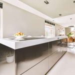
1. The Influence of Color on Mood and Behavior
Color plays a powerful role in shaping our emotions and behaviors, especially in the kitchen—a space where people gather, cook, and socialize. Different colors can evoke different feelings, influence appetite, and even affect decision-making. Understanding how color psychology works can help you create a kitchen that feels welcoming, energizing, or calming, depending on your needs.
How Colors Affect Emotions in the Kitchen
Every color has psychological effects that can impact how people feel when spending time in the kitchen. Below is a breakdown of some common colors used in kitchen design and their associated emotional influences:
| Color | Psychological Effect | Best Used For |
|---|---|---|
| Red | Stimulates appetite and energy, creating a lively atmosphere. | Great for kitchens where socialization and dining are key. |
| Yellow | Promotes happiness and warmth, making spaces feel inviting. | Ideal for brightening up small or dimly lit kitchens. |
| Blue | Elicits calmness and relaxation but may suppress appetite. | Best for kitchens aiming for a serene and clean aesthetic. |
| Green | Sparks freshness and balance, often associated with nature. | A great choice for health-conscious and organic-themed kitchens. |
| White | Makes spaces feel clean, open, and spacious. | A classic option for modern and minimalist kitchens. |
| Gray | Adds sophistication but can feel cold if overused. | A good neutral base that pairs well with accent colors. |
The Role of Warm vs. Cool Colors
Kitchens can benefit from both warm and cool tones, depending on the mood you want to create:
- Warm Colors (Red, Orange, Yellow): These colors tend to be stimulating and inviting. They encourage conversation and make the space feel energetic, which is why they are often used in restaurants as well as home kitchens.
- Cool Colors (Blue, Green, Gray): These shades promote relaxation and cleanliness. They work well in kitchens where you want a more tranquil atmosphere or a fresh aesthetic.
Selecting the Right Color for Your Kitchen
Your choice of kitchen color should align with your personal style, the size of your kitchen, and how you want people to feel when they enter the space. If you love hosting dinner parties, warm tones might be ideal. If you prefer a peaceful cooking experience, cooler hues may be better suited for your needs.
2. Warm vs. Cool Tones: Choosing the Right Palette
Color plays a powerful role in shaping the mood of a kitchen. Whether youre aiming for a cozy and inviting space or a refreshing and calming atmosphere, understanding the psychological effects of warm and cool tones can help you make the best choice.
Warm Tones: Creating a Cozy and Inviting Kitchen
Warm colors like red, orange, and yellow bring energy and warmth to a kitchen. These hues are known to stimulate appetite and encourage social interaction, making them an excellent choice for homeowners who want their kitchen to feel welcoming and lively.
Psychological Effects of Warm Colors
- Red: Boosts energy levels and increases appetite.
- Orange: Encourages conversation and adds vibrancy.
- Yellow: Evokes happiness and enhances brightness.
Cool Tones: Achieving a Refreshing and Calming Space
Cool colors such as blue, green, and purple create a soothing ambiance. These tones are ideal for those who prefer a relaxed and peaceful environment in their kitchen.
Psychological Effects of Cool Colors
- Blue: Promotes calmness and reduces stress.
- Green: Represents freshness and balance.
- Purple: Adds sophistication with a hint of creativity.
Choosing the Right Palette for Your Kitchen
The decision between warm and cool tones depends on your personal preference, lifestyle, and how you use your kitchen. Below is a quick comparison to help guide your choice:
| Color Tone | Mood & Effect | Best For |
|---|---|---|
| Warm Tones (Red, Orange, Yellow) | Energizing, inviting, appetite-stimulating | Social kitchens, family gatherings, open spaces |
| Cool Tones (Blue, Green, Purple) | Calming, refreshing, serene | Relaxing environments, modern aesthetics, minimalist designs |
Blending Warm and Cool Tones
If you find it difficult to choose between warm and cool colors, consider blending them. For example, pairing soft blue cabinetry with warm wood accents can create balance in your kitchen design. Using neutral tones like white or gray can also help tie both color families together harmoniously.
Final Tip:
No matter which palette you choose, lighting plays a key role in how colors appear. Natural light enhances warm tones, while artificial lighting can shift the appearance of cool shades. Always test paint samples under different lighting conditions before making a final decision.
3. Popular Kitchen Color Trends in American Homes
Color trends in kitchen design evolve over time, influenced by cultural shifts, regional preferences, and the desire for timeless aesthetics. In the United States, homeowners often select colors that reflect their personalities while also considering functionality and resale value.
Trending Kitchen Color Schemes
Current kitchen color trends in the U.S. range from warm neutrals to bold accent hues. Below is a breakdown of popular choices:
| Color Scheme | Description | Why Its Popular |
|---|---|---|
| Neutral Tones (White, Beige, Gray) | A timeless choice that creates a clean and open feel. | Enhances resale value and complements various design styles. |
| Navy Blue & Deep Green | Sophisticated and rich colors that add depth. | A modern alternative to traditional neutrals with a refined touch. |
| Earthy Shades (Terracotta, Olive, Mustard) | A warm and inviting palette inspired by nature. | Cultivates a cozy atmosphere and aligns with sustainable living trends. |
| Pops of Bold Colors (Red, Yellow, Teal) | Bright and energetic hues used as accents. | Adds personality without overwhelming the space. |
| Two-Tone Kitchens | A combination of contrasting cabinet colors. | Counters visual monotony and adds character to the space. |
Cultural and Regional Influences on Color Choices
The preference for kitchen colors varies across different parts of the U.S. due to cultural influences and climate conditions:
- The Northeast: Homeowners tend to favor classic white kitchens with dark countertops for a sophisticated look.
- The South: Warm tones such as cream, beige, and soft greens are common, reflecting Southern hospitality and charm.
- The Midwest: Neutral palettes with occasional rustic touches like deep browns or barnwood finishes dominate kitchen designs.
- The West Coast: Coastal-inspired hues like light blues, soft grays, and natural wood tones are popular for a relaxed ambiance.
The Role of Timeless Aesthetics in Kitchen Design
Kitchens are long-term investments, so many homeowners opt for colors that stand the test of time. White remains a top choice due to its versatility, while navy blue and deep green have gained popularity for their ability to create a bold yet elegant statement. Pairing timeless shades with modern accents ensures a balanced and stylish kitchen that remains appealing for years to come.
4. The Role of Lighting in Enhancing Color Perception
Lighting plays a crucial role in how colors appear in your kitchen. Both natural and artificial lighting can dramatically change the way a color looks, making it essential to consider different lighting conditions when selecting your palette.
Natural vs. Artificial Lighting
Natural light varies throughout the day, affecting the appearance of colors in your kitchen. Artificial lighting, on the other hand, depends on the type of bulbs used and their color temperature. Understanding these differences helps you make informed decisions about your kitchen design.
| Lighting Type | Effect on Color |
|---|---|
| Natural Light (Morning) | Soft and warm, enhancing yellows and warm tones. |
| Natural Light (Afternoon) | Bright and neutral, providing the truest color representation. |
| Natural Light (Evening) | Cools down, making blues and greens more prominent. |
| Incandescent Bulbs | Add warmth, enhancing reds and yellows while muting cooler tones. |
| Fluorescent Bulbs | Tend to have a cooler tone, making whites appear stark and blues more intense. |
| LED Bulbs (Warm White) | Mimics incandescent lighting with a soft, inviting glow. |
| LED Bulbs (Cool White) | A crisp, modern look that enhances blues and greens. |
| LED Bulbs (Daylight) | A balanced spectrum that closely resembles natural daylight. |
Selecting the Right Lighting for Your Kitchen
The key to ensuring your chosen color palette looks great in all conditions is layering different types of lighting. Use a mix of ambient, task, and accent lighting to create a well-balanced space:
- Ambient Lighting: General illumination that sets the overall tone of the kitchen.
- Task Lighting: Focused lighting for work areas like countertops and stoves.
- Accent Lighting: Decorative lighting that highlights design features or specific colors.
Tips for Testing Colors Under Different Lighting Conditions
If youre unsure how a color will look in various lighting conditions, try these simple steps before making a final decision:
- SAMPLE IN DIFFERENT LIGHTING: Test paint swatches or material samples at different times of day to see how they change under natural light.
- CHECK WITH ARTIFICIAL LIGHTING: View samples under the actual bulbs you plan to use in your kitchen.
- MIX AND MATCH BULBS: Experiment with different bulb temperatures to find the best balance for your space.
- AIM FOR CONSISTENCY: Ensure that adjacent rooms have complementary lighting so colors transition smoothly between spaces.
The Bottom Line on Lighting and Color Perception
No matter how carefully you select your kitchen colors, lighting will always influence their final appearance. By considering both natural and artificial light sources, layering different types of lighting, and testing colors under varying conditions, you can create a kitchen that looks stunning at any time of day.
5. Practical Tips for Selecting the Perfect Kitchen Colors
Choosing the right colors for your kitchen can feel overwhelming, but with a little planning and experimentation, you can create a space that is both functional and visually appealing. Here are some practical tips to help you find the perfect color palette.
Experiment with Different Shades
Before committing to a specific color scheme, try out different shades to see how they look in your kitchens lighting. Natural and artificial light can significantly impact how colors appear throughout the day.
- Use paint samples on small sections of your walls and observe them at different times of the day.
- Consider temporary peel-and-stick wallpaper or color swatches to test different hues.
- Remember that lighter shades can make a space feel larger, while darker tones add depth and coziness.
Incorporate Accents for Balance
Accent colors can add personality without overwhelming the space. Use them strategically to highlight specific areas or features in your kitchen.
| Accent Element | Suggested Colors | Effect on Space |
|---|---|---|
| Backsplash | Bold blues, greens, or patterned tiles | Adds visual interest and contrast |
| Cabinet Handles & Fixtures | Brushed gold, matte black, or polished chrome | Enhances style and sophistication |
| Bar Stools & Chairs | Earthy tones or vibrant pops of color | Creates a focal point without overpowering the room |
| Dishes & Small Appliances | Pastels, deep reds, or stainless steel finishes | Adds subtle color accents without permanence |
Balance Personal Taste with Functionality
Your kitchen should reflect your personal style while also being practical. Consider these factors when selecting colors:
- Mood and Atmosphere: Warm tones like red and yellow can stimulate appetite, while cool tones like blue and green promote relaxation.
- Maintenance: Light-colored cabinets may show stains more easily, while darker surfaces might reveal dust and fingerprints.
- Resale Value: If you plan to sell your home in the future, neutral tones tend to appeal to a wider audience.
- Cohesion with Other Spaces: Ensure your kitchen’s color scheme complements adjacent rooms for a seamless flow.
Final Thoughts on Color Selection
The key to creating a beautiful and functional kitchen is finding a balance between aesthetics and usability. Don’t be afraid to mix and match colors until you discover what works best for your space. By experimenting with different shades, incorporating thoughtful accents, and considering both personal taste and practicality, you can design a kitchen that feels inviting and uniquely yours.