Embracing Earthy Neutrals
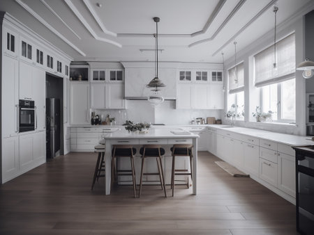
As we step into 2025, kitchens across the United States are experiencing a beautiful shift toward earthy neutrals. American homeowners are looking for spaces that feel warm, inviting, and connected to nature. This year’s color trends reflect that desire, with kitchen cabinets, backsplashes, and walls all embracing natural hues inspired by the outdoors.
Popular Earthy Neutrals for Kitchens
Earth tones are making a strong comeback in kitchen design. These shades bring comfort and timeless style, creating a cozy retreat right at home. Here’s a closer look at the colors gaining popularity:
| Color | Description | Where to Use |
|---|---|---|
| Soft Taupe | A gentle beige-gray that adds subtle warmth without overwhelming the space. | Cabinets, Walls |
| Clay | Inspired by natural terracotta, clay offers an earthy red-orange vibe for rustic charm. | Backsplashes, Accents |
| Olive Green | This muted green brings in outdoor freshness while staying calm and sophisticated. | Cabinets, Islands |
Why Earthy Neutrals Are Trending in 2025
Across America, there’s a growing appreciation for designs that ground us and create a sense of peace. Warm neutrals like taupe, clay, and olive reflect this mindset. They work well with popular natural materials like wood and stone and pair perfectly with open layouts and large windows that let in plenty of light. These colors not only look modern but also help kitchens feel more connected to the outdoors—something many U.S. families value.
Design Tips for Using Earthy Neutrals
- Layering: Mix different earth tones together for depth—think taupe cabinets with clay tile backsplashes.
- Pair with Textures: Combine these colors with wood grains or stone countertops to enhance the organic feel.
- Add Greenery: Potted herbs or indoor plants work beautifully alongside olive and clay hues.
- Keep It Light: Use lighter shades on the walls to make the kitchen feel open and airy.
Bringing Nature Indoors
The trend toward earthy neutrals is all about making your kitchen a relaxing gathering spot—a place where friends and family can unwind. By choosing colors inspired by American landscapes, you’ll create a kitchen that feels both contemporary and comfortingly familiar.
2. Bold Accents with Impact
For 2025, American kitchens are seeing a surge in bold accent colors that bring personality and energy into the heart of the home. Homeowners across the U.S. are moving beyond classic neutrals and experimenting with vibrant shades to create kitchens that truly stand out. Whether its a splash of terracotta on an island, a navy blue backsplash, or lower cabinets in deep forest green, these bold choices offer a fresh yet timeless twist.
Popular Accent Colors for 2025
| Color | Where Its Used | Why It Works |
|---|---|---|
| Terracotta | Kitchen islands, backsplashes | Adds warmth and earthy vibes; pairs well with wood and natural materials |
| Navy Blue | Lower cabinets, accent walls | Creates depth and sophistication; versatile for both modern and traditional kitchens |
| Deep Forest Green | Cabinets, open shelving, trim | Brings a calming feel; connects indoor spaces to nature; works with brass or matte black hardware |
How Americans Are Using Accent Colors in Their Kitchens
- Kitchens Islands as Centerpieces: Many homeowners choose a standout color like terracotta or navy blue just for the island, letting it become the focal point without overwhelming the space.
- Colorful Backsplashes: Vibrant tiles or painted backsplashes in bold hues add instant visual interest and can easily be updated down the road.
- Two-Tone Cabinetry: Pairing neutral upper cabinets with colorful lower cabinets or base units gives kitchens a dynamic and modern look while keeping things balanced.
- Accent Walls: Painting one wall in a deep green or rich blue offers drama without committing to an entire kitchen makeover.
Tips for Incorporating Bold Accents at Home
- Start Small: If you’re not ready for a major change, try adding color through accessories like barstools, light fixtures, or small appliances.
- Balance with Neutrals: Use whites, grays, or natural wood tones alongside bold accents to keep your kitchen feeling open and inviting.
- Mood Matters: Choose colors based on the atmosphere you want—warm terracotta feels cozy, navy is classic and calming, while forest green brings freshness and tranquility.
- Mix Textures: Combine glossy tiles, matte paints, or textured cabinetry finishes for added interest and dimension.
![]()
3. The Rise of Warm Whites and Creams
For 2025, kitchens are moving away from the sharp, bright whites that once dominated American homes. Instead, warm whites, creamy tones, and soft off-whites are taking center stage on cabinets, backsplashes, and walls. This subtle shift creates a cozier and more welcoming vibe—perfect for the heart of the home.
Why Warm Whites Are Trending
Stark white kitchens can sometimes feel cold or clinical. In contrast, creamy whites and off-whites introduce warmth without sacrificing brightness. These shades make your kitchen feel inviting, relaxed, and lived-in—a place where friends and family want to gather.
Blending Styles with Ease
One of the best things about warm whites is their versatility. They provide a neutral backdrop that easily pairs with both traditional and modern elements. Whether you prefer shaker-style cabinets or sleek minimalist lines, these colors let you mix textures and finishes without clashing.
Popular Warm White Shades for Kitchens
| Shade Name | Description | Best Use |
|---|---|---|
| Alabaster | A soft, creamy white with subtle yellow undertones | Cabinets, walls |
| Swiss Coffee | A classic off-white with a hint of beige | Walls, trim |
| Ivory Lace | A gentle, light ivory perfect for creating warmth | Backsplashes, islands |
| Creamy | A rich cream that feels both fresh and timeless | Cabinets, accent areas |
Mixing Materials and Accents
Warm whites serve as an ideal canvas for mixing in natural woods, brass hardware, or colorful accessories. They help highlight statement backsplashes or unique countertops while keeping the overall look harmonious.
Quick Tips for Using Warm Whites in Your Kitchen:
- Pair creamy cabinets with natural wood shelves for a cozy vibe.
- Add brass or matte black hardware to create contrast.
- Layer different shades of off-white for depth and interest.
- Use textured tiles or stone on the backsplash to add character.
If youre looking to refresh your kitchen in 2025, consider swapping out crisp whites for softer creams and warm whites. This trend brings comfort and flexibility—just what every modern American kitchen needs.
4. Mixing Metals and Matte Finishes
When it comes to 2025 kitchen color trends in the U.S., one standout look is the creative blending of metal finishes with painted surfaces. Homeowners are moving away from perfectly matched hardware and instead are mixing metals like brushed nickel, matte black, brass, and even copper for a more collected, curated vibe.
How Paint Colors Pair with Metal Finishes
Color is playing a big role alongside these mixed metals. Soft, earthy tones like sage green, warm taupe, and muted blues are trending for cabinets and walls. These shades not only create a calm atmosphere but also let metallic accents pop without overwhelming the space.
| Paint Color | Popular Metal Pairing | Style Effect |
|---|---|---|
| Sage Green | Brushed Brass | Warm, inviting contrast |
| Creamy White | Matte Black | Crisp, modern edge |
| Dusty Blue | Polished Nickel | Fresh, coastal feel |
| Mushroom Taupe | Copper Accents | Earthy sophistication |
The Rise of Matte Finishes in American Kitchens
Matte finishes are gaining popularity as a chic backdrop for both cabinets and backsplashes. Unlike glossy surfaces that reflect light, matte paints and tiles offer a soft, velvety look that feels sophisticated and modern. They’re less prone to showing fingerprints and smudges—a big plus in busy kitchens.
Where to Use Matte Surfaces:
- Cabinets: Matte painted cabinetry gives a smooth, contemporary appearance that works well with any metal hardware.
- Backsplashes: Matte tiles or stone slabs add texture and depth while keeping glare at bay.
- Walls: A matte finish on walls provides a subtle backdrop that lets other design elements shine.
Why Americans Love This Look:
The trend toward mixing metals and choosing matte finishes reflects an American preference for personalization and practicality. It allows you to express your style while keeping your kitchen easy to care for—making it both beautiful and livable for daily life in 2025.
5. Personalization through Color Blocking
Color blocking is becoming a major kitchen trend in 2025, especially in the U.S. It’s all about using two or more contrasting yet harmonious colors to make your kitchen feel uniquely yours. Instead of sticking with one color palette, American homeowners are mixing things up—pairing bold shades with neutrals or even combining unexpected hues for a playful, custom vibe.
What Makes Color Blocking Stand Out?
This trend allows you to showcase your personality. Whether you love cheerful brights, calming pastels, or classic earth tones, color blocking offers endless possibilities to highlight your style while keeping your kitchen on-trend and inviting.
Popular Color Block Combinations for 2025
| Cabinet Color | Backsplash Color | Wall Color | Why It Works |
|---|---|---|---|
| Navy Blue | Soft Blush Pink | Crisp White | Classic meets modern; creates depth and warmth |
| Moss Green | Terracotta Orange | Light Beige | Earthy and organic; feels cozy and grounded |
| Charcoal Gray | Lemon Yellow | Pale Gray | Striking contrast; energizes the space without overwhelming it |
| Sage Green | Creamy White | Pale Blue | Soft and soothing; easy to personalize with décor accents |
| Matte Black | Emerald Green | Warm Taupe | Dramatic and sophisticated; highlights architectural details |
How Americans Are Adopting This Trend
Kitchens are often the heart of the home, and color blocking lets families create spaces that feel joyful and welcoming. Some opt for colorful lower cabinets paired with neutral uppers, while others experiment with vivid backsplashes that pop against muted walls. Open shelving painted in a different color from cabinetry is another fun way to try this look without committing to a full remodel.
Tips for Successful Kitchen Color Blocking:
- Select colors that complement each other: Even contrasting shades should feel harmonious together.
- Balance boldness: Pair one vibrant hue with softer tones to keep things lively but not chaotic.
- Test paint samples: Lighting can change how colors appear, so test swatches before making final decisions.
- Add personal touches: Incorporate family photos, unique hardware, or patterned tiles for an extra layer of individuality.
This playful approach to kitchen design reflects the American spirit of creativity and self-expression—making every kitchen as unique as the people who use it.


